I didn't get very far at all but I did have some criticisms from the short time played:
- I love the art style and sfx thus far. The goblins sounded sufficiently gobliny.
- Please let me edit the mouse sensitivity.
- In the inventory I tried equipping a sword I found by double-clicking on it. I didn't see the "Use" button at the bottom of the screen until I was trying to figure out why that didn't work.
- The ladders looked weird with having the flat texture on two different planes. I feel like having it be a 3D model like chests or other interactable entities would look a lot better.
- I like the Dead By Daylight-like "hold until you're in the sweet spot" for combat but it felt very swingy. Hitting the sweet spot was always a kill, and missing it did nothing.
- Maybe this was because of the rusty sword I had, but it felt like monsters had a lot more effective attacks on me compared to how often I could attack.
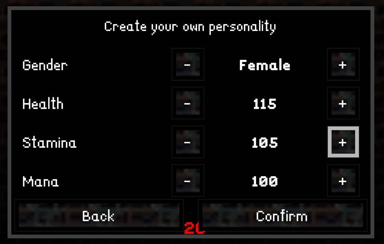
- There are some UI scaling issues. For reference, I have a 3440x1440 monitor and there did not appear to be any option to not go fullscreen. This lead to some odd UI things like below:


