thanks for the feedback and for playing!!
Can you elaborate more on the visuals specifically? I think I know what you mean, but more direct feedback would help me! I do believe the bullets and medals blend too far together unfortunately but I just loved the gold medals so much that I just kept it...
Viewing post in Bullet Hell Jam 5: Mastodon jam comments
Of course. And i must add that the game plays like an absolute pleasure. It seems that you have this genre down.
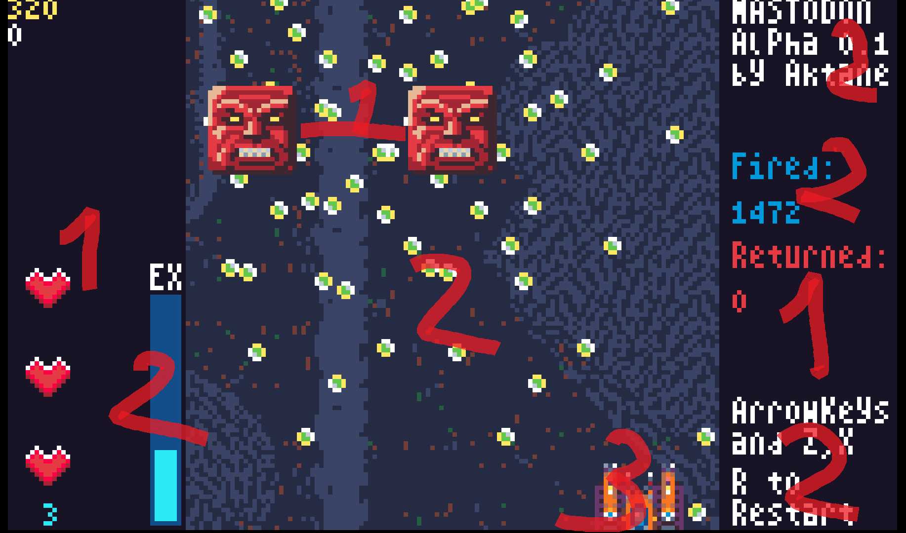
this is what i see at a glance with a fuzzy vision, without focus on anything specific
The biggest problem is that we are overloading the vision with the ui elements. The sidebar red takes is the best contrast and is visible first. next is the white test, because of the black/white combination. Then the blue. All these elements have to take 3rd/4rth priority. I love the background and it's complexity, but i suggest dropping it's contrast by something like 80% less. You still want to see the detail and complexity but it should fade waaay into the background. There is a lot strong difference between dark and light blue constantly signals that something needs attention, while it's actually just a back setting.

There are some tutorials on youtubes . What works best though is to sit down with a graphic designer and talk though which colors they would pick and why. The trick i try to use is to have 1 strong primary, somewhat less strong secondary and the all the rest fades into the background. In your case, i would maybe make the player 1, bullets and enemies 2 and the rest faded. Or enemies one, bullets and shit 2. Whatever works best during playtesting.
How does that sound?
This is awesome!!! Thank you so much for this feedback. There's a lot to chew on here. And the picture is super helpful.
Everything on the right was a placeholder so that can just be ignored. I do also agree the player is a bit too dark.I was using a palette so there really aren't any darker colors I could go for, or hues unless I add colors to the palette! Possibly I picked the wrong palette or more evidently didn't use the palette correctly.
I don't think the background should be even darker personally, because I don't even notice it, so I would love to get others feedback on that... but everything else makes sense and was mostly a placeholder. Although I do think certain UI elements need to be bright enough because they are important to see at a glance without having to move your eyes. Specifically the lives and the EX. The score is also too small.
As far as working with a graphic designer, thats a great idea and I never thought of it! I wonder how they'd do with a limited palette... That would be a fun experiment!
Thank you so much! Part of me is curious about what you think of my Crossgunr games but I think the feedback is gonna be similar ;)

