Play Shmup
Bullet Hell Jam 5: Mastodon's itch.io pageResults
| Criteria | Rank | Score* | Raw Score |
| Fun | #25 | 4.000 | 4.000 |
| Theme | #32 | 3.667 | 3.667 |
| Overall | #48 | 3.667 | 3.667 |
| Visual | #74 | 3.778 | 3.778 |
| Audio | #137 | 3.000 | 3.000 |
Ranked from 9 ratings. Score is adjusted from raw score by the median number of ratings per game in the jam.
Are you using any third party assets?
I made everything during the jam
Are you using any AI generated assets?
HELL NO
Did you use BulletFury?
No
Leave a comment
Log in with itch.io to leave a comment.


Comments
Really loved this one! The retro style graphics remind me of pico8 games which I really like to play on my fake gameboy haha. Also the game goes hard with the consequenes and overall difficulty! I didn't last long but it was fun while I lasted lol. Great job!
watching Krystian from Lazy Devs Academy play this was like watching someone being sent to the slaughter! haha sorry about the high difficulty! <3
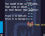
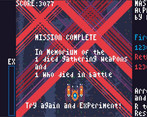
MISSION COMPLETE Score : 28877
Absolutely love how wild you went with the theme, two awesome implementations in the same game, love the beginning, love the end.
Besides the game looks, sounds and feels good, and overall all the sequences are super fun to deal with, the boss fight is great and the difficulty is perfect.
This is an amazing entry, thanks for sharing.
yeah haha I took the theme to heart I guess :P ... but omg <3 such a positive review... I guess it was worth it! I was a little shy on posting this game, I felt like the deadline made it so it was very unpolished and I didnt know if the balance would work in the end :) thank you so much for playing it and that alone makes it worth it.
Fun game. I really liked the Old School Arcade feel. Definitely Bullet Hell. I had to force quit to exit game though. Awesome game I enjoyed playing it!
I thought force quit was standard for jam games 🤣🤣🤣.
Thanks so much for playing!
😂😂😂
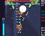
Those are definitely consequences! I think UI wise the game has a lot of room to improve and I think enemies have the charm of Crossgunr, but something about the colors was making it difficult to parse. Regardless, its an awesome idea, and I love that the main character is a tank.
Good feedback! You're not the first to comment on the colors. Something is definitely not right here... I think I misused the palette.
Retro! Thank you for the experience!
thank YOU for playing! <3
Nice game! The return bullet policy hits harder when I tried it myself.
yeahhhhh its a bit harsh! haha easier on the simpler ranks but much harder on the high powered ranks, much patience required lol
thank you much for playing!
Loved the gameplay, good traditional bullet hell.
The visual hierarchy was a bit of a mess, but thats what jams are for!
thanks for the feedback and for playing!!
Can you elaborate more on the visuals specifically? I think I know what you mean, but more direct feedback would help me! I do believe the bullets and medals blend too far together unfortunately but I just loved the gold medals so much that I just kept it...
Of course. And i must add that the game plays like an absolute pleasure. It seems that you have this genre down.
this is what i see at a glance with a fuzzy vision, without focus on anything specific
The biggest problem is that we are overloading the vision with the ui elements. The sidebar red takes is the best contrast and is visible first. next is the white test, because of the black/white combination. Then the blue. All these elements have to take 3rd/4rth priority. I love the background and it's complexity, but i suggest dropping it's contrast by something like 80% less. You still want to see the detail and complexity but it should fade waaay into the background. There is a lot strong difference between dark and light blue constantly signals that something needs attention, while it's actually just a back setting.
There are some tutorials on youtubes . What works best though is to sit down with a graphic designer and talk though which colors they would pick and why. The trick i try to use is to have 1 strong primary, somewhat less strong secondary and the all the rest fades into the background. In your case, i would maybe make the player 1, bullets and enemies 2 and the rest faded. Or enemies one, bullets and shit 2. Whatever works best during playtesting.
How does that sound?
This is awesome!!! Thank you so much for this feedback. There's a lot to chew on here. And the picture is super helpful.
Everything on the right was a placeholder so that can just be ignored. I do also agree the player is a bit too dark.I was using a palette so there really aren't any darker colors I could go for, or hues unless I add colors to the palette! Possibly I picked the wrong palette or more evidently didn't use the palette correctly.
I don't think the background should be even darker personally, because I don't even notice it, so I would love to get others feedback on that... but everything else makes sense and was mostly a placeholder. Although I do think certain UI elements need to be bright enough because they are important to see at a glance without having to move your eyes. Specifically the lives and the EX. The score is also too small.
As far as working with a graphic designer, thats a great idea and I never thought of it! I wonder how they'd do with a limited palette... That would be a fun experiment!
Thank you so much! Part of me is curious about what you think of my Crossgunr games but I think the feedback is gonna be similar ;)
Awesome game dude! Good visuals and gameplay :)
Aw thanks dude! I'm gonna check out yours too!