Of course. And i must add that the game plays like an absolute pleasure. It seems that you have this genre down.
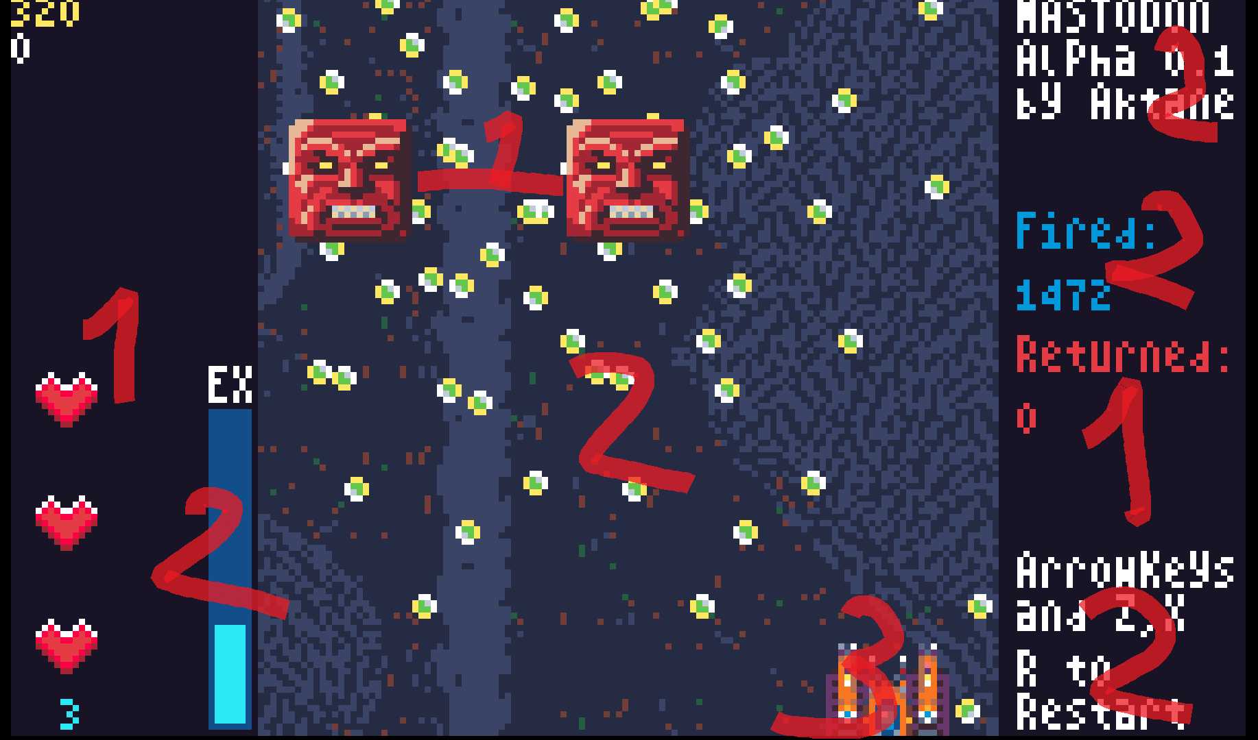
this is what i see at a glance with a fuzzy vision, without focus on anything specific
The biggest problem is that we are overloading the vision with the ui elements. The sidebar red takes is the best contrast and is visible first. next is the white test, because of the black/white combination. Then the blue. All these elements have to take 3rd/4rth priority. I love the background and it's complexity, but i suggest dropping it's contrast by something like 80% less. You still want to see the detail and complexity but it should fade waaay into the background. There is a lot strong difference between dark and light blue constantly signals that something needs attention, while it's actually just a back setting.

There are some tutorials on youtubes . What works best though is to sit down with a graphic designer and talk though which colors they would pick and why. The trick i try to use is to have 1 strong primary, somewhat less strong secondary and the all the rest fades into the background. In your case, i would maybe make the player 1, bullets and enemies 2 and the rest faded. Or enemies one, bullets and shit 2. Whatever works best during playtesting.
How does that sound?

