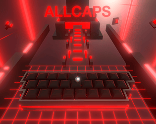
Wow, it's really cool and weird actually seeing someone else play my game. It was interesting to see you figure out the way the jump and movement worked over time (it's supposed to be that you charge your jump with the energy and have to balance your movement speed with the force), but even without solid instructions that I probably shoulda included in the game itself you managed to figure most of it out. Also, I'm super annoyed at myself I didn't fix that flashing lights thing before the due time a lot of people are having problems with it (it's a bug on reloading the scene). Thanks for playing!
beeseekay
Creator of
Recent community posts
For a short time-span project like this, getting something shorter that shows off the mechanics faster is probably a better idea than staggering them out so much across what is admittedly quite a bit of content with some neat ideas, but a lot that most won't get to in such a short time (most people will only really play a game for a few seconds to a min if there isn't much intrigue). I have a feeling you made the game in order as you can see a considerable improvement as it progressed, but getting solid mechanics first and then adding more content is more important.
Also a good idea would be to zip both the exe and the data folder together and just upload that as one thing rather than 2 downloads.
Besides looking feeling and sounding really cool, the reflecting bullets thing is clever, and a few small design tweaks could really change it into something that could be expanded upon really nicely. For example, the 'shooting multiple enemies without lowering' mechanic is really cool, but the reward is kinda self-defeating as getting shots more accurately/ faster probably means you aren't burning as much ammo, but if you aren't doing well and need to hide away to reload more often (reloadings pretty cool btw), you'll inevitably get stuck without any way to get more ammo. Overall really cool use of the design theme.
The wall jumping ain't no super meat boy levels of polish, but it all functions really well and I like how you use the shifting colours in some interesting ways other than just as jumping platforms (Different paths requiring you being a specific colour at the start is nice). Some pretty darn solid level design throughout.
This is extremely well made and looks pretty cool with the whole lined screen aesthetic, and there's a surprising amount of content for a 48 hour game. Kinda reminds me of The Swapper which is a super underrated puzzle platformer. I would love to see other ways the hook would be used if you developed more content. Maybe some more stationary interactable elements like door triggers or avoiding projectiles etc.
The area of visibility decreasing if you hold fire is really clever, I could see this also being used for more obstacle avoidance than just bullets if you had more enemies in the future. Visuals are simple but immediately understandable so they serve their purpose well (probably don't need the word void written over and over though). Also, you've got it in your description but why isn't this game just called Shot in the Dark? That's such a cooler title. A great, quite polished work to make in such a short timeframe.
Handling takes some getting used to but it feels really good when you're managing to use the walls to recharge your move/ fire, adds some interesting gameplay challenges. I think starting the player in a stationary position and letting them plan out their precise moves feels better than the frantic levels however. Maybe having a way to weigh your ball down to stop it bouncing so you can line up shots (as well as more precise turning) would turn this into a pretty amazing puzzle platformer.
Wow, this is pretty! I also like the gradual addition of mechanics. The only problem is the shifting distance makes it hard to judge the length needed to make the jumps to land on the bounce pads. Being able to adjust the length of jumping somehow could add another element of control (though in only 48 hours you got more done than I ever could).


