Thanks chief! Excited to give this a try, would using a hex grid disqualify me for the challenge? Rest of the models would be using primitive shapes.
BottleDev
Creator of
Recent community posts
Thanks chief! Glad to hear you enjoy it!
Just a lil tip, the arc trajectory isn't correct past the apex as the gravity on the monkey is increased as it falls.
Originally I intended the trajectory to be simply a tool for me to use when designing levels and jump distances so I never got around to fixing it.
I love the PS1 art style and you nail it! Our games both share a similar mechanic of yeeting a monkey around but it's interesting to see how our controllers differed and how yours lends itself to your situation far better than mine would. Nice little case study of how drastically different games can be made from the same mechanic.
Great job chief :)
The art is so cute for the different monkes! I love their little facial expressions and the little things you did to make them different. Sadly for me the game stopped working a few times and wouldn't let me progress. Additionally as Legend said, having to go through so many dialogue options sort of messed with the flow of the game. Regardless, really fun! Great job chief :D
This was my third game jam I've participated in but the first I've ever actually finished and submitted.
The thing I learned most from this jam was that I should really be less anxious about showing people my game. I had finished my game and was considering not submitting for fear of people finding everything stupid. I eventually managed to say screw it and just submit the game because someone close to me said that whatever happens, whatever people say, they can always teach me more, and what I want to do is learn how to be better. Upon submitting I was pleasantly surprised by the amount of positive reception I got and it brought me to near tears.
More importantly however, I was shown issues with the game, simple issues I could have solved in 5 minutes. If only I had shown my game to others beforehand and had them catch it, then I could've fixed it. The issue with not showing your games or work to people is that it stunts your improvement. You can't learn from your mistakes if there is no one there to point them out to you. Moreover, if I had shown my close friends and family the game, they could have told me things to fix so that y'all wouldn't have to.
I really need to learn to get over that hump of anxiety and insecurity and just show my game to people, let em try it, and learn from what they tell me.
This is so cool! Love the art and especially that flail fire staff thing!
So satisfying to bounce it around. Did you make all the animations and assets yourself? They are amazing! They fit so well together and blend seamlessly!
My only criticism would be that I feel the strikes should have slightly more weight to them. I personally prefer combat that doesn't slow down movement, but if you do want to make it come at a cost of movement and agility, it should have a bigger punch and weight when you do it.
All in all great game! :D
Good job!
Glad you liked the art :D
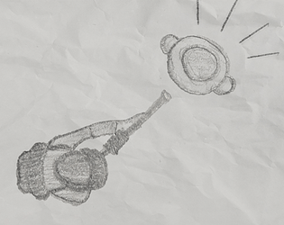
Yes, everything was drawn in my sketchbook, photographed, and then masked out in Photoshop. Not the best artist, or photographer, or good with Photoshop, so this all took me quite a while as I had to manage the lighting, making sure the lines were dark enough to be visible, and also learn how on earth to cut out a section of an image in Photoshop.
I'm so sorry you ran into issues with the contact spawning in front of an enemy! I hope to fix this in tomorrow's update :)
Thanks for starting with the positives! Means a lot you liked the art!
I really appreciate the feedback you've given and I am happy to say that all if not most of it will be fixed in tomorrow's update :)
If you get a chance I'd love to hear your thoughts on it when it goes live!
As for the theme connection, I interpreted "connection" as a business connection who assists you in some way. I followed this train of thought until I reached the idea of an informant in a criminal organization!
Definitely need to fix the UI, thanks for the feedback! Gotta figure out how to make everything look like it blends together but still catch the player's eye.
As for the theme connection, I interpreted "connection" as a business connection, someone you know who can assist you. In this case that someone is an informant in a criminal organization.
Thanks for the feedback friend :)


