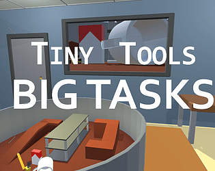
A beautifully executed and perfectly dreamt implementation of the theme. 10/10.
Busted Softworks
Creator of
Recent community posts
Love the sponge idea! It's a killer implementation of the theme because it explains why the object would get bigger and smaller rather than it just "magically" happening (like our game lol). I think this all very well executed from the animation to the art and color pallet. Well done. Hopefully you can get our game working (press Enter on the title screen - I'll add this to the description in case someone else has issues with the colors like you did).
Our team (like I'd imagine most teams) also struggled with work/life getting in the way, spending too much time on the central mechanic and also didn't finish. You were at least nice enough to put a message to the player in the game! We probably should have done that. As you said, you're proud and you should be. I really like the monochromatic color scheme and the artwork. Excellent work.
The art style is really cool. I love the honeycomb background. It's the subtle attention to detail stuff like that that can really make a game's visuals pop. The UI transitions are also really smooth and professional looking. The whole game has a cohesive whimsical and fun vibe. Impressive amount of work for a game jam.


