weird, I tried sideloading this zip with the readme in it and the website didn't seem to mind.
dfug
Creator of
Recent community posts
I clapped when dragula came on while I was collecting giant pixelated roasted chicken, top 10 zombie britain moment
I wish there was a key to speed up the job giver's dialogue instead of skipping all of it - It'd probably help to require key input to go from one page of dialogue to another.
The most fun part of this for me was trying to rack up large combos to speed up the money grind -- It's pretty hard to go past x10 even with upgrades due to RNG zombie placement though, I'd slow down a bit on the combo bar decay.
Reversing is a disaster due to inverted controls + broken camera, there were a few times where I was right next to the bloody fuel tank and couldn't reverse into it before the fuel gauge ran out
Dumping all your money into the gate/upgrades right before fuel runs out essentially negates the fuel system's entire purpose as it can't drain you of your cash when you respawn. I wonder if it wouldn't be more punishing to slow the car down to a crawl instead of making you respawn with halved money.
Also I'd probably take a cue from the Dead Rising games and stick a "total zombies killed" count somewhere in the UI.
I get that the art style is meant to be black & white (and I think it does work well for the items and characters), but the map itself still looks rather boring to traverse. Music doesn't really help either atm, sadly.
The minimap is also quite confusing, it feels like it's always one block away from where I really am.
Combat system might be a bit too complex for its own good but I like the idea of being able to charge your moves with hitting weaknesses giving you extra charges, it's megaten-ish without feeling like a carbon copy.
Been meaning to test this out for a while - think this one's got real potential (and not only bc of the stellar pixelart tiddies tbh)
I had fun playing the first mission, it's very easy but then again it's level 1 so I can't hold that as a negative.. beam goes brrrr
- The zoomed out portion which introduces the miniboss feels a bit boring since the cutscene is mediumlength, you can move during it but there's nothing to do... Maybe spawn in some extra enemies while the dialogue plays? Shmup levels shouldn't really have too much dead time.
- Really needs some extra SFX in there! Most of the weapons being silent atm feels super weird.
- Miniboss has great design, you can focus the lower portion to get rid of the grenades, the sword sweep requires you to hug the ceiling, it's good stuff.
- Focusing should probably slow the player character more, it's still possible to overshoot when dodging.. Regular unfocused speed feels fine to me. (Is beam really slowing you down as mentioned in the database? I barely felt the difference.)
- I think the hitbox should be always visible when focusing touhou-style, but it's not too hard to memorize that it's basically the cleavage of the player sprite.
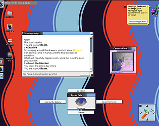
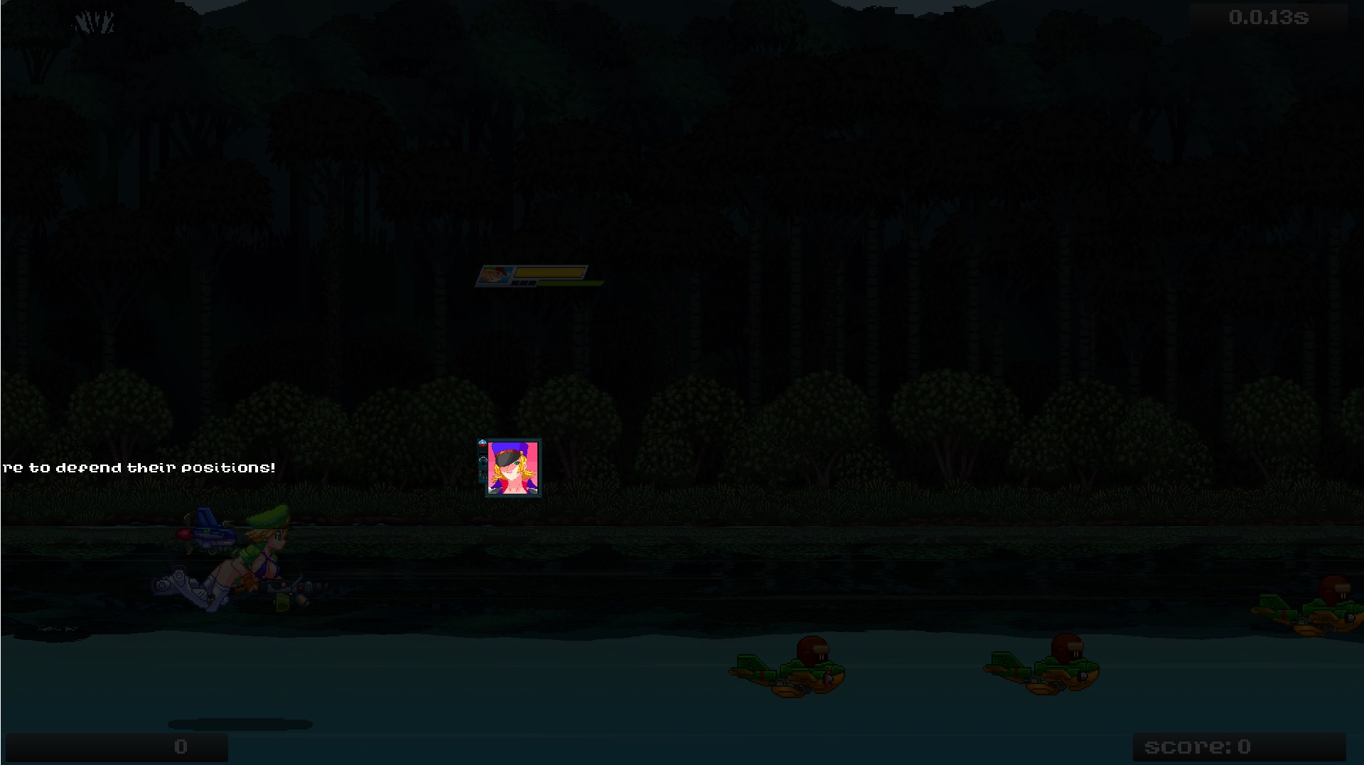
UI is super fucked for me in the first mission but not in the tutorial/practice room, wonder if it's because I'm running at 150% scaling? Unity UI can be incredibly annoying to get pixel-perfect visuals with so I share the pain..
Hitting alt-enter to get out and back into fullscreen makes it worse:
👋 I mightve forgotten to test out borderless properly... I believe you can delete the resolution settings in the windows registry at key Computer\HKEY_CURRENT_USER\Software\TVC-16\Funtography .
The resolution dropdown currently doesn't look at the current resolution, so if you checked fullscreen it likely defaulted to 640x480.
I recommend playing windowed for now, as you can resize the window anyway you want and the fake OS resolution will match.
Very fair. Thanks for playing though m8!
I'm obviously biased but I think the story picks up a bit once the initial generic adventure game stuff is done; It is kinda heavy on urban/building pictures now that I look back on it though
The OS itself is what I want to keep building on, so hopefully a future demo will be more interesting.