I realise this is long into the future, but how would you add this CSS into the appropriate space? and where?
From The Chasm
Creator of
Recent community posts
https://fromthechasm.itch.io/the-glass-pool-of-berrandas
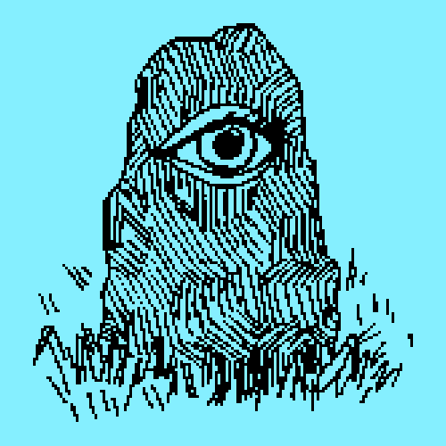
The Glass Pool of Berrandas
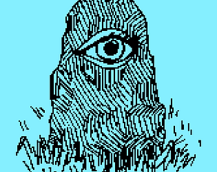
Can you reach The Glass Pool of Berrandas?
What lies beneath its murky depths?
Can you find the stones that unlock what lies beneath?
A text-based adventure, set in on a fantasy isle.
With artwork by Lewis Fox
Made for Bandersnatch Jam 2019
Made in Twine, powered by Harlowe.
a From the Chasm production, 2019.
This made me laugh. Its not often you get to give a protagonist the boot. This is a great mechanic, much needed in all platform games. Summoning the hook was pretty neat to. I've been trying to think of a way to make it more attached to the player, like a fishing rod perhaps? That might connect the player to is function a bit more.
The mysteries of space. I would foolishly attempt to romance a doomed ladden alien again. It was cool to have a mini-sci-fi story to get through. I couldn't quite tell if my choices in the text were having an effect on the story? THere were a couple of spelling mistakes etc. But not a big deal. It would have been nice to have a change in music, when the atmosphere got more tense for example. When the text was moving across he screen I was thinking it would be neat to have sound effects as the letters appeared.
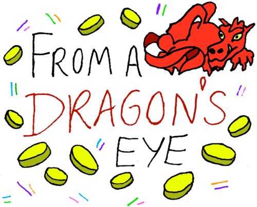
https://fromthechasm.itch.io/from-a-dragons-eye
Can you rescue your companion?
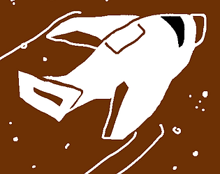
The Red Dragon, Animus has enchanted your companion with a deal they cannot refuse. Can you break the Dragon’s will? And win back your partner?
Created for the Brackey's Game Jam #2 (2019)
Artwork by Lewis Fox.
Made in Twine, powered by Harlowe.
a From the Chasm production, 2019.
Love really does hurt. First of the concept is really unique. I really like the lore and story of it. Shapeshifting around is a really cool idea. I did though find it difficult to tell what species I was trying to be and the gender, especiallt the more humanoid creatures. More graphical changes would be appreciated and a restart button!
The Pixel art style was pretty nice. Though why the angel in the title screen is not the same style confused me a little. The floating cherub was cute. I'd have liked the opportunity to fly into the crowd a bit. The different coloured hearts could perhaps be differentiated some more. Otherwise, pretty fun to play.
Although contrary to definition, I put in Trump as the designated individual and was amused when the descriptions of a flagging career was given. It was refreshing playing a game that wasn't arcade-like. The wall of text input boxes were somewhat intimidaiting, and in places I felt my choices were kinda guideless. But it was amusing to see the results. Staggered in the beginning may have built up my confidence in their result. Was interesting to play.
I though the design and styling were really good! And the SFX worked well. The text I found a bit hard to read, but as soon as I saw the companion blindly walk forward I realised I had to protect them. The peasant mobs did seem a little unresponsive but it was cool to engage with them. Perhaps an element of knock-back in the combat would give it more dynamism. Good effort!
Brilliant! It was a real challenge. I didn't make the ending, but the attempts were atmospheric enough. This is the sort of jam game where you can really see the potential. The aesthetic reminded me of 'Don't Starve' and really suited the vibe of the town and the arrival of the werewolf. I'm not quite sure abotu the motive of the guard, I presume it was to enforce a curfew. Audio was great and the effects were nice. I could really see how give more time this game could be something really special. Perhaps even with a multiplayer element.
Guiding your team mate is a really neat idea. I wonder if it really does make the two players work together rather then lure each other to uncertain death. This game has given me more ideas then others! Perhaps a sequal could involve both a double win-state and a single win-state so the two characters could betray each other? With an online-multiplayer element this game could really open up!
There is potential here. I thought i was interesting how one character can block or get in the way of the other. If there was more slipping and sliding, this might add my dynamism to the interaction. The sound effects were cutely used. The traps were a little inconsistent, I fell down some holes and nothing happened, while others resulted in death. Not bad!
I really liked this. Although I got stuck pretty early, the ideas involved are really interesting. It didn't take long to realise they couldn't cross paths by sight. I began to imagine them as two medusa's where if they caught they eye of the other, both would turn to stone. A way to highlight the line of sight between the two players might be a nice addition.
Well....it certainly made me chuckle. Is it advisble just to randomly touch people....probably not. Did I find my love? nope I think I was the flaw in this game. I did enjoy pushing random hearts around with my stick though...not so much when they oozed a black cloud all over me. If there was a rating for weirdness this would be right up there.
Those hearts were pretty ferocious! I liked how the pink heart showed up for a few seconds with a shocked faced every time I perished. Sadly for me, about a 10th of the overlay had disappeared on the right hand side, so I couldn't get a clear idea of the plot. I think a couple of background changes or colours I would have played a little longer, and some differentiation between the player's heart the the ones with glasses.
This was pretty overwhelming to play. That little squeeky character really drew me in . Moving around on the board was pretty fun. It took me a while to realise I was meant to go through the rings an not just avoid them. I thought I found a good strategy to fly up out of sight up the top the screen. I wasn't completely sure what I was meant to fire at, whether it was the rocks highlighted in blue or those evil looking ships. So I fired at everything. If it wasn't for the laziness of my internet, causing things to juddfer, I would have gone on playing this longer.
Did I understand the plot? Nope. Did I enjoy moving a small blue cube around firing at stuff? Yes. The moment I saw the term "AC" I couldn't shake from my mind you didn't mean "Air-Conditioning Unit." That threw me a little. As a player it felt a little clunky, I was hoping for a few powerups to find to give me an edge. What I most enjoyed was the ai of the red fellows; it was quite nice having them following me around, up until I did the old horse-archer trick of kiting them in wide circles.
It took me a while to get my ancient mind around it, but once I figured the grid the circles were moving around on where important it soon clicked. It felt really innovative.The aesthetic was nice and minimal. The grey stars felt a little out of place, but their effect really upped the difficulty. As a game it feels like its begging to be played by two players...
Straight off I love the animation of the little heart. I managed to push one of the grey dudes straight off without any harm, which I thought was pretty funny (whether intentional or not). The field of view telescope thing was pretty neat, although it gets a bit stressful when making leaps of faith. Iguess the restricted view comes from how the heart is blindfolded? If thats true then perhaps a cool intro would include it being put on. On one run one of the grey heads just ran me over, so I found their consistency a bit weird (though that was probably just my ineptitude.
I was uselss at this. But I was smiling all the time. You don't know tragedy until you see a small horse bellyflop onto a cactus. Gravity felt quite unforgiving. The silhoutted birds although looked cool, were slightly hard to tell whether I was meant to avoid them or ignore them. I couldn't quite tell whether if I man the colt leap constantly it would just collapse from exhaustion? I half expected the next horse to be a different colour. I liked the idea of the stablemaster coming back out to replace the one I had stupidly punished.
This game was not at all what I was expecting. It was a nice suprise. It kinda felt like I was directing two bomb disposal robots, on their day off, to find love... Maybe the addition of some faces? or decals on the block might give them even more personality. I liked the chunky aesthetic. It took me a while to get to grips with how the little cubes worked, kinda like mirrors with laser beams. Perhaps if they were more differentiated from the bigger cubes, their function might be more obvious. Lots of potential.
Thanks for the bug spot! I'll look into it. I've been playing games for a long old time. First game I remember playingwas 'Pirates!' back in '89. I was a toddler at the time though. Cheers for trying out the endings! The time limit runs on way to long, and needs adjusting, a long with the Dragon interaction (not at all developed). Thanks for playing!
https://fromthechasm.itch.io/the-lost-hat
The Lost Hat
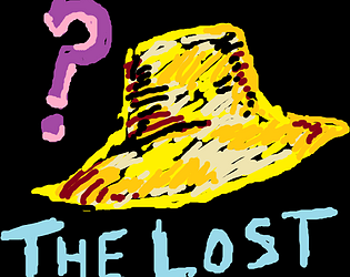
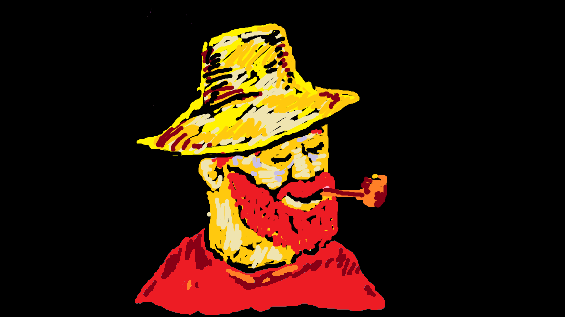
Can you find Vincent's hat? It is keeping him awake at night. He can't sleep without it.
A game inspired by the paintings of Vincent van Gogh. Featuing; "The Starry Night".
Created for "Paint Jam 2019".
Illustrated by only using the default MS Paint colour palette.
Artwork by Lewis Fox.
https://www.instagram.com/lewis0fox/
Made in Twine, powered by Harlowe.
a From the Chasm production, 2019.


