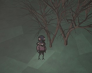
This game is slow, deliberately so. It drags out in ways that are deeply reminiscent of my own struggles with mental health. There are no monsters, there are no jumpscares, just a deep sense of dread over nothing. And in a ludo-narrative sense, that recreates anxiety beautifuly. Excellent work, everything I love out of games
Jessica Coan
Creator of
Recent community posts
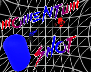
From the moment I saw that banner I was intrigued. The aesthetics are dead simple, and that's all it needs. The guns feel punchy and the way enemies exploded into fragments was satisfying. The main mechanic forced quick and snappy gameplay, in a good way.
On to the bad: The floor really should be infinite. Enemies seem to come at you from all directions, which isn't quite fair when you don't know they're coming behind you. I was confused what gave me health (killing enemies?), an indicator would be nice (to help stupid people like me :P).
Overall, I really liked this one. I'm interested to see more of what you do!
There's a beauty in simplicity. For the few minutes I spent with this game, I walked away with a smile on my face.
Strictly talking about the jam, there's nothing that I'd really call innovative (though that's not necessarily a bad thing). And while the wrench technically does serve more than one purpose, it doesn't really do anything that would encourage the player to use it in multiple ways.
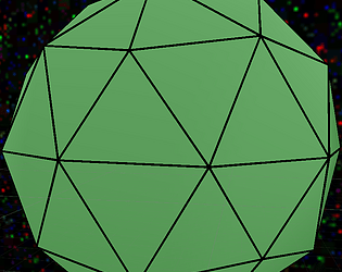
I'm loving the aesthetic. Low poly bright colors are my jam. I also liked the idea of moving mower wheels individually, definitely adds some complexity.
However, I didn't really feel the upgrading really fit with the idea of "dual purpose". It didn't feel like it meshed with the main mechanics, just sort of a side addon thing. Same thing with the menu music, doesn't quite fit with the mood of the gameplay. I also couldn't figure out what was forcing me to restart the level (though it's distinctly possible I'm just stupid).
Overall, good. Not great, but good. Another pass in the design phase, a bit more cohesion between assets and gameplay, and you really could have something great.


