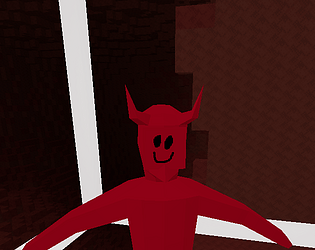
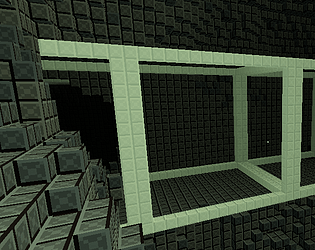
The game is really fun to play, but my biggest gripe is the visuals. For example, in the first screenshot of the game the walls are very bright and the floor is dark. Plus the wall textures have a lot of contrast which is kind of annoying to look at. The levels should be either entirely dark or bright, and the enemies should be the opposite. That would instantly make everything look much nicer, at least in my opinion.
Now, onto the gameplay. Some of the power up things might need to be rethought. Why would anyone want multiple Anti Gravity power ups when it would just put you at a further disadvantage? Maybe it should just make the enemies slower? And the ring of flames looked like I was on fire.
Particle effects for the portal should be bigger. It is nearly impossible to see from far away. I do like the indicator that shows you when you are getting close to the portal, but I didn't realize what it was for a while.
Not sure what's up with the areas where you get shot by nothing and your view turns constantly. And the lost king filtered me. Couldn't avoid his laser.
I encountered a couple bugs:
- One of the twin pillars that I fought was named "@Twin Pillar@43874."
- One of the powerups that reduces ammo for each weapon causes each new weapon to start off with more loaded ammo than there should be.


