Indie game storeFree gamesFun gamesHorror games
Game developmentAssetsComics
SalesBundles
Jobs
TagsGame Engines

Improb

27
Posts
1
Topics
28
Followers
28
Following
A member registered Jan 15, 2022 · View creator page →

Creator of

Recent community posts

Thank you for playing the first 90 minutes! Sorry I didn't get back to you sooner.

About the Umineko influence; I think that's just me being more of a reader/writer than a gamer, lol; so the linear-ness of the story is just me prioritizing writing than gameplay, at least for this build of the game so far. Although, if you have any suggestions on how to make the player more involved in the story, that would be really helpful. 

The locks for the choices in this build are routes which I haven't gotten around to writing or editing them yet, so the locks should only be there temporarily. 

As for the seamless bgm loops not working, I replied to Animamendi24 that there was an issue of the engine which broke the seamless loops. However, just recently, I've also noticed that there are some bgm which could be looped perfectly (if one removes the song ending/intro), yet the royalty free music artists didn't bother to make them into loops. I'm in the process of manually editing those bgm into loops, so that I don't have to call the seamless fade function in the code and instead just play the bgm directly. 

Again, I really appreciate you playing, even for a bit! I'm glad you've picked up on that Umineko vibe! And it's awesome you are also taking notes on the mystery as well!

This really is a nice start for a classic, rpgmaker exploration/puzzle game.  I really like how you used the setting, music, and sound effects to create a calming, empty, intriguing, yet slightly disturbing mood all the way through. The puzzles weren't hard, and they help move and set up the pace very well. Although, when they were tricky, I wondered if I discover a new bug or if I broke the game or not, since it's currently a work-in-progress. (This happened in a puzzle for a different rpgmaker game I tested; I did not find any bugs in your game fortunately.) The backdoor placement is, however, not very obvious, since the path from the toolshed to it is overgrown, but I think most players can figure it out. 

Honestly, when I first saw the blood after discovering the lighthouse, I did not expect it would be that kind of game. I feel like the lore in the demo so far makes it seem like it was a summer home that a family never went back to for a long while due to tragedies from war or illness, kind of like what happened in Virginia Woolf's To the Lighthouse. Solemn and melancholy is what I am getting from this game, not full-on horror. Even the ghost which appeared seemed too playful. I hope the blood is there to suggest that there is a tragic backstory with the family, but that it isn't anything horrible or disturbing. But that is just me hoping; you can take it to any direction you want. 

As a katamari tech demo, it's quaint and simple. While the graphics and colors do match the autumn vibe you are going for, I'm not sure about the music, which doesn't seem to specifically suit the autumn theme. In fact, it becomes quite jarring after several replays of the game. The controls are similar to katamari, what with twisting and turning, but the floatiness is bothersome. I also see that the controls use the space/enter key, but aside from using it for the start screen, I don't feel it affects gameplay at all. 

(4 edits)

Thank you for your comment. I read from a VN marketing blog which suggests that you can use an intriguing spoiler scene to entice readers since most will forget it later on . I think the spoiler is small enough, and I think it's intriguing, but if you think it's too big of a spoiler, I might switch it out with the first cg once that is done.

I realize that a lot of the very first backgrounds I've made aren't as well put together in comparison to the newer backgrounds, since I've been constantly experimenting and improving my gimp skills. I've been thinking of redoing them, but I believe it would be really helpful if I know which specific backgrounds, or at least which scenes, have unsuitable backgrounds that I should re-edit or switch out, or which backgrounds work well to the point that I can use them as either a basis for edits or a template to improve on.

There was an issue with the seamless BGM and sound loops after the recent update of the renpy engine. Before the update, the seamless loop for the BGM and sounds worked as intended. I had to update the engine because for some reason the older engine was reacting to the windows updates and was causing some worse sound issues. Updating the engine fixed all of them but also introduced new ones, that being the seamless loop breaking in certain instances for some reason. I believe there is a work-around to the problem, so I will need to re-write the code for those loops.

I know it's a long demo, so I really appreciate you playing it!

Man, what a comfy visual novel! I really like the slow pace of the story, and I especially like the sound mixing, cg, background, and sprites. They are all high quality. I also like how you provided so many options to customize the font style, size, and textbox, although it was hard for me to tell between the cream and white font colors. 

I don't have many issues, since I understand this is still a work-in-progress. The prose itself has room for improvement, but you could always use a proofreader for that. I also found the default ambience sound was a little bit too high in volume for me, since I couldn't hear the voices and music in some occasions, so I turned it down. I also noticed the fading didn't work for some of the ambient sounds, but I think that is a bug of the renpy engine. 

Also, a funny thing happened after I first started the game. When I first saw the menu, I noticed the continue button was clickable. When I clicked it, it crashed the game, giving me this error:


I probably wasn't supposed to click "continue" before first clicking "start," so that's just me being curious and stupid lol. 

What initially drew me to this VN was through your backgrounds. I was especially amazed by how you edit the backgrounds from the real images; the first time I've seen them were when you posted them in the renpy discord, and every single edit you've made awed me. Correct me if I'm wrong, but I remember you posted a photoshop video tutorial for the backgrounds that one time. If that was you, can you please link it again?

Again, I think this VN has a lot of potential, and I can't wait to read more!

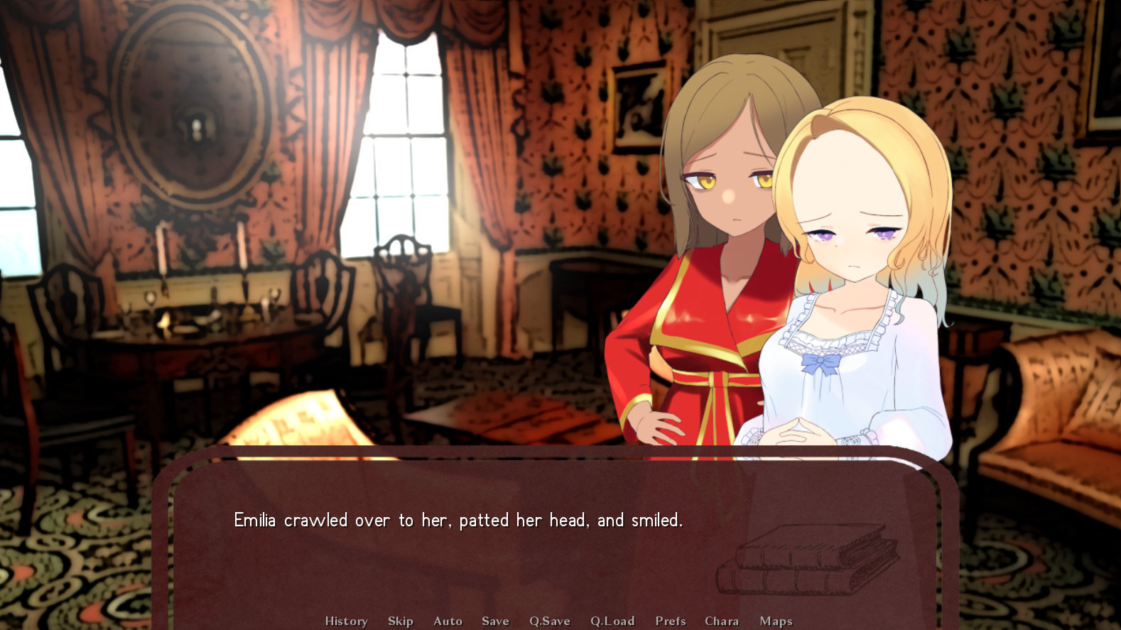
brooo even after I rewrote the passages I realized I made a small error in Emilia's explanation of a mathematical concept lmaoooo 😭😭😭 don't worry I'll get to it in the next update once the cg is done.

I have a lot of memories making mazes in Rollercoaster Tycoon so this game really scratches that itch. It's pretty fun for a casual game. You've gotten the country fair vibes spot on. Add more scenery and it would be even more fun to play with in the editor. 

Most of my suggestions are probably things you are thinking of already or are going to get around to it sometime soon, such as an options menu. I do like the quake FOV, although an FOV adjustment option might be a good idea.  Another suggestion might be to prevent saving if the maze itself is impossible. 

Anyway, those are my ideas for now. As a casual game idea it's simple and perfect, and I don't know if you should deviate much from that maze focus. 

Sure, feel free!

Thanks for uploading the VOD! I really appreciate that you've enjoyed it.

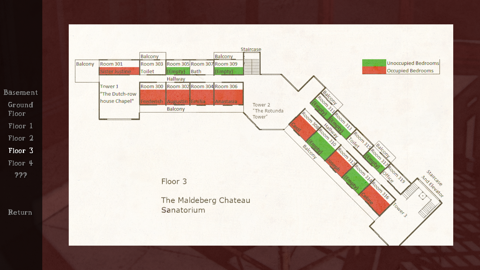
You were not the only person to assume that the map was an unlockable feature. I think what I need to do is to make it clear somehow (maybe at the beginning of the demo) that the VN features a map, character biographies, and notes. I'll see what I can do with that in the next update; maybe I should provide a notification in the GUI that the map is updated as the story moves from one scene to the next, but perhaps that might be a little distracting.

Now that I see more players reading out loud my writing, I do begin to see that some sentences seem to be drawn out, and that is something I need to figure out how to cut back. At the same time, I also know that VNs, especially mystery VNs, tend to reiterate the same ideas in order to drill the scenes and clues into the readers' heads, and that's what I've been trying to do.  But there should also be a balance. I'll see if I can cut back some sentences without losing important information. 

Again, thank you so much for the VOD, and really I hope you let me know more of your thoughts the more you get into the demo!

Thanks for the comment. Any criticism is welcomed.

Yes, I do have an issue with the backgrounds as well. I have played around a lot with the colors, and it is somewhat hard to figure out what changes would not ruin the scene. Regardless, one of the reasons why I ended up using real life backgrounds is that many notable visual novels which started on a low budget did as well, such as Higurashi and Tsukihime, and even though they don't blend with the characters that much, the variety of real life images one can use helps set the mood better and more accurately than drawing and reusing the same anime background assets for multiple locations. Where can I search for several anime backgrounds of an early 20th century hospital? There aren't much options unless I'm willing to break the bank now. And using real life background images can help illustrators gain an accurate idea of the scene if I am to use anime backgrounds in the future. Anyway, that was my thought process.

(1 edit)

Being a fan of Zero Escape, I really had fun with the demo. The first room itself wasn't so difficult; however, I felt the size of the room was a little bit big, and I think implementing a point-and-click system on the objects in the room in addition to moving the character there and clicking it might be a good idea. Regardless, the clues in the room were helpful and fun to discover.

However, there was one part of the demo which I got stuck on- not because the puzzle was hard- but because there was a bug (no pun intended) when I tried checking the vents. For some reason, when I clicked on the vent that was supposed to have the key, there was no response, which made me unable to receive the key. It was only after I checked your walkthrough that I found it to be a bug. I didn't know what order of events lead to it, but once I switched up the order of clicking on the objects I finally was able to bypass the bug. Just letting you know.

Edit: Apparently once you click on the vent but instead of examining it you leave, you couldn't click on the vent anymore. That was how the bug happened.

(1 edit)

For such a short story, you really took things at a perfect slow pace and atmosphere, building up the mystery and unease, and releasing everything in one amazing moment. I really admire your pacing and I also really like the characters despite the short length. As for suggestions, I wish the final visual was a lot more detailed to really drive the grotesqueness home. 

Your words mean a lot to me! I initially was concerned about my writing in the trial scene, but to my surprise, a good amount of players, especially other game devs, enjoyed that part and felt it was engaging, so thank you!

Yes, I do have an issue with the backgrounds as well. I have played around a lot with the colors, and it is somewhat hard to figure out what changes would not ruin the scene. I completely replaced some backgrounds between demo version 1.0 and 1.1 because I gave up editing the colors just so they won't mesh with the characters. In the end, backgrounds are something I need to experiment with, and it's great to have other people's opinions on them in order to correct the current backgrounds and decide for the future.

Thank you so much for streaming! And I didn't even know so many game devs in the chat enjoyed my game as well!

Hello!

I was able to enjoy the VN up to the machine translations. I think what you have is a very likable, lighthearted slice-of-life story and setting.  The AI art is well suited, and the characters are all distinct in backgrounds and personalities, as they play off each other nicely, especially in the D&D scene. That being said, I still would like to make a couple of suggestions.

I feel like AI art tends to makes the character sprites stiff. In other words, the sprite poses are a little bit too perfect. They play nicely to their core personalities but not so much to their emotions. And speaking of emotions, since the theme of the game leans towards being comical and light-hearted, I feel the emotions should either be more cartoonish or animated. I'm not sure if AI art can generate faces like that, however. Also, I feel it is hard to focus on both the emotions of the characters and the textbox: the words are too far away from the faces. My suggestion is to either increase the sprite size or move the textbox a little upwards and increase the font size. I feel Renpy's default font size is way smaller than non-renpy visual novels, so you can always increase it if there's room. 

I also feel some scenes go too fast, especially if the scenes are emotional or dramatic. It is better to take things slower in those passages, since readers might miss out on certain elements, especially if they are elements you want your reader to pay close attention to. A good way to either make scenes slower or bring attention certain ideas to the player is to reiterate. A lot. It might look repetitive on a word document, but I feel like good visual novels do that, or at least the ones I've read. I tried scribing word-for-word a fifteen minute scene from one of my favorite visual novels as a writing exercise, and boy, do they reiterate a lot of the same ideas in different words. But it's preferable, since readers tend to not flip back or check the text history, and it helps control the pacing. Speaking of which, another suggestion writing-wise is to limit the use of pronouns when referring to objects or persons in the previous textbox sentence. E.g. readers might fail to fully pay close attention to one sentence only to be hit with "And so she did this" in the next textbox sentence, completely forgetting who "she" is, and is forced to flip back. This example isn't referring to anything specific in your writing, for I am guilty of this as well.

Anyway, those are my two cents, feel free to accept or ignore them. I hope you continue to enjoy making the game, and good luck with it!

Thank you for streaming! First of all, I really appreciate that you were able to stream up until the end of the demo, and that you went over the three-hour limit in your first part of the stream because you were invested. That really meant a lot to me.

The plan I have is that the final murder will not be revealed until the true ending is reached, which will require finishing several routes to reach that. However, each main route should have enough information to figure out the murderer on its own. Or at least, that's the expectation I have. The current path this demo is on might not show who the murderer is, but I hope you judge it once I submit it to a later feedback fest with a completed path.

As for the confusing word choices, since most of the setting is based on early 20th century or late 19th century literature, I also took a lot of inspiration from the prose of that era while still trying to find a midpoint between that and the typical Visual Novel writing. However, I might be too dependent on trying to pay homage, since there were a lot of writers that I liked from that era, especially non-English writers, whose proses don't mesh well with Visual Novel writing. I'm still trying to find the balance I am satisfied with, but it's hard to figure out. Your stream helped, since you've read out loud a few passages I felt flow well on a word document but not in renpy. I'll try to figure out how to shorten or rewrite those passages whilst still conserving that midpoint. 

Again, thank you for streaming, and I really appreciate your help!

Your comment means a lot to me, thank you! And I really appreciate your streaming! I hope you enjoy the rest of the demo. And yes, I'll try to figure out how to diversify the songs during the trial scene.

Thank you for streaming my VN!

Since I originally made the demo as part of a game jam, I had it start in the middle of the story when the string of murders begins. This is so demo readers could jump into the mystery instead of wallowing through the setup. The setup will be focused on the Slice-of-Life side of the characters and story, so the professor will get screen time then. That might mean I have to adjust the trial scene after adding the setup to highlight the importance of the professor like you said, but I think I might rewrite the trial scene in its entirety anyway and figure out how to either prioritize more emotional investment or make it shorter. But currently, I wish to write the rest of this route before I write the setup.

The vote between Cecil and Frederich will impact further murders, which means that point will branch out to two major paths. As of now I am focusing on writing only one of those paths so far. As for not being able to choose a third option, that will be unlocked once the two other paths are completed. Perhaps I should give the MC the option to vote for the doctor but give it a lock symbol to show the choice is possible but only under certain conditions. That might decrease the reader's frustration if they want to vote for the doctor.

Again, thank you for streaming it! Let me know what you think of the rest of the VN once you have the chance!

Thank you so much for the criticism! It's great to get more readers and know what others prefer! After I made the original nanoreno demo, I only received two comments more detailed than yours, so again, I really appreciate it!

I made the demo to start in the middle of the story when the string of murders begins. This is so demo readers could jump into the mystery instead of wallowing through the setup. The setup will be focused on the Slice-of-Life side of the characters and story, hence the cutesy sprites. I've played horror VNs where they used close-ups of bgs, and I assumed they were used to give feelings of claustraphobia. Maybe I'm using the bgs incorrectly, so I'll keep that in mind to either limit or get rid of them.

One of the most common criticisms of the original demo was how short the scenes were in the game, as there weren't enough characterization and character appearances, so I expanded upon those scenes in the most recent version, albeit maybe a little too much. I also felt unsatisfied with the lengthy scenes, so I agree with you. I'll keep that in mind as I write further. 

For instance, in the original nanoreno demo, the trial scene was nonexistent, and readers gave suggestions on how I should write the trial scene. I followed their suggestions, and yet I felt there were some elements which made it lengthy and I wasn't sure why. You pointed out the repetitive bgm, so that might be one of the reasons. (I was trying to find several suitable royalty free bgm for the trial, but I couldn't find any similar enough to complement the two bgms I had) . You also pointed the lack of player interaction, so that might be a good idea to add more MC participation, especially to the trial, just to break up the passages even more. 

As for now, I'll continue progressing the demo and will come back to fixing these scenes once I'm done finishing this major route. Thank you!

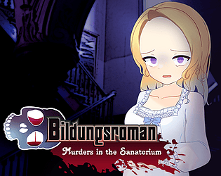
Hello, I have used your bloodsplatter in my game, Bildungsroman: Murders in the Sanatorium! Please go check it out! Because it's a murder mystery, your assets have been very helpful. I also have attributed you in the downloadable text file.

You did a great job setting a vibe that really pushes the Lain aesthetic. I can't wait to see where the atmosphere and the story takes me.

Here's a devlog post explaining some of my inspiration for the game: a mix of my experience with Murder Mysteries, Ryukishi07, Hokkaido, and classic literature.


Bildungsroman: Murders in the Sanatorium

(3 edits)

Thank you for your comment and video! 

Hello, I have used your assets in my game, Bildungsroman: Murders in the Sanatorium! Please go check it out! I also have attributed you in the downloadable text file.

(1 edit)

Hello everyone! This is Improb.

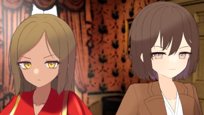
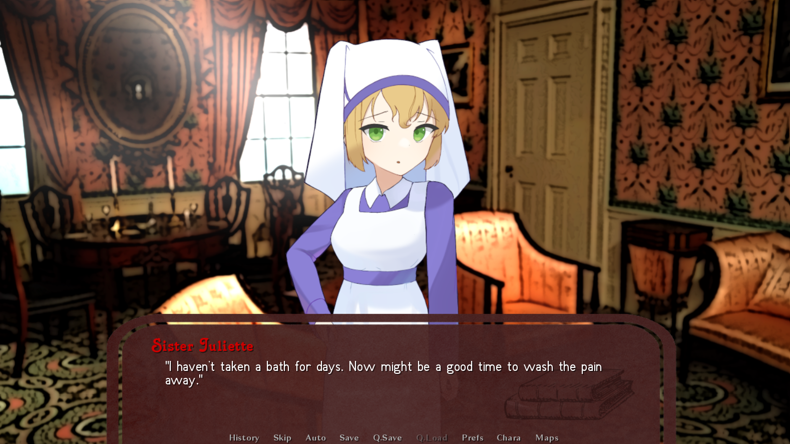
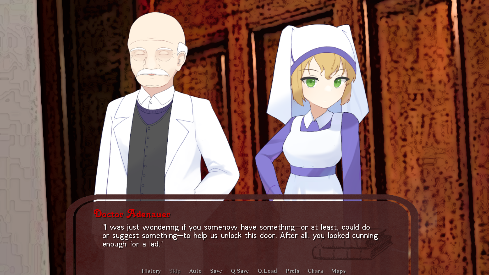
Recently I have released a Visual Novel demo called Bildungsroman: Murders in the Sanatorium. It is a murder mystery and horror visual novel set in the early 20th century in the Alps. It was inspired by And Then There Were None-styled murder mysteries and the setting of Thomas Mann's The Magic Mountain. Basically, characters from a philosophical novel gets slowly killed off one by one. 


If you are interested and you have one hour to spare, come play the demo and let me know your experience with it!

-Improb