This is a creative approach of this prompt. There are many things you could add to make it polished. You could add some background music, animations of throwing the ball and fetching, and just a win scene after fetching the ball. I think the models are all great and the character moves smoothly. Adding some UIs and mechanics will make it more fun. At first, I didn't realize I was supposed to fetch a ball. The ball is too far away so I guess a little introduction would help. Overall, Good job!
JacquelynZ
Creator of
Recent community posts
I like your art and ideas! Rhythm games are really difficult to make and you've done it! At first, I thought I was a person who was playing the arcade game. Finally I realized that I'm in the machine's perspective. This idea is super cool. I would suggest that adding some special sound effect when hitting the keys and that would add more to the feelings of playing a rhythm game. Overall this is so cool!
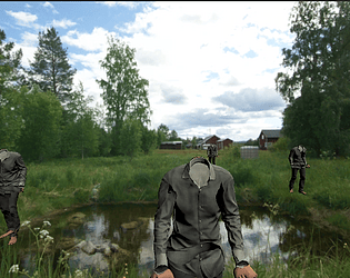
I like all the modeling and arts. As for "Eagle eye," I expected that the perspective would be more like an eagle. You could add more mechanics such as adding some vibration functions to the controlling system. Adding some tasks would make it more fun. I also wish that I could move faster during the play.
I didn't get how to play it at first, but after a few rounds I'm already skillful. I like the art and your ideas. The perspective you chose is so unique and because of that, the "Rock, Paper, Scissors" game became so fun. I also like "thumbs up to play again." As for critique, I would suggest that adding some introduction at the beginning and that could make players easier to understand the mechanics. Overall, this is really cool! Great job!
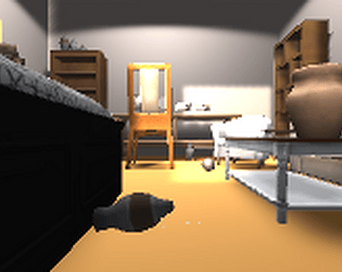
I love playing as a cat instead of playing as a human who own a cat. The gameplay feels comfortable even though sometimes I can glitch between furniture. The sounds all works very well. I would suggest that you could add some UI other than the time. Also you could add more things that can be interacted with. Overall this is a cute and great game!
The theme is interesting and I understand that the mechanics are simple. I guess you can make it into a 3D game such as adding modeling of a house and restrooms. You can definitely do that to push this game further. Instead of left and right buttons, add some mouse looking mechanics would be better. On the other hand, you can add more conversations and dialogue to make it into a short visual novel.
I like your theme, I agreed with Ivory that this could fit in the pet game prompt. Besides that, I also feel that this could fit in the Non Human Perspective prompt as well haha. I would suggest that besides 100% randomness, you could add some mechanics for players to make progress for. Overall Great job!
I can almost feel how desperate the fish was. (I mean how desperate I was) It took me three times to succeed;( I like the theme of this game and the animation of the sea works so well. Even though you just used one asset from the assets pack, I think this would be the best use of the fish asset in this package haha. This fish model doesn't feel like it's alive so I really think it perfectly fits your idea. As for critique, I would suggest that if more things could be added to save its life. Overall I like your work!
I like it so much! I love how you leave the options of interpretation to the players, which makes this game more like an artwork. Though I can't interpret the intention of the game, I enjoyed thinking while playing this game. I feel like if I can click on blue people and make them red, that will be more fun. I guess you wanted to express something like balance between people or races and ethnicities. By adding some explanations to the UI, you can definitely push it forward. Great work!
I like how real the scene is. The skybox fits the dodgeball theme very well. I think the background music makes this game easier and more comfortable. Without the background music, I think this would be a horror game. I like the simple mechanics of clicking dodgeballs. My only concern is that the balls come from all directions and it's really hard for me to notice each one of them. I can only get no more than 5 scores. As for critique, I would suggest that making dodgeballs coming from 180 degrees instead of 360 degrees or slower the speed of their moving. Overall, your ideas work very well. Nice work!
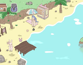
Hi Claire, this is a really polished game! I like all the animation and aesthetics. I feel like this is what a pet game will be like including feeding, stroking and triggering conversation. For me, this is a typical virtual pet game with cute pixel arts and animations. I love the theme as well. As for critique, I really don't have so much to suggest, but I would only suggest that adding some sounds when triggering conversations and animations. Great work! (Sorry for late comments)
I like this the mechanics of feeding the cat. The aesthetics works really well and it perfectly matched the title "Tube Cat." Sometimes I felt that the cat should rotate along with the "tube body." I don't know how to create that mechanic but I guess that will make this game more smooth. Also I think the movement is a little bit slow. Overall, I like the animation and all the UI, Nice work!
I really enjoy how you combine drawing letters and feeding the "pet" together in this game. I didn't want to skip the intro because it was so fun. The art style is intense. As for critique, I would suggest that besides drawing letters, you could add typing letters and words. I guess more mechanics will make it more fun, but your mechanics are already incredible. Nice work!
Hi, this game and the pet is so adorable! I like all the colors and pixel art which perfectly match the theme. The controlling is easy and the sound of "giving stuff to the pet" works very well. The only suggestion I would give might be that the pet sometimes walk to the border of the screen and I think that can be fixed easily. I also think you can add a "win scene" to tell the players if they successfully build a relationship with the pet or not. I can imagine that this game can be a prototype of a polished pet game. Great work!
The rotating mechanics works with your amazing concept so much. Your game has a really good theme and I also like how those particles gathered before the ball moving. I think that when pressing SPACE, the atoms slowly stop and turning the other way feels smooth and comfortable to play with. It's very natural and it provides players with a good transition. The music and sounds also match so well. I played to the third stage and I would suggest that if the nuclear is actually growing, it will be easier for me to understand when I'm about to go to the next stage. Also in the future stages, I expect that there will be more than one atoms moving towards the center nuclear since after being skillful, I guess more atoms increase the difficulty to the next level. Overall this is a greatly polished game!
Like the other comments, I also think the hold and release mechanic works perfectly in a timing game. The carrot and pot models are cute as well. I like how they first drop to the pot before cooking. I guess this is a scene which happens a lot in many RPG games whenever there is a cooking system. In terms of critique, I think the timing range can be various such as a random number of seconds. Also more food can be added to this game to fit those different times. (I'm kind of thinking of Overcooked..haha) Also, it's hard to release at exactly 8 seconds so I guess you could make a larger range for "perfectly cooked" as well. Overall this game is nicely polished and good jobs!
Hi Claire, this game is fascinating! All the assets and music match so well. Even the font and low-saturated colors create a kind of mysterious atmosphere. I agree with most of the other comments that this game is definitely visually pleasing. Besides, the mechanics are simple and easy to understand. When I press "SPACE" for the first time, I already know the only movement of the game. In one second, I'm about to know the whole mechanics of your game. I think your game really made a successful introduction to its players!
The only things I could think of and which could make it better are adding a second stage and making different-sized red and blue parts on the ring. Sometimes, I feel it's hard to rotate when "enemies" are approaching from four directions. Maybe you can make only one "enemy" coming in the first stage, then two in the second stage and so on. Overall, this seems to be a very completed mobile game! Nice jobs!
Hi Raymond, I like how you used pixel art, which matches the theme very well, to create this game's assets. When I saw the title "Train Jump," I assumed that I will control a train and jump between platforms. Your game is very close to what I wish to see! I really like the background design, but sometimes the mountains just disappear for seconds. Also, the train's movement feels very smooth but a little bit slow. If you can make the train "heavier," it will possibly be better.
Overall, the game is simple but fun. I would suggest that more mechanics can be add to make it more fun. For example, adding some traps or coins to be collected. (These are my thoughts though...) This art style reminds me of Mario so I'm expecting more mechanics. I still love how you made an "one button game" using this train theme!
I like how simple this game is! The music matches this theme very well. The mechanics of the fish's movement is simple and useful. At the beginning, the page scroll down a little fast and the "bread" is not coming down so I just constantly lose one life at the beginning. I also think the "bread" can be fixed a little bit so that they don't cross with each other which makes players easier to see where to jump to. The jumping system feels a little bit light. The fish drops in a slow speed and I guess if you try to set a larger number for the fish's mass, it will become better. The particles around the fish are amazing! I really love this game overall!


