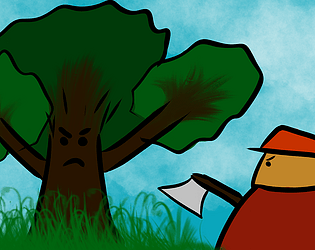
Well, that is intended. Removing acceleration and adding instant max speed would be a couple lines of code change, but it would decrease purpose of other mechanics like friction. Gameplay is designed in a way to utilize player momentum so you have to plan your future moves in advance. I might consider increasing acceleration, but removing it completely is a bad call imo. The character instantly achieving max speed starting from 0 speed looks stiff and unnatural to me.
Julshar
Creator of
Recent community posts
It seems that people usually need to play once or a few times before getting a good grasp of game mechanics (Sorry for not making any tutorial). However the game is beatable on hardest settings - Axetreme difficulty and small map. I've just posted a video showing how it can be achieved. I also decided not to use the spot on the bottom right corner of the map to make it even harder - that is the only place with one exit/entry. Link to the video is on the game page.
The capital letters not showing or text not moving with view is definitely something I want to investigate and not let to happen in future versions, so thanks for pointing that out. If it comes to moving UI did you play on different resolution than 1920x1080? If so then that is the explanation for UI problems. I tested it once on lower resolution and UI background shifted one UI length to the right at some point, making it possible to see the grey world background beyond the left map edge. Also the bottom part of the UI was not visible then. This is happening due to me having little experience in UI making, so it is not scallable, tied to top left corner and thus only playable in 1080p. If I'll start working on full version of this game I'll definitely remaster it to make it scallable so it works properly in any resolution.
The pathfinding improvement is indeed on the list. Currently it is very cubersome to navigate units. I plan to implement A* algorithm but that would have to be done after implementing fog of war since that is on the list too and these two things are linked in a certain way.
The ideas of adding more maps, sawmills, trees and even lumber jack types are something that I would certainly implement in a full version but there are still basic things like minimap and fog of war that are priority for now.
I had a lot of fun developing almost every aspect of this prototype so I consider continuing it. Although I have to say that I did not realise how much does it take to implement everything that a proper RTS game needs before I started and my respect for creators of these kind of games only grew.
Glad it was fun to play and that you were able to come up with proper strategy without any tutorial and with bugged UI. Congrats!
The hotkeys for actions are numbers 1-6 but I guess letters are more intuitive so probably I'll change it sometime. Good point.
To be able to use blocked whisp I consider adding 1x1 structures or ability to transport whisps over trees. I want to make the most of the blocking mechanics so I'll definitely keep an eye for that.
I agree the game requires some skill to play at current state. The obscure pathfinding with single selectable unit makes moving units require many inputs. There are some efficient tactics, you can abuse the fact that lumberjacks focus whisp more than oak and plane and lure them to the other side of the map. You can even abuse their pathfinding algorithm in some ways. I've managed to win Axetreme on large map but I had a lot practise. A tutorial or even pause menu would be good to learn basics.
I didn't have time to implement everything. There are still things like fog of war and minimap that are mandatory for a proper RTS. In fact there are much more things on the list for this project including rewriting everything at some point. If I continue working on this I'll add some things to current version first because they are crucial to understand before spending time to plan everything from scratch.
Nice concept, I liked the artstyle and sound. Brings up memories of some old platformer games from childhood :) The lighting system makes the dungeon climatic, you could even consider to make it darker overall.
Wallclimbing is buggy. When you drop from edge without jumping and then come near wall the wallclimb animation does not play and character can't climb upwards. Sometimes I feel like part of game is thinking that player is wallclimbing and part is not. I took fall damage because of that in a situation when I certainly should have not taken it (I dropped from wall just above the floor and still took fall damage). Also for example when climbing down the wall and holding move towards wall player gets stuck on wall corner. Just pointing out things here to help you fix it but I guess you probably are aware of these issues.
The autojump on edge should be disabled by default imo. Knowing when to jump is a huge part of platforming and this is taking it away, and sometimes it even is annoying if you want to drop instead of jumping. But this is just my opinion, you do what you want :)
Overall had fun playing. Nice sound effects and I also liked the boss design. Reached level 9. The initial levels were easy (that is good to get to know how game works), diffuculty progression on later levels was also fine. I got stuck for a while on level 8 and got frustrated a little by having to repeat all of the level every time to get to the place I needed to practise. You could add some life refreshes somewhere on levels maybe, so player can take more than 3 hits on one try, or checkpoint in the middle of the level. But maybe I'm just bad at platforming :)
The whole game brings up Little Big Planet vibes. Maybe adding more interactable things like buttons, triggers or movable objects to enable logic riddles would make the game mechanics more interesting. Also a well animated character is important for platformer games. Walk animation make crab look like it is floating and breaking jump animation where needed would also make difference (When you jump and hit ceiling and fall to ground faster, the jump animation still playes while crab is already on ground).
I also found that the rotating platforms can get you at really high speed when jumping on them at the right moment. Maybe that is a good developement direction for some harder levels?
Good luck on further developement :)


