Play game
Crabby Seastride's itch.io pageResults
| Criteria | Rank | Score* | Raw Score |
| Overall | #6 | 3.400 | 3.400 |
| Fun | #6 | 3.600 | 3.600 |
| Sound/Audio | #8 | 3.400 | 3.400 |
| User Interface (UI/UX) | #10 | 3.100 | 3.100 |
| Visuals(Graphics) | #12 | 3.400 | 3.400 |
Ranked from 10 ratings. Score is adjusted from raw score by the median number of ratings per game in the jam.
DevLog Link
https://ase-cg.itch.io/crabby-seastride/devlog/570018/improve-my-game-jam-28-updates
Developer Feedback Questions
Did the game look and feel smooth on your machine?
Could you navigate the levels without confusion?
Was the game too easy/challenging?
Did you have fun playing?
All other feedback is greatly appreciated as well!
Leave a comment
Log in with itch.io to leave a comment.


Comments
Did the game look and feel smooth on your machine?
Everything worked out smooth
Could you navigate the levels without confusion?
I got through three levels with little confusion. I didn't realize the fire hurt me at first, so danger awareness was acquired through dying.
Was the game too easy/challenging?
Once I got the hang of the game, it became much easier to navigate. I did not get to any boss fights or any puzzles requiring too much complexity, so I can't comment on those.
Did you have fun playing?
I don't play a lot of platformers, but the good ones always are relaxing and this one relaxed me, so it must be good.
Thank you for playing! I will need to work on making the hazards/damage more apparent in the future, there is truly nothing worse than an unexpected death in a game due to poorly advertised hazards. I am very happy to hear that the gameplay was relaxing overall, I do want this to be a fun and challenging game but I am hoping it will also be relaxing enough that my nieces can play it when they get a little older lol so that note actually means a lot to me.
Thank you again for playing and best of luck with your future game developing!
The game ran fine for me.
I only had time to play the first two levels. Didn't have any trouble navigating. They were fairly easy, but I don't think that I can really give a good answer to the question of difficulty with the short time I had to play.
I did have fun playing and I really enjoyed the music.
I don't play a lot of platformers so I am not sure what advice I could really give here to improve it further. Adding some kind of visual effect when an enemy is destroyed would make it more satisfying to hit them I'd say.
Thank you for playing! I'm glad you had fun and enjoyed the music! I think that a visual effect would be a very good addition as well, maybe some kind of effect and I will be working on a fade out effect thanks to a suggestion by Animamundi24. I appreciate the feedback and the playtest!
I didn't get very far into the game but I played the first 2 levels:
Did the game look and feel smooth on your machine?
Yes, but I have quite a good PC. A little bit of a weird visual tear roughly in the centre of the scren when I jumped around half the time, this was on a 144hz monitor.
Could you navigate the levels without confusion?
Kind of, I don't see the point of the very zoomed in state and could have done with a level of zoomed out more or even 2 more levels of zoomed out, but the level map UI made it easy to cross reference.
Was the game too easy/challenging?
I didn't play for very long because I don't really play platformers, but it was good so far.
Did you have fun playing?
Yes, I liked the music and the sound of the crab/ the fact crabs move sideways and the theme feels nice and original.
All other feedback is greatly appreciated as well!
I was a bit confused why there were mushrooms in a beach theme.
Wasn't sure if the fish/platforms were damaging me as they seemed to be but I couldn't see any indication of current HP. I think enemies need more obvious animations and player needs screen tint for damage or a heart UI system, since it seems you don't die in 1 hit.
The controls UI screen is really good. (And also nice to see controller support too, I played with keyboard only and the controls felt good, although W + S controlling zoom was a bit weird initially.)
Thank you for playing! I will try to make sure I address these issues and improve the game through this feedback, so I do appreciate all of it! A visual tear sounds very distracting so I will be trying to look into that issue aggressively.
The zoom states do seem to be a point of interest for many people, be it positive or negative. It doesn't do much in the early levels but as the player progresses it becomes a gameplay mechanic to adjust the view while playing (there are areas where you need to see more surroundings paired with areas that block your view when zoomed out so the player needs to plan their view while playing the game for additional challenge) and overall I stand by the decision but it does still need some dialing in lol. I'm also thinking about adding a "peek" option that will rotate the camera around the player by just 20 degrees or so, allowing the player to have more of a look around the level environments. I do need to get a feel for this in general though, and find out what feels right for the most players.
I love to hear that you enjoyed the music! I always have though that music choices can make or break certain games (and platformers in particular).
Yea lol and I don't know what to say about the mushrooms on the beach.... I guess I kinda figured you can find mushrooms and decomposers everywhere but I really don't see them very often in the sand. At the end of the day I just suppose I just thought they were fun, but the enemies will probably be getting some new models down the road (especially the mushroom and the frost enemy found in the snow levels). The Longnose Gar fish was intended to be an enemy, but with it only causing damage when you are hit by the fishes nose I can see how it might read more as a platform. I am thinking I might make the player pass through the fish in the future to help with that.
I feel bad for not making the health bar more prominent, the 3 bubbles in the top left are the players HP (I thought it would fit the theme better than hearts but it may be causing some visual confusion). I will work on making sure players are made aware of the UI early in the game to avoid future frustrations.
Thank you again for all of the feedback, Good luck with all your future game development!
- Did the game look and feel smooth on your machine?
- Works perfectly fine.
- Could you navigate the levels without confusion?
- "Level Select" has collision shapes which tracks Overlap, I'm entering the level immediately by touching the collision shape by subpixel of the character's mesh. Needs more room to move around, and Interaction with a signboard of desired level instead of Collision Shape->Begin Overlap event.
- Was the game too easy/challenging?
- Inconsistent. It has some strange game design. Why can the generic platform (fish in the water) do damage to me? My hits can whiff at point blank, making me open for incoming damage. The character's mesh is rotated instead of flipping, probably it is intentional but common Platformer games usually utilizes the mirroring of character's sprites. To flip the mesh, multiply Y.scale by -1.0f instead of adding +180.0f to the Z.rotation.
- Did you have fun playing?
- Thanks for gamepad support. It was very fun until Level 4, where the environment was too hostile with all these fish-like platforms and fires always hurt me.
- All other feedback is greatly appreciated as well!
- You're using [Destroy Actor] blueprint node which makes the target Actor disappear instantly. Instead, I would recommend to make some animation of destruction/death, make the enemy's mesh dissolve (Mask out the opacity in Material properties. You will need a Dynamic Material Instance to operate the Scalar Parameter values in Blueprints), and call [Destroy Actor] just after that.
Thank you for playing! I appreciate the feedback, this will help me improve the game and help me make things fun for more players for sure! Level select is a great call out, interaction would be a good idea along with just making it more spacious in general. I have even toyed with the idea of making it a top down view more like Super Mario World or Shovel Knight and just make a Hub World map that opens up as you beat levels... I might get more serious about implementing that as well. I'll try some things and see what works.
I hear you about the design confusion, the Longnose Gar (fish) character was not intended to be a platform but rather just an enemy (they are a natural predator of crabs among other things) that players could ride on or use as platforms if they wanted to. I may set the collider so the player cannot stand on the fishes back in the future, it should not be necessary to complete any of the levels at this point. I got this note twice just here at the end so it does feel like something I should try to address. And the flipping is not a bad idea as well, I like the visual of the fish actually rotating around but gameplay is king for sure, I don't want it to make the game feel more frustrating and less fun.
Thank you for the Opacity fade out suggestion for enemy deaths though, I will start looking into that right away I think I could improve a few of my games with that feature. The instant removal can be a bit jarring. Plus I could probably use the same effect for the player during invulnerability frames... good idea for so many things!
I have run really short of time this week, and I don't think I managed to get to your game over the weekend but I saw the gameplay video was posted. I'll be sure to at least check that out and give a rating!
Thanks again and good luck with your game development!
Yes, by the way, in my game, I'm using a same distortion visual effect based on opacity mask on Yin-Yang Orbs and Golden Spikes, you may notice how they gradually appears and disappears over time before being destroyed. And a character on right side is mirrored by setting Y.scale = -1.0f. I'm sure that will help!
Had me laughing at the sounds and the environmental settings. Music feels suitable and the levels are diverse. I would've liked some landing animation to let me know when the crab is fully grounded and can rejump.
Had me laughing at the sounds and the environmental settings. Music feels suitable and the levels are diverse. I would've liked some landing animation to let me know when the crab is fully grounded and can rejump.
Thank you, I'm glad you enjoyed my goofy sounds and music :-D. I will make sure to have a landing animation on the list, it is hard to tell when the crab has completely landed on the ground, thank you for the feedback!
Well done AsE,
What Stood Out (For Me):
Art Style / Theme:
I like the art style and theme of the game, it reminds me of my crash bandicoot days.
Variation in Environment:
When I plunged underwater and found I was able to jump much higher, that was a cool experience.
I think expanding on this could be a great way to open up various forms of gameplay for players.
Power-Ups:
Although rare, at least in my playthrough thus, they provide some ability enhancement that diverges from the traditional gameplay.
Feedback:
Coyote Time:
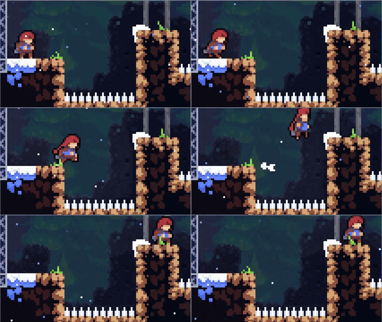
I think adding coyote time to jumps is a good idea for most platformers, it usually provides a smoother gameplay experience for players:
Telegraphing Enemy Attacks:
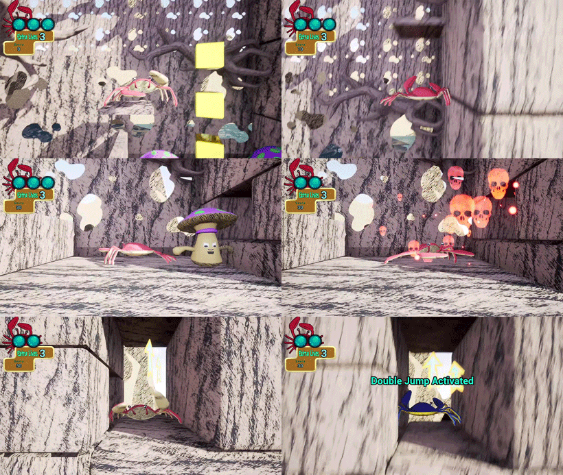
The mushrooms specifically, I was unsure when exactly they were going to attack. Perhaps providing a more obvious load-up phase for attacks, or a red area around them indicating how far away you need to be, would be helpful.
Limited View:
I did figure out that you can zoom out a bit, however the limited view still posed a problem in some cases:
There were a few times where I was either able to jump really high, or I was on high ground and I needed to progress to the left or right (usually right), but there was no way of knowing what lies below when falling down. It feels a bit like rolling dice to see if I'll end up getting hit when I fall down (especially by the fish).
Having an ability to directionally move the camera in an intended direction (even if briefly) could help with this.
Control Pop-ups On First Encounter:
When first encountering the breakable ground tile, I think it would be convenient to show a pop-up of ("E") for players that have yet to pause the game and are unfamiliar with how to break the tile ground. This could provide smoother gameplay. (But I do appreciate the pause menu)
Checkpoints:
Checkpoints, for more casual players, might be beneficial, so they don't have to start from the very beginning when they lose a life. (It provides a sense of progression, especially to those less skilled in platformers)
Keep it up! 👏
Thank you this is very helpful, I feel like the game with improve a lot thanks to this feedback! Coyote time does seem like a good idea, I had been toying with the thought of adding the extra jump forgiveness as a powerup but with the double jump already implemented it might be a good idea to just have it as a default setting, especially as the difficulty increases in the later levels.
I for sure need to do something to telegraph the enemy attacks, the enemy attacks in general were intended to be placeholders but then I keep getting distracted by other things and the updates slip through the cracks lol. I was mostly just thinking more dynamic and expressive but a proper "wind up" will for sure make the game less frustrating in the beginning. I will probably also have the "toxin cloud" and sound effect play every time the player triggers the attack sequence instead of just when they are hit so it can be timed if the player goads the mushroom into attacking and then backs away.... either way that one is definitely going on the to do list.
I can't believe the water level drop in slipped through the cracks this long to be honest, now that you mention not being able to see the fish when you drop it seems so obvious but I really hadn't even considered it. I do think I could cook up a "peek" mechanic that would help with that while keeping the game challenging... and maybe even open the door for even more sneaky hidden areas that can only be found by peeking around the right corners.
First encounter pop ups are also a good call out, plus it's quick and easy to implement so I am always happy with that lol and checkpoints for sure I was looking for a way to add difficulty settings down the road anyway and that one seems like a great solution. Oh and thank you for the positive call outs as well! I need to know what's not working but it's nice to know what's working as well :-).
Best of luck with all your game developing!
This game is so weird but not in a bad way. Very creative setting and layouts. There can be some improvements after applying some after effects and such, but I liked the overall aesthetic. The pause menu surprised me the most, really cool looking. Well done!
Thank you :-D I like to think that weird but not in a bad way is kind of my life motto lol. I will continue to try and polish up the effects and the environments, but I'm glad the overall aesthetic s working for people. I'm also glad you liked the pause menu, with as strange of an art style as this one has I can never tell if other people will think stuff looks cool or weird. I appreciate all the feedback!
Overall had fun playing. Nice sound effects and I also liked the boss design. Reached level 9. The initial levels were easy (that is good to get to know how game works), diffuculty progression on later levels was also fine. I got stuck for a while on level 8 and got frustrated a little by having to repeat all of the level every time to get to the place I needed to practise. You could add some life refreshes somewhere on levels maybe, so player can take more than 3 hits on one try, or checkpoint in the middle of the level. But maybe I'm just bad at platforming :)
The whole game brings up Little Big Planet vibes. Maybe adding more interactable things like buttons, triggers or movable objects to enable logic riddles would make the game mechanics more interesting. Also a well animated character is important for platformer games. Walk animation make crab look like it is floating and breaking jump animation where needed would also make difference (When you jump and hit ceiling and fall to ground faster, the jump animation still playes while crab is already on ground).
I also found that the rotating platforms can get you at really high speed when jumping on them at the right moment. Maybe that is a good developement direction for some harder levels?
Good luck on further developement :)
Thank you for the thorough review I love to hear things that people are interested in from the players perspective. I will start thinking about the rotating platforms idea for sure, I do think using those as a timed launch would be great for a challenge level or even as a way to reach a secret area or something (maybe even a power up to let the player take extra hits). I have also considered checkpoints, or even an easy/hard mode where one has checkpoints but they can be removed for an extra challenge. I love the interactable objects idea, logic and physics puzzles are always fun and it would add that variety.
Animation updates are for sure on the list as well, I'm still trying to decide if I want to try and implement them in a way I'm familiar with (using the baked animations and just adjusting them until they match up with the game speed and things like that) or if I'm ready to start looking into unfamiliar territory with procedural animations. I know I need to start getting familiar with those I'm just dragging my feet lol.
Anyway thank you again for all the feedback, this has given me some new perspectives on the project that I think will really help. Good luck with your games as well I'll make sure to check out your entry today!
Hello. The game played smooth and the levels were easy to follow, with or without the mini-map. The difficulty was ok and it was overall fun! Maybe increase the crab animation frames to show the legs moving faster and reflect its speed?
Thank you for playing! I will look into syncing up the leg animation with the speed of the character a little better, and I'm glad the level design was easy to follow. I appreciate the feedback!
The game was smooth here, but I had a problem with the Anti-Aliasing, the levels are intuitive but I find it a little bit easy, besides that i see some potential on the game
I noticed a bit of an anti-aliasing problem on my end the other night as well, I will for sure be going back through an adjusting some things there. I'm glad you liked the levels, I will work on adding some challenge as well especially to the later levels. Thank you for the feedback!
doesn't run on browser or linux, can't play it :(
Oh my bad, I would love to make an HTML build but unreal just doesn't like to play nice with that for some reason. I'm still looking into it though I love browser games just for accessibility. I will try to get a Linux build out soon as well, I really should anyway so more people will be able to play it. Sorry to leave you hanging but thank you for the reminder!