Trackball myska je na toto docela fajn nastroj. Super hra
Lentsius
Creator of
Recent community posts
What a juicy post! Thanks! Let’s get to it:
- I believe we’ve fixed this issue as it’s been reported before. If not, this time around there’ll also be a Github repo where people can make PRs and open Issues :)
- The OSX version HAS to happen, also for ipads thoguh! I think that’s a match made in heaven
- It’s great to hear you’ve been thinking of pursuing some app dev, as you can see godot is great at it, the single most important bit is exploring and becoming comfortable with control nodes as quickly as possible, as those will allow you to build functional, beautiful and extensible apps’ (and games’) UI. Best of luck!
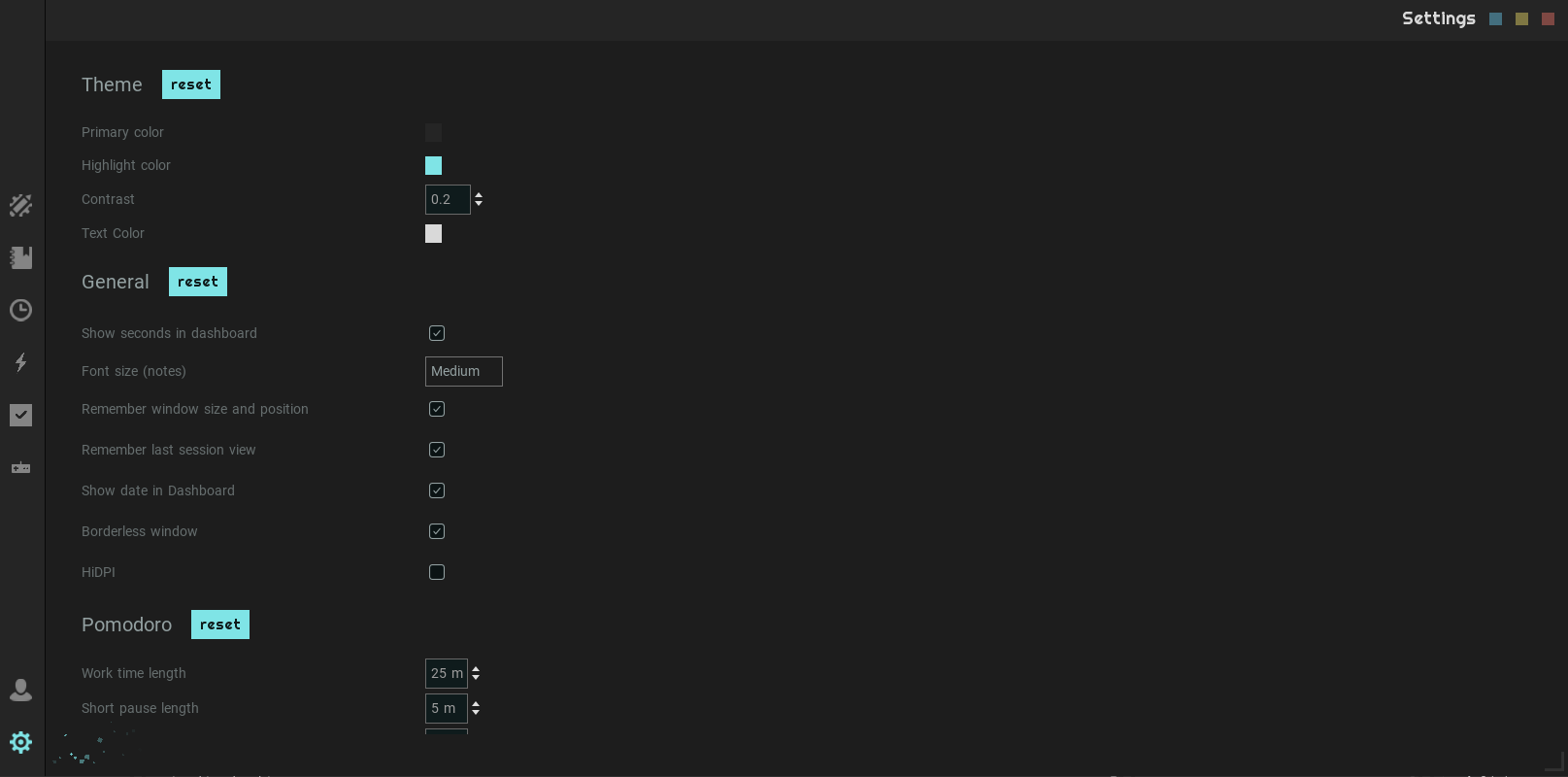
Sadly the custom title bar is not a 100% fully featured thing when the window is borderless in Godot, hence much of the anticipated basic functionality of windows needs to be reimplemented. Thank you for reporting the issue and luckily this is one that will be fixed in the next update. It won’t make the window fullscreen when you drag it to the top, but there are now limits in place. Created by the current size of the window.
Hello and thank you for trying out mad productivity, this is such a pity! I wish I had access to this however, once the new update comes out, please let me know whether the HiDPI settings work and if not, I’ll do my best to fix this bug. I honestly think that the app should work regardless of screensize. Thanks for reporting :) Much obliged.
100% it congrats! And 1.5 hours?! Oh my goodness I was already surprised by the amount of content the game delivers but this, this is beyond my expectations! Thank you for the long review you left here and honestly, that coming from you and the game you made this means a lot :)
Ah that bug is a new one, I’ll be sure to fix it for the post jam version. The whole logic of where and when and how of the boxes needs its design finalized in a way that makes more sense.
Also glad you enjoyed the character, and the story as well as the lore, I may have mentioned this before but that was definitely a part I have wanted to do in a solo project for the longest of time but this jam gave me the ideal opportunity to finally dive in, for that I am eternally thankful.
Thanks for the long comment and a wealth of information. Also congrats on your well deserved second place.
Glad you enjoyed the experience, I very well remember your submission, what a lovely take on the theme you had! Yeah I really wanted to expose enough settings so that
a) I wouldn’t lose too much time setting it all up and
b) people got enough customizability out of it to set the game up for their needs.
Inertia! Believe it or not, the initial version was a lot more “physics” based, I then ran playtesting and as a result went for a lot more arcadey feel as the more physics based one, which although more accurate, irritated the players more than it helped the game feel. It’d be worth experimenting with an inbetween solution for the future though and seeing how it fares in relation to the previous.
Esc to exit the map is a fantastic catch, that is easily fixed and makes total UX sense.
I was working on that! On stream! Haha, but then I experienced a good ol’ brain fart and the inversion logic mad no sense to me, so I decided to take the easy way out and put an info note there. However for a more polished post-jam version this is a must to have in there, ideally ranging from 0 - 2, where 0 is none, 1 is default and 2 is double of the default. Should be easy enough.
In terms of checkpoints, that was a design decision. I wanted to give the player the agency as in some levels there are multiple options for checkpoints and the one you want to activate is the one that’ll most help you current strategy. Otherwise part of the gameplay would turn out having to find a way around the checkpoint which you don’t want to remain active as after having died you wish to return to the currently active one.
Thank you for the long and detailed post and again, for playing the game!
My feedback is two part,
one, the shooting was fun! The fact that the enemies would change, go through this randomized evolution as you tried to get rid of them was a fun twist on the usual shoot and kill approach of many other games.
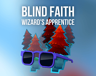
two, getting FPS platforming right is a difficult one, if you search for “First Person Platformer” on google, you’ll find quite the number of game design reddit threads that heavily discourage creating such a project suggesting that the most viable way of doing so is to make the platforming feel more like exploration rather than precision tasks. This is essentially the Achilles heel of both the concept and this project imo, as the player can’t always see either their feet, the edge of the platform or in the worst case scenario, both. This makes knowing what’s going on vey difficult. A transition to a TPS would greatly improve the difficulty. I’m speaking from experience as I had spent a year making “Blind Faith” which is a… you guessed it, magical First person platformer in which every time I had people playtest it they’d even miss the easiest platformer. This was a recurring problem.
In all honesty I really enjoyed the “shooter” part of the project! Getting the bow string strength just right whilst aiming and moving about felt like a good combo that underlined the fun gamefeel :) Let me know if you plan on continuing the development of the project and i’ll gladly playtest it.
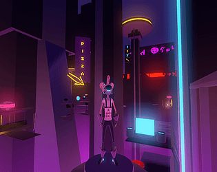
This title has a unique feel to it. The art, to me, is a direction inspired by the 90s and I loved that part. In terms of the art direction again, I played a similar game sometime ago, needless to say I was instantly reminded. The switching of level I’d say could have been done slightly more… “flamboyantly” however considering this was your first project for most of the team I congratulate you on the feat! This is not easy to pull off as a first project, not at the complexity you set out to achieve. I enjoyed the platforming, climbing the ledges and analyzing the worlds to see what happens where and whether I need to wait for a tactical advantage. This is a design that would be super interesting to take further. Wish you all luck if you decide to do so :)
Thanks for giving the game a go! In terms of lagginess, I knew from the start the performance wouldn’t be ideal but I tried to mitigate the risk with the options settings, did you try to change those to see if performance would improve? Things like shadow quality and SSAO can make some difference, although I fear it might not be enough.
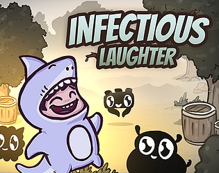
Glad you liked the main character! It looked slightly different at first but after the first playtest round of feedback i decided to make them more cardlike.
Hey, thanks for playing the game! That’s an interesting point you’re making and something I’ll be sure to consider should the development of the game move onwards. The boxes could slow down and hover around the player much more slowly to decrease that effect, visually the player character could be projecting an anti-gravity field above their head for instance.
I’m glad I had the time to put the settings in there. mouse sensitivity depends on the settings and DPI of your mouse, for instance for me 0.7 was ideal (gaming mouse set to a slow mode), for many who tested a higher value was necessary. Overall this just shows how important a settings screen can be. Thanks for playing!
We’ve been quiet and we’ve been busy!
Here’s a little teaser regarding what’s coming up I’m also writing up a blog post that go along with it, the plan is:
- open source the the code base (mit)
- fix bugs
- fortify the codebase
- better ux
- No more disappearing data! (hopefully, I mean this is a productivity app)
- Theming support
