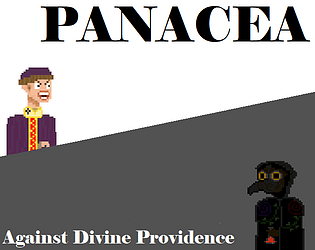
Excellent game, with wonderful use of the themes for this game jam, this is a very succinct and beautiful entry. I have no notes, well done!
Linxwire
Creator of
Recent community posts
The functionality of this game is astounding, it has so much that you can do and the way to do those tasks is *mostly* detailed. I enjoy all of the characters, and the little chirps they have for each line of dialogue are endearing, however, when there is an influx of customers (especially ones who seem much more impatient than others) it gets rather difficult to have a full conversation with them because you're juggling other tasks. The urgency is important for this kind of game, but I think it needs some tweaking.
The UI in this game needs some additional attention. For one, the UI doesn't scale well with very high resolutions, making text rather difficult to read with larger monitors. Also, unless I just happened to miss it, there's no in-game menu for me to use to quit the game, return to the main menu, or view the options
Great experience, played it many times!
This is a very solid game, the (what appears to be cell-shaded) art is beautiful and tasteful but doesn't seem to be used throughout which is a detriment to it's appeal. You've taken inspiration from Noita, but it feels much more at home with a game like Dungeon Defenders, given the way you navigate the map and fight enemies to defend a point on the map.
Right now, the game is lacking in its own identity. The only thing I have to understand what is going on with these many things happening is the summary given on this page. That, along with understanding what all of the purchasable upgrades do (if they are functional right now) and making all of the available wands capable of something even if it is just a slower brick would be a great step forward.
The vibe in this game is great, and a wonderful nod to it's obvious inspiration. All of the visuals in the game feel right, even in it's current state. However, the actions that take place during the game, especially of your opponent lack any clarity. If we were able to see the moves they were making it would feel less unfair. Additionally, it's unclear as to why the player looks to their left before (something?) happens.
Enjoyable experience with a considerable amount of content to get through. Very creative idea and spin on the challenge. Unsure if the game's UI is supposed to show four inventory spaces if it seems like you can only use two? If the other spaces are for a different kind of item, maybe you could give them a distinct flair to make it seem like they have another significance. Not being able to hold more than two items make sit hard to experiment with and remember gem combinations.


