that ruins the point, if it's not even then you can statistically tell who the impostor is
Lunar Fox Games
Creator of
Recent community posts
Anything you can think of that involves time (no right or wrong answers!) Some examples:
- Time of day
- Time travel
- Timing puzzles
- Time limit
- The passing of time
This is just scratching the surface and is a good starting point. Again, no wrong answers. Just interpret it however you like and you’ll also great!
Love it! Here's what I have to say:
- I like the different occlusion settings change the way the game is played.
- Keep Lit makes exploration based levels better, being able to see where you were.
- Always Lit is better for skill based platforming levels.
- Only Current makes it so you have to remember obstacles. I also like the flexibility for making levels.
- Having multiple bulbs and keys/doors really makes exploration levels interesting, where it's also possible to make linear levels.
- More enemies would add extra depth to levels.
- Maybe giving coins a use, like making the view radius around the player increase.
- The frame rate for the web version: It would be nice if it were better, but it would be difficult to fix and probably not worth it (especially with the time limit). For a game like this, it's not a big issue at all.
Overall, a great jam game. Thanks for your submission!
First of all, I love the little dude. He's awesome. The game overall looks great, even the platforms changing colors is a nice touch. The sound design is also great (the aiming sound especially). There's also little bonk sounds. I just wish the gameplay was improved. An arrow above the player showing the angle would help a lot. Some labels on the meters would also help (don't quite know what they each mean). I ended up stopping after a bit since the platforming was super tricky along with me not being able to judge my jump properly. Overall, a really great and charming game!
Reviewing this game seriously, the theme is great. Balancing a super interesting life and being a super hero is unique. Only if the rest of the game held up. The gameplay is unintuitive. It would be nice if the papers disappeared after you stamp them. I also don't know if there's a difference in the stamps, if you have to use both or not. As for aesthetics, when I read that you switch to outside with the window, I didn't know at first it was the small blue box. I kept clicking the picture on the wall instead so it could be a bit more obvious. The artstyle looks nice at some points, such as the boss. There is no image on the title screen, just text. The sound is extremely lacking as there seems to be no audio aside from the title screen.
This game fits the theme very well, having to balance the red and blue kills. The game is confusing at first since the fire buttons are not obvious and aren't in an instructions file, tutorial, on the itch.io page, etc. (they're O and P, had to check every key). The sounds are kind of lacking, only the clicking noise in the background and a simple firing sound. As for aesthetics, the orbs in the background are nice, really adding a bit of immersion. The ships, however, are all recolors of each other. It would be nice if the player's ship looked different. There is also no health bar for the player. The best way to improve this would be adding more sound effects, like an explosion when the enemy is destroyed or when you are hit. Some particles would also look great.
The sounds are limited, I wish there was music while you were playing and some audio cue for the timer getting low. The theme is a bit of a stretch, maybe if there was some story I would understand restoring the balance more. The aesthetics are fine, nice arrows to let you find the sheep better, but there could be a grass texture and a more accurate sheep pen. In terms of gameplay, it's fun and simple, but would be better if the bark did more and the sheep pen was in the middle.
The gameplay is pretty unique, but hard to control at points. When I first played, I didn't know the controls or even the typing until I checked the page. Some ingame instructions would be helpful. The difficulty starts super high, having little room for error at the start. A little more time to type would be helpful. The game fits the theme very well, having not only balancing the sk8tboard but also balancing your hands on the keyboard (if you type the words or rebalance the sk8tboard). The aesthetics are good, but the ui could be improved. It is difficult to see oncoming objects when you look at the left side at sk8terboi while objects come in through the right. The sound design is nice with the background music fading out when you lose, but there should be sound effects when you type a letter and defeat an enemy.
The ball's top speed is way too high coupled with the insane jump height against the terrain. There appears to be no high score present whatsoever and there is no balance (from what I can see). There is no ui, tutorials, or anything else similar. Just you, the terrain, and the end goal. There is no audio in the game. The same couple levels loop over and over again and do not pair well with the physics in some cases.
It doesn't have to be an online high score table, as long as it shows on the screen. Here's a similar question.
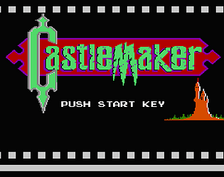
As you probably know, it’s been a while since the last update. This is due to other projects being started (which will be revealed in the near future), along with having very minimal time to work on game development recently. CastleMaker will still continue receiving new updates, just at a slower pace, along with a couple other games being released. When the next update is I have little idea, but just keep waiting.


