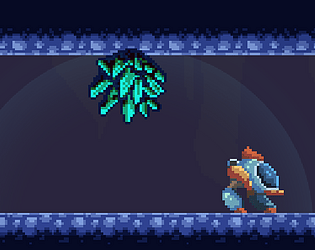
Really loved this game, it has a nice nes style aesthetic to it, especially the title screen. enjoyed the levels a lot too they were very well designed. The random facts things between level were really funny too.
LunarKreatures
Creator of
Recent community posts
Really nice game, reminded me of old dos games which brings back some good memories. Though i honestly almost needed a tutorial to pass the first door lol, took me a while to understand where i needed to go. Nice touch that you are only hurt when colliding with enemies that are attacking, not walking around.
I will say that the enemies were kinda hard, they attack too fast sometimes (especially the ones with guns) and there isnt much warning when they do. sometimes i also think the player moves too fast not giving much time for reaction time and makes platforming a bit hard in some spots, combining that with small platforms and enemies on top resulted in some deaths for me lol.
But i really enjoyed the game even though it feels a bit hard for me to finish it, and like i said love the dos style game you went with, the music also fitted perfectly.
Its a fun game. i like the mechanics though had some trouble whenever i walked too close to the machine as audrey would start drinking making me lose some time. I would prefer to have a button to drink. I guess some indication on the screen where the dying plants are would be nice as sometimes when moving away they die offscreen and i didnt know where they were.
Other than that the game looks nice and i like the sound effects. Also nice reference to little shop of horrors XD
This is a fun game, reanimating the skeletons in the graveyard was very fun. I had some problems with the game though due to my browser(opera) having mouse gestures with right click, but after disabling those it worked fine.
If i had to say i wish the skeletons were a bit smarter at attacking enemies, as they are just good bone shields against ranged opponents. but was still very fun.
Thanks a lot! Honestly that was the first time i even tried to make a mech design like that, so i am also a bit proud of how it came out. I tried as much as i could to grab cohesive assets, and when making the mech i tried to match the other styles.
Yeah the jumps have problems, especially when getting on platforms. I tested the distance between the recharge spots when positioning them, but i guess i forgot the important point of since i knew where they were, i had an advantage over everyone else to reach them. Its for sure one thing i will pay more attention in the future.
Ah probably a problem with the state machine i did not calling the animation... i noticed some of these freezes specially when shooting and walking, tried to fix most but ran out of time to fix all. I am glad you enjoyed the game, as i was very worried it would be a bit boring to play. Gosh, now that you say that it does remind me a bit of Ecco too lol.
its a nice game really love these sort of management games, though I noticed some points that could be improved.
Once you are able to get 5 hamsters things just become a waiting game, as you are able to produce way more energy than necessary for one phone but has no means to increase how fast you gain sunflower seeds to buy another charger. And the wait can be a lot, i am actually writing this while i wait.
Path finding is a bit buggy but i learned that if you move the hamster wheel to the hamster that is stuck they get on the wheel so i was able to work around with that.
The things i think need the most improvement though are the ui controls, the buttons dont vanish when you click anywhere else or right click, most games of this kind if you click outside the button disappears and right click usually cancel an action. Another thing is buttons being covered by other objects, very noticeable with the wheels. there is also no way to cancel buying something i bought a bowl by accident and when i tried to cancel i couldnt, even tried to click the shop again but it only placed the bowl behind the shop button so maybe moving the ui to where you cant place things might be a good thing for a next game. anyway good job with it! (and i still dont have a second charger lol)
This is a fun game, i enjoyed it, i didn't go very far though it was kinda hard for me. Color machine puzzle was the hardest one for me, one thing to note is that the color puzzle might not be too accessible to color blind people, maybe adding another way to recognize what to press like a shape or texture could make it more accessible. I think my favorite puzzles are the switches.
thanks a lot for playing! Not having a checkpoint was intentional to give the challenge to collect all gems in one go, since it's a short game it felt ok to do it. if it was a longer game i would definitely agree with you that the checkpoint is needed. And yes that's a path with no return so it's necessary to collect the gems on the other areas first. Though i agree this is not a good design, just ran out of time to adjust the level.


