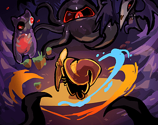
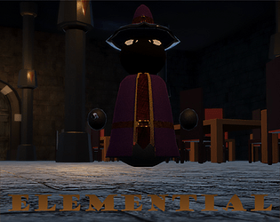
Hey there! Thank you for commenting despite not being able to play right now. We're actually going to bringing out an update that should resolve the issue once the judging period has ended, so if you're not able to access a windows PC before then you have that to look forward to!
Lunar
Creator of
Recent community posts
This is a pretty big game for a jam! I really liked the tone that was set by the opening sequence. I won't get too deep into how grindy it is as I'm sure you're already aware. A few points:
- Monsters are quite prevalent and they do very little damage. You also can't really shoot them much without running out of energy. As a result, the optimal play becomes to basically try and dodge and tank monsters while grinding as much material as possible.
- I reached the second area before repairing most of the stuff in the base. Not sure if that's intended but I felt like I got there a bit out of sequence.
- It can be a bit finicky sometimes whether I use my pickaxe or shoot. Binding them to separate buttons may work better.
- Radiation makes it basically pointless to upgrade battery cells before you get to the second area.
- The game is made more repetitive by the map being static. If the map changed every time you went out it might become more interesting.
All in all a solid framework, but needs work to become as fun as it has the potential to be. Good job!
This is a pretty good proof of concept for a platforming game. The experience is quite short so I don't have too many notes, but here's a few.
- Depending on how the final game will look, I envision the shadow mechanic maybe having some issues. Right now it's a pure enhancement of the moveset, which will force the level design to become very obvious (you'll be forced to put crystals wherever the shadow form is needed, which will probably tell the player exactly what they need to do). This can work if you're envisioning a celeste type platformer, but might run out of legs, especially if the plan is a more metroidvania style game.
- A better approach might then be to instead give both forms their own abilities, and let the player figure out which form is required in a certain location, ditching the crystals entirely. Right now you just want to be in shadow mode whenever you can be.
- If you decide to keep the crystals, you can maybe do some interesting stuff by extending the form when you continue to pick up crystals. That can create some challenges where the player needs to keep up the pace to maintain their form.
Other than that, I like the visuals and the audio and music are a good fit. There's a lot of ways you can take the concept from here but the groundwork is pretty nice. Good job!
The atmosphere here is on point and there's some interesting mechanics. Unfortunately there's a number of choices and issues that make the game a little frustrating.
- Checkpoints are determined a bit strangely and can cause for some sequence break issues (dying in the first room sent me to the maze room).
- There is some missing collision on some of the walls (specifically the northeast chamber relative to the maze room.
- The tripping is very punishing, not only breaking up your movement but also getting rid of your reagent, meaning you have no light by which to navigate.
- The maze is particularly frustrating because you can trip in the middle and then have to basically stumble your way back out.
- After using the alchemy table and fusing the reagents, the maze becomes even more punishing, destroying the floor and causing a game over if you trip. I ended up tripping with the combined reagent and losing it, spawning back outside the maze and having to redo the fusing process. At this point I had already spent up to 15 minutes and decided to give up.
I love 2D zelda and there's room here for a great game, but the player is definitely being set back too far for mistakes right now. Increasing the base light radius around the player when they're not holding a reagent would go a long way.
These types of games are definitely not my thing, but it works pretty well for what it is! The different drink names are fun and I can see it being quite charming with a bit of polish.
A few points:
- The environment is a bit straining on the eyes, I think a tavern setting with some moody orange lighting could work well.
- Some ambient background chatter could help drive the setting home as well.
- The tutorial was a bit much all at once. When playing game jam games a lot of people tend to skip straight to the game if they see a lot of text so try to be careful with this.
- As others mentioned, the debuffs should probably have some sort of indication when they start or end.
- It feels a bit finicky to get the customers to accept their drinks sometimes.
- It was a little unclear how to make the slug cola at first, perhaps rather than N/A just write "none"?
- You can theoretically spam a bunch of drinks of each type right now and then go around serving them to get a really high score.
Overal it needs some polish but there's potential for a good game here. Good luck!
A cute and clever little puzzle platformer. I could see this having potential as a metroidvania!
The mechanics functioned well and made for some interesting puzzles, albeit a bit straightforward. I'd love to see a full version create some more complex scenarios. I agree with other commenters that maybe having a wheel to swap between abilities and binding it to a single key might work better.
I did find a bug where placing a cauldron directly under another air source will cause the upper one to not function. I had to move the cauldron aside a bit.
Overal a fun and well presented experience!
As someone with some limited web dev experience I'm impressed! It's cool that I can just expand the DOM to see the different game elements in the browser.
The gameplay loop is fun and I found myself playing it for quite a bit to see how strong I would get. There's a couple of balancing quirks though.
- The movement felt pretty clunky. I didn't really get at first what was going on and thought the portal was sucking me in, but after a while I realized that it was based on where I was aiming. Even then it felt like I was fighting the movement more than that I was controlling it. Some velocity ramping would also help.
- At first I thought I was supposed to protect the portal so I stuck around it and was confused why no enemies showed up.
- By making enemies stronger the farther away you are from the portal, it allows the player to pretty easily stack up buffs to the point where they're unkillable and only then venture out. This means that there's never any real challenge as the player can always just stick near the portal to only kill a couple enemies at a time, which is in my opinion the more optimal but boring way to play the game. Scaling the enemy spawn rate naturally over time seems like a more fun way to do it.
- The upgrades are very powerful. Especially health regen is very strong. This combined with the fact that enemies do not reapply damage if they stay in contact means that it only takes a few regen upgrades to be unkillable.
I think if you make some changes to how enemies apply damage and throw in an infinitely scaling difficulty ramp on the them with a timer on screen, this would be a super fun "survive as long as possible" type roguelike. Great job!
Thank you for the insightful feedback! I agree that a few hints would probably go a long way. The idea behind consuming the elements on invalid combinations is that I wanted players not just to select elements by trial and error but also think about which elements made sense to combine. I can definitely see how it would be frustrating though, so I'll have to figure out a better way to accomplish that! Thank you for playing :)
Thank you for the feedback! The intent is for the player to purchase spells by clicking on the circular buttons in the upgrade screen when they have enough resources. Combining elements serves to create new elements (which are required to purchase more advanced spells). This clearly hasn't been communicated very well in the interface so that's definitely something for us to work on ^_^'
This was good! The presentation was well done and I thought the soundtrack was especially good and accompanied the visuals very well.
The light mechanics were clever and created some interesting puzzles. I would've personally favored some more complex puzzles over the timing based platforming challenges. I do think the game could have done a better job introducing some of the mechanics as it took me a bit to figure out what was going on at times. Some better visualizations and some very simple introductory puzzles could help with this. Also, maybe highlight elements that changed for a brief moment when they're revealed?
The story was a little predictable (although I can't really blame you for the content warning at the start). Despite that I felt like the dialogue worked well for me, especially the relationship between Bell and her Sister was well executed. Even though I knew where it was going I enjoyed discovering how it would get there.
All in all a great game! I'm interested in seeing how it develops further.
Cool concepts! I think the mechanics have potential but could use a few more iterations before they're there. They feel a bit too punishing at the moment A lot of that just comes down to tweaking some values, like smoothing out the player movement, adjusting some hitboxes and slowing down the enemies' projectiles a little. It's difficult to react quickly to enemy bullets when you can't see where you're going!
The night vision mechanic could be fun but feels a bit frustrating to use right now. Often times I found myself barely seeing anything even with night vision on and having my movement and shooting blocked by it to the point where it felt better to just leave it off. As a core mechanic it should probably feel a bit more rewarding to use. You could maybe do that by reducing the duration and treating it like a toggleable power up instead.
Other than that, the presentation and the upgrade system are good. I thought the tutorial was especially well executed. Good job!


