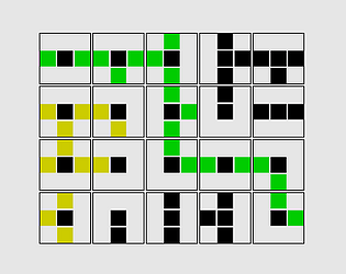
I will admit it took more than one attempt to understand what the game was asking of me and a few seconds to figure out how I was supposed to select the direction, but once it clicked it felt pretty obvious. If that's the most confusing part of the game, that's pretty good going!
m4rek
Creator of
Recent community posts
Well that's super neat! Love the way it wraps up the core elements in a cohesive package, as it takes a lot of focus away from how you're mostly just mashing spacebar. The mechanics of choosing the direction to turn are probably my favourite part, as it both breaks up the action nicely and it's just clever. Art is great (so great that I might want to pick your brains on it), and the music is quite fitting (though I did have to turn my volume down by half). I would suggest maybe an epilepsy warning might be worthwhile, as there were definitely some flashing images.
A neat little minigame that could easily be the opening level of a game about a day in the life of this dragon. I too like the added little touch of heating the tea, and the inclusion of the story; both give the game an added feeling of depth and scope, that there's more world/game out there beyond this level.
Lately I've been struggling with the question of how do I make a game that people will want to keep playing for longer, past the first impression, past the first level clear... 10 levels of this game later, I'm thinking I ought to stop worrying about that so much. If this were mouse+keyboard rather than just keyboard, I'd no doubt have immediately hit restart. Great entry, particularly love the cloud layer as a little touch that goes a long way!
If you were inclined, I'm sure you could develop this into a game one could sink an hour or two into.
Immediately neat to see volume controls! Great way to make a first impression.
Love the "Generating Level" intermission screen; a nice little touch. Lots of comments saying how polished the game is and it's things like this that really make it shine. The pre-start info/instruction box is great too, if a little on the small side when not playing fullscreen.
Easy to pick up but brutal enough to provide a healthy challenge, especially if you miss a door! Still trying to beat my embarrassingly bad score. Good show! Fantastic jam entry!
I think it’s still valuable feedback, indicating that more visibility would be good for level completion and game over notifications. Probably outside the scope of the post-jam tidying that I’m doing currently (as I’m already pushing the limits of that), but definitely something I want to add in the future, likely before 1.0 👍
Just wanted to confirm what you're seeing; is it that your current stats weren't updating? Last/Best will only update at the end of a run. I've taken a look and there should be no reason for it to not be updating, nor was I able to reproduce any situation where the current score was not updating. Did find the bug messing with spawning, but that's no help.
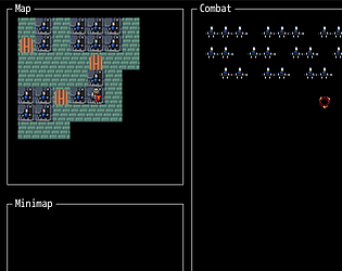
Hmm. When you reach a ladder, you should get a little notification (standard DR .notify!) to say you cleared a level, the counter for “floors escaped” should increment by one, and the level should reload with potentially a new map to explore. Odd if that didn’t happen, I’ll take a look and see what’s up. While I’m in there I might even find the bug that’s causing the player to spawn inside walls >.>
A-ha! Yes I know what’s causing that speed up. There’s a clearing of dead enemies on level change, which I can make happen more often and hopefully keep performance a little better. Probably won’t help much, but it’ll be something. Thanks for the tip; next update will be focused on performance (but will also bring three new map variants to keep things fresh)
Yeah, there’s definitely significant performance issues on the web build (the downloadable build should be better, but that’s no excuse). I should be able to add enemies even when you don’t move as I’m already incrementing the spawn position on the screen, and there’s a lot of little balancing tweaks in terms of the intervals at which enemies appear/advance/attack. The intent for a goal is to find the level exit, which will likely also come with a random starting position, and basic variations of the level layout (flip vertical, flip horizontal and both).
Thanks for checking it out, and taking the time to comment!
Oh I would so dearly like to enjoy this game... Unfortunately it too often comes across as cruel and capricious. Early-game blues, trying to get enough salvage together to pay for consumables? In the darkness ahead of you, a slime consumes it and pretty much sets of fireworks to make sure that you *know* that it has consumed something. Having trouble with the early game because the ceiling keeps falling on you and you don't know why? Well if you find the necessary item or can afford the torches, you'll see that there's a particle effect from the ceiling marking areas that will collapse (and yes, it will only collapse when you walk under it). Finally getting to grips with the game and using markers to keep on track? Did you know that you can pick them up (sometimes), slimes can eat them, or birds can carry them away?
And if you're finally getting somewhere having learned all of that the hard way, there's no-dig zones that spawn and sometimes they spawn with a thin vertical gap between them and the surrounding terrain. That you can fall into. You can't dig into the space you know is beyond because it's nondestructible terrain. Digging back up to the tunnel you fell in from will cause rocks to fall on your head and kill you. Eeeeeh. Sigh.
A short and simple platformer, though perfectly functional. My biggest gripe was no obvious means to control volume in the game (OS volume mixer to the rescue) and the delay between death and respawn being a little too long. It's about 20 minutes worth of gameplay, albeit with little to no replay value. Much akin to flash games of old.


