any idea's on improvements of platforming?

Hey, thanks for checking out the broken game version :D
We managed to fix most of the bugs. I thought you'd like to hear about that Distance Meter problem and it's solution. The problem was purely the webgl browser build and the way it handles floats. at some point adding a ton of really small (0.0005f ;0.015f) numbers to the display just make it behave like a Number not Found, which was weird. so the winding path to making that problem dissapear : the number actually displayed is an int now, that fixed infinity/NaN. :D
Oh and thanks for the idea to constrain the mouse to the window, it's a really good idea. Implemented!
this is cool.
the controls are really nice and snappy, the camera feels good.
gameplay is allright, the level design is great for a platformer, but it's brutally punishing to die on Level 3 and have to do the previous levels again. Loved it!
Aesthetics... the game looks allright. since it's brutally punishing, would make the player sprites stand out in contrast a bit more, like having a black outline or smt.
audio, there could be more loops using the same made melodies :D like the drums really sell the vibe of the Egyptian atmosphere. not all instruments need to be playing at all times... makes it feel like the music was a last minute implementation
Anyhow, your game is so much better then what I've made :D very well done!
oof, as a casual gamer I gave up on the box level, where you gotta throw boxes to collect the stars.
wish the timer had a bit less impact. Like maybe, the could be a timer that determines what rank/score you get, but not a thing that just makes the players try to do it faster. ehh. I hate failing :D
this game looks like something that really takes the Teamwork theme to a proper level. it takes some patience - waiting for the one you are not controlling at the moment to do an action and that is wonderfull! love your design. it's actually very clear. good job!
"This means that the player(s) can not inflict pain, damage or harm anything. This includes inanimate objects.
Remember that this only limits things the player has control over."
My take on this would be... Trying not to get harmed by enemies, let the enemies crossfire and kill eachother off or smt.
Now to take you on point. placing a mine would be attempting to harm enemies. Smells a bit fishy. it's not immidiately harming enemies, but still the player is directly attempting to inflict damage. Throwing some cup or box at the enemies head would also be too direct. placing a camouflage blanket on top of a pit with spikes and watching enemies fall into it... now there, the player just hides the scary deadly stuff... that's would be a fun tangent on the limitation.
It is in the genre of one of those mobile games.
Hyper-casual.
there is absolutely no reason for you not to try this out.
The game is polished and has awesome soundtrack.
Control's are quick to respond, and there is a lot of good "game feel" in play.
love it. spend about two hours hammering my head against these challanges and lemme tell you this much - gets a lot more difficult if you lose your cool. enjoy the ride!
 Yes, i've tried the fullscreen mode (resolution 2560x1080), the text and tool-tips are readable.
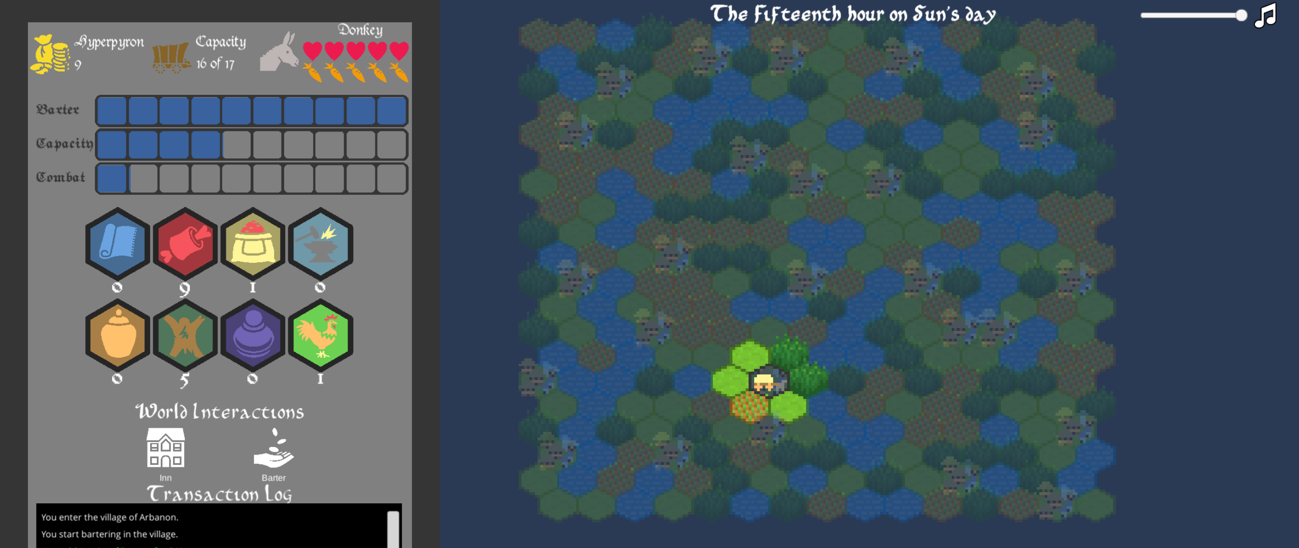
Haven't given the Log a chance to prove itself worthy because it gets cut off(screenshot). since the text scrolls from bottom to top, the latest information is lost. in simple browser mode the Log is undreadable.
I'm here to help make this a better experience, so gonna give it a try. how to avoid a brutal cutoff like that? 1. move the log to the other right side could solve it. 2. maybe making the log go from top to bottom would be end of it. 3. alternatively shrinking some of the other elements on the left side could also work: make all the items be in one row, decrease the vertical size of the upgrades. 4. move the items acquired to a new collumn, so that stats, money, donkey meter, capacity, actions, log remain in the first one, while the second column only holds the acquired items. link for referance of the mentioned game, check how leftside has all the goods there (https://store.steampowered.com/app/271240/Offworld_Trading_Company/)
The town stock surplus/dearth is now clearer that you've mentioned it. The stars show which button is better. so the second time i've played it, i've tried to annihilate all stars on all towns. buying till no stars left to make a good buy, selling till no stars left to make it a good sell. wasnt really even looking at the numbers, just the stars. and that I guess is some overwhelmingly useful UI, which is the surplus/dearth star indication.
Now to talk about if I was using the numbers. what would be useful to see is the money spent to acquire the items, when hovering over hexes on the left hand side. in other words a reminder at what price where the items were bought. for example, at the start of the game you sell all the silk to acquire 60 gold. then buy some food for 1 gold and tools for 7+8+9+10 gold. So the hover over the hex reminder would tell you that you've spent 1 gold on the available 1 food and 36 on the tools (average 8.5 /item). once the items are all sold this reminder would show 0 because what you have is 0 items and that gives you 0 coin. 0 item = 0 gold would make afor a great logic check.
on another scenario, with the same 7,8,9,10 value tools. let's say we sell one tool for 11. how would the acquired price change? it could be 36-11 = 25 (avg 8,3/tool). Alternatively, the tooltip could say that the average of the tools is still 8.5/item, and the total gold spent on it was 25.5 coins.
I'm here to explore the idea of "Weak". I didn't implement it in the best way, but had a great time brainstorming and later on cutting off some ideas. Time is short with the jams!
Snow Dash ( https://itch.io/jam/mini-jam-43-travel/rate/536269 ) - does it so that you are the slowest in a race. otherwise, most of the same rules apply to the player and others npc racers. but the player is the only one that throws snowballs. two snowballs can make another races go backwards. and player is the only one with access to a "present box'o'speed", this item makes player go super fast, but only in terms of repositioning. doesn't matter how many presents you pick up, the will not influence your position in the race. This was an interesting game.
Also, question; is racing from a clear start to a clear finish considered traveling?
queue up Pokemon theme song please.
The Merchant of Mors ( https://itch.io/jam/mini-jam-43-travel/rate/535648 )- Can't really understand where the weakness in this game is. this game is a traveling merchant type. buy stuff cheap, sell them for gross amounts. hard to say if the player is weak, because there are no other merchants to encounter. I wouldn't go to the lenght of saying that the merchant is weak, because there are these powerfull economic figures- towns. Good thing one of the main mechanics in this game is travelling.
The Land of the Lost and Found ( https://itch.io/jam/mini-jam-43-travel/rate/535039) . well, well, well... mechanically in this game the player is almost all powerfull. being the only one who seems to move around in the map and also the only one to remember, being not lost and finding things. naratively... I've got no idea. smbd help me out where the weakness is in this game. But hey! Travel was involved very much. loved exploring the map!
Rush it! ( https://itch.io/jam/mini-jam-43-travel/rate/535891 ). Weakness - one life. that same thing is repeated on and on in the mobile casual game sphere. would also consider driving against traffic a mental weakness. That's just dangerous, absolutely not safe! and to gain score while doing so! oh my god!
fun to play and we seemingly explore a never ending road in the middle of a city.
Dungeon Slime ( https://itch.io/jam/mini-jam-43-travel/rate/536448 ). This game has a dungeon, you need to fing the exit. there are grunt chilling around the dungeon and if they catch you, that's gonna be it! Thank goodness there is two dimensions to explore. enemies can kill you, but you can't kill enemies. A weakness. that's pretty clearly a disadvantage. but the player is smart. Grunts are not. Exploit the rudimentary AI of enemies to easily bypass them. exploration of the dungeon is a very exciting gameplay loop for me personally.
These 5 better browser playable games show that implementing a players disadvantage ingame isn't so difficult. but thing is. It jsut doesn't cut it for me. This was a really interesting theme to play around with. send me straight to hell for not implementing anything interesting in my own game. What i did was limit the players "Stamina". and that is used for higher jumps, running faster, so you've got to rest every now and then. and the rest takes a minute.
hey. I made a quick post jam fix to the game. this one's a bit ... off.
fixed wedgl version is here : https://under-a-lamp.itch.io/potion-maker