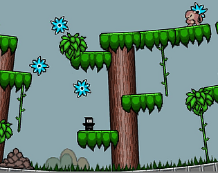
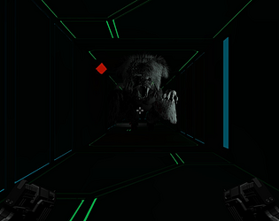
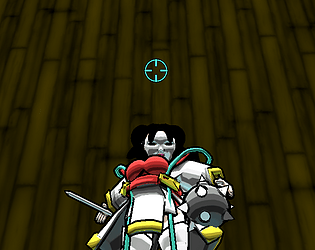
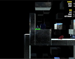
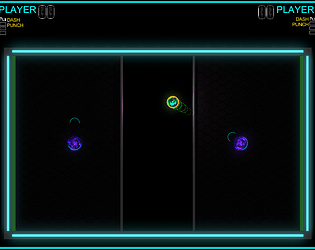
That was a fun little puzzle game. The changing of directions was a nice twist on the classic sokoban games. The audio from the arrows however... it multiplied and nearly wrecked my ears (on the 6 arrow level) - Still... a fun little challenge. I enjoyed it. (Jeebus)
Mathbear
Creator of
Recent community posts
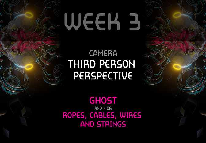
You may use one or more of the Themes above. Submissions are due by 5 April MIDNIGHT.
SUBMISSONS
First upload your game on https://itch.io/
Then Create a new Discussion at http://makegamessa.com
Use the following subject line...
[#PROTOSHI] 4 ADVANCED NameOfYourGame
or
[#PROTOSHI] 4 BEGINNER NameOfYourGame
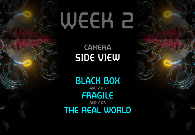
You may use one or both of the Themes above.
Submissions are due by 29 March 9:00 pm.
SUBMISSONS
First upload your game on https://itch.io/
Then Create a new Discussion at makegamessa.com
Use the following subject line...
[#PROTOSHI] 2 ADVANCED NameOfYourGame
or
[#PROTOSHI] 2 BEGINNER NameOfYourGame
You may use one or both of the Themes above.
Submissions are due by 22 March 9:00 pm.
SUBMISSONS
First upload your game on https://itch.io/
Then Create a new Discussion at makegamessa.com
Use the following subject line...
[#PROTOSHI] 2 ADVANCED NameOfYourGame
or
[#PROTOSHI] 2 BEGINNER NameOfYourGame
You may use one or both of the Themes above.
Submissions are due by 15 March 9:00 pm.
SUBMISSONS
First upload your game on https://itch.io/
Then Create a new Discussion at makegamessa.com
Use the following subject line...
[#PROTOSHI] 1 ADVANCED NameOfYourGame
or
[#PROTOSHI] 1 BEGINNER NameOfYourGame
CHOOSING A CATEGORY
Choose either ADVANCED or BEGINNER.
If you decide later to submit another game as Advanced, then all of your previous submissions will be considered ADVANCED as well.
thanks a lot. You have raised a lot of points that i would never have considered on my own.
The dash as a double jump, sounds like a very interesting idea.
I keep forgetting to disable the experimental powershot, but i agree that it would be better suited on the mouse.
Up for jump, is a weird one. I have had some people ask me why it was not available. So i added it. There is a culture split regarding that option.
I am not sure that i will be able to lock the camera, since the level bounds are not currently clipped by the floor etc.
I will try out all your recommendations, and update them here once i am done.
Thanks for the time and input!
My Specs as mentioned above...
Operating System: Windows 7 Professional 64-bit (6.1, Build 7601) Service Pack 1 (7601.win7sp1_gdr.130828-1532)
System Manufacturer: ASUSTeK Computer INC.
System Model: N61Jv
Processor: Intel(R) Core(TM) i5 CPU M 450 @ 2.40GHz (4 CPUs), ~2.4GHz
Memory: 4096MB RAM
DirectX Version: DirectX 11
System DPI Setting: 96 DPI (100 percent)
Acceleration:NVIDIA GeForce GT 325M
Hi Bernard.
First of. WOW. I can see a lot of work has been going into this and there is a lot of focus given to the fine tuning of the steering mechanics. I haven't played Wipeout in many years and so my feedback as a player can be considered entry level, or newcomer.
My feedback below is not an indication of things that are wrong or missing. I'm just going to offer humble ideas on how I think it can be improved.
UI alignment
First just a quick UI challenge.... 1024 X 768 fullscreen causes a "warping" of the game UI which is naturally at the user's request. This warping appears to throw the UI out of alignment whereby having the mouse in the center of the screen, allow me to click on the NEXT button on the far right. I don't know if this is something you might like to test on your side - After that I played in windowed mode and the game was running fine.
Frame rate Performance hit
I have a somewhat outdated Laptop(I'll attach my specs) so the frame rate was suffering at "Fantastic"
I had to scale the quality down for a smoother gameplay. This had me wonder if perhaps there is a performance drain somewhere since I don't think that the pre-race scene I was looking at had that many elements to cause such a performance hit. Perhaps the performance hit is irrelevant on stronger machines... but it might become a problem if the game starts using heavier assets.
Visual Noise
Track Alpha and Track Gamma have too much visual noise. The feedback below pertains to those two tracks alone since the Beta track seems to have a different visual layout. The thing I noticed was that it looks like you were aware of this and tried to make the green arrow (visual queues) pop in the daylight by making them bigger... but this approach just added even more visual competition between the track elements.
So by visual noise I refer to the vividness and brightness of elements and how they tend to catch our eyes.
In the game, the grass billboards are very front and center, and very bright. Things like trees, bushes and tall grass are actually quite dark, even in the day time, because we can't see the top surface where theses items are being lit... they are also quite distant and blurred into the background (no jagged edges)
Overall your daytime tracks are applying a LOT of ambient light to everything which is very colorful and distracting. The yellow "turn" boards become almost camouflaged as a result.
I would recommend that the surrounding scenery be dulled down with colder darker colors and a less ambient light. I would avoid using the grass billboards altogether or at least make them smaller and darker.
The constant gritty texturing of the ground (dirt) was also adding a lot of visual noise. I feel that racing games (especially street racers) get by with making the pattern very subtle , somewhat darker (or less ambient) and mundane so that the player forgets to look at it. With that you won't be required to try and boost the green road arrows as they were really working well they way they are in Beta.
I believe the changes above all relate to reducing the texture noise, brightness, quantity and ambience of "background" and doing so would reduce the visual noise and make the game play feel cleaner and more crisp.
Camera elevation.
I would have liked it if the camera was a bit higher... when it gets too low to the ground, the track flattens to a point where the sides are just horizontal blurs running straight across the screen. in Other words it reduces the visual impact of a curve up ahead...
Lifting the camera to be more above the player will allow them to see and understand what is coming a bit better. This might seem like a generous change that will make the game easier, but I think it is necessary because we don't have natural depth perception or natural motion blur in games that would normally help us define the road up ahead... so a bit of camera elevation might help compensate for that.
Controls
Keyboard controls weren't bad. I'd have to get used to the sensitivity but I understand that this is a core aspect of the game. I kind of feel like it is snapping very fast between straight and full turn. On the other hand a gradual build might annoy players that want to get full turn right away. I'd like to suggest that you consider trying an exponential increase in value (so not linear or instant but something that curves so that there's an option to feather the turning with taps, but reaching full turn shouldn't have too much of a delay)... but that could just be my noob expectations. I was a bit disappointed that I couldn't use the mouse and was hoping there'd be some kind of analogue steering option. Does the game have controller support perhaps?
Dead stops
This is more of a personal preference really. When hitting the edge without blowing up, it still seems to have a tremendous penalty. I know that it should be avoided at all costs and wouldn't happen very often if I get more practice in, but I would dim the penalty down a bit anyway so that I don't have to stop almost dead, re-orient and start accelerating from scratch again. While this isn't realistically accurate, I think it will keep the excitement and flow going.
Hellooooo
I've added Mouse aiming...
You can tweak sensitivity in the pause menu (press enter during gameplay, go to Sensitivity.
Hit Enter until it reaches the desired level. It'll reset back to zero after Max)
Also you can use the Right shift to fire, but I think once you start using mouse, you probably won't need to bother with that option anymore.
New update has been posted!
Contains following changes :
- - RIGHT SHIFT is also a fire button now
(right ctrl wasn't used because it jams the WASD keys)
- - MOUSE AIMING! this is set by default...
You can change the sensitivity in the Pause menu (enter)
You can disable mouse aiming in the Pause menu (enter).
You also HAVE to disable mouse aiming if you want to play with a controller.
- - No more getting stuck on the enemy bots.
- - Space/ Enter/ LMB - added as selection buttons in the menus
All of these act as SUBMIT buttons now. This is in the Menu pages including PAUSE menu.
But only ENTER/START will bring up a pause menu.
- - Platforms have been added but you need to power up to reach them.
Thank you for your kind comments. I hope you don't mind if we ask a few questions.
Some people have said it's very difficult.
- What was your experience?
We do intend to develop this a bit further. (Jam games rarely meet the initial design goals :)
- What features would you like/hope to see in a new version?
The current layout wasn't due to a coop design... I just naturally coded it to use WASD and Mouse for fire... But I can see why having your hand on the mouse would make you want to use it to start aiming. A few other people have also mentioned the desire to aim with the mouse... I will definitely look into it.
I personally enjoy the aiming and movement being tied to the same control... I guess I'm a sucker for trying to master the conflicting controls. Deciding when to push or let go was a fun part of it for me.
I won't be doing snap aiming or auto aiming.
I'm not sure I understand this point..."and by splitting it to 2 inputs you added aiming onto 3 more buttons." ...Your earlier suggestion is to split the aiming to a separate input, but here you seem to indicate that splitting it up is overwhelming? I'm also not sure what you mean when you say I added aiming onto 3 more buttons. Are you referring to the direction buttons WASD? There really is no other way around that unless I implement the mouse aiming...
The third fire button in the title screen is just a submit button. It is currently mapped to ENTER or START on the controller... Instead of removing that button and limiting it to only the fire button, I would rather add ALL the buttons I can think of. That's because a player would be annoyed if they had to "figure out" which button starts the game. It's a small thing to ad the other buttons. I just haven't gotten around to that yet.
Thanks for all your input though. It's great that you took the time to talk to me about it.