Hey! It does feel nice to have something out there.
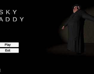
The title screen is indeed meant to be more funny than scary, and is more or less just something that helped me laugh while testing the main menu.
The jumpscare/cross bug is interesting and I'll definitely look into it as I refactor things. The dragging I'm unable to replicate, but if it's only happening in my game them I'm sure I did something funky and it's not on your end.
Thanks for the comment!
melmsie
Creator of
Recent community posts
Hey folks,
just wanted to say that as my first project and my first jam, I loved this one! I enjoyed this size, it felt much more approachable to posting my own prototype.
I played most of the other games and I'm really impressed and in awe of the stuff you've made.
Thanks Queen for hosting, can't wait for the next.
Thanks for playing! I agree that looming threats are as good as, if not better, than jumpscares. I'm planning on building on this and keeping to that ideology.
I agree about the crosses. Those were a list minute addition and I'm not entirely content with how they turned out, I think I might make them larger and add some sort of "holy glow" on the cross itself rather than just a point light.
As for textures, big agree! Art is the one thing I'm still struggling to learn to implement aside from the deadline of posting this. Will keep working on it though.
(Loved your game btw!)


