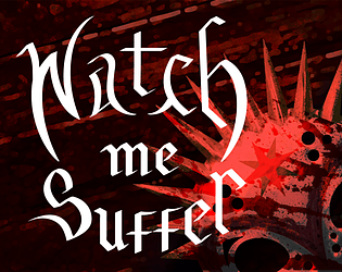
Hey! Recently worked on a visual novel, https://boobysoft.itch.io/watch-me-suffer - any dyslexics wanna tell me how readable it is? We used a sans serif, as I know that's... recommended, but did not go with open dyslexic, because open dyslexic looks... deeply unpleasing to my eyes.
I know different dyslexic people have different experiences, so this may not be a one size fits all thing - but is this working for y'all?
Obviously, if it's not super readable, I can definitely swap the font (or give an option in settings to swap the font) to something I find less visually appealing but works better for people, but I would like to know if this works okay currently for people.
If you download it and play rather than just looking at the images (which truly, would be simplest), know that there are some sound glitches right now/some of the voice acting is not yet implemented. Not looking for feedback on the game itself (which will get an update to handle some of the issues within the coming weeks), just some info on readability (although if you wanna play go ahead, it's definitely functional and I'm proud of what our team has done).


