Indie game storeFree gamesFun gamesHorror games
Game developmentAssetsComics
SalesBundles
Jobs
TagsGame Engines

NathanLurker

87
Posts
5
Followers
8
Following
A member registered Oct 01, 2023 · View creator page →

Creator of

Recent community posts

There should be a button underneath the banner image section on the right when you edit your project (might be different on mobile)

Thank you very much, glad you like the skulls, I would like to experiment more with UI ornaments in the future. 

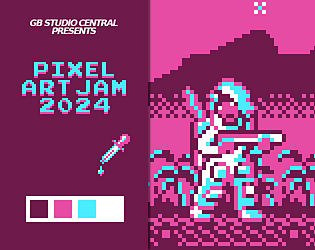
Thank you, I was trying to bring all of that in this image, I'm glad you feel that way.

Thanks. I started by picking the most unusual palette for me, as an additional challenge. It is a very bold palette with striking contrast, I wanted to see if I could make an atmospheric thing out of it. I thought I might be able to use the 2 shades of pink primarily as eerie background instead of candy coated highlights, and the white and cyan should be used for characters and monsters. If my character was going to be primarily white, I thought it make sense to have a space suit, and as monsters, I thought of ghosts, and wondered if bold white and cyan could turn creepy. The thought process was really to bend a palette that doesnt seem eerie into an atmospheric horror game scene. I loosely wanted to connect the mood with my submission from last year. For the typography, I used a free font called "smallestpixels" that you can find here although I had to tweak spaces between letters. I'd like to try my hand at making my own font at some point.

Thank you, I started with the character's suit, I wanted that and the ghosts to be striking and the background elements to be moody. Glad you liked it. 

Thanks Robert, hopefully at some point I find the time to explore those ideas in Gb studio. In my mind, this and last year's submission are in the same world. Who knows, maybe I'll develop further.

Thank you, I wanted to use it in the most atmospheric way I could.

Thanks, I do try to imagine what the game would be like when drawing for the jam.

Never say never, if I ever find the time to adapt it. I have some GB studio experience.

Yes it was the odd one and I chose it because of that. I was surprised that there were a lot of submissions using it. Thanks for your words, appreciated.

Congrats all, fun jam

Yeah, congrats all, it's great to see there's so many submissions. I browsed through most of them I think.  Super fun jam.

Composition is so good, looks amazing, good job

Superb, it looks great

Cute, love it.

cool tiles

Love it, well done

Fantastic stuff

Nice structure

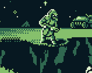
Cool motifs, water reflection and the minimal use of green. 

Well done, I like it

Cute

Looks like an actual game, well designed, good job

Cute

In my mind, this is a strawberry headed man, having a regular monday :) 

I enjoy the composition, and the characters, good job

Great stuff, love it

cool details and textures, the organic parts with the architectural works so well

I love it, everything about it, it's dope.

Interesting use of sharp angles and geometry here, I enjoy the piece, good work

Cool stuff, nice work

I bet 5 rupees on sir Marione

oooh blue moon and it's blue light, good use of the palette, good job, cool moth

Nice

ah, great use of the color palette.

that 3d effect on the landscape is quite nice,I think you have a pretty good use of the blue color throughout the piece, good job

Good mood, well done design

Very good, so much detail on such small characters and objects, it's great

Pretty cool, nice job