On Sale: GamesAssetsToolsTabletopComics
Indie game storeFree gamesFun gamesHorror games
Game developmentAssetsComics
SalesBundles
Jobs
TagsGame Engines

Nightcrawler Studios

24
Posts
2
Topics
A member registered Jan 10, 2024 · View creator page →

Creator of

Recent community posts

I played the web based version of this game, and am SO impressed! I was wondering which game the animated raccoon I saw being developed on Discord over the course of the jam made it into.

Things I like: Visuals! The raccoon animation is absolutely fantastic and its clear you have a 2D animation background – but on the page you say you learned a lot about animation so maybe you’re just good at stuff? ha. Also, I LOVE the art deco style of both the page and the game.

Vibe The river spirit theme is really stinkin’ cool. The whole game has a lonely, forgotten quality that fits really nicely into the environmentalism you’ve got going on with the rivers. There was a LOT of thought put into this. Are the extra limbs representative of river tributaries?

Very impressive that you solo’ed this.

Things to improve: Visuals: The line art on some characters and details is too thin which causes a scratchy pixel aliasing dancing effect that is a little distracting. I think that making the lines a little thicker could be an easy fix.

Also, the color palette on the game’s page is 10/10. The blues and grayscale really fit nicely together - but in the game I felt like the colors didn’t vibe together as well - almost everything did except for the brown of the trees and the green of the bushes - which seemed too brown and too green (rather than having a pinkish hue to reflect the environmental lighting) and that drew attention to them rather than the characters. Unless that was intentional due to the environmentalism undertones it should be an easy fix to pink them up.

I would also raise the opacity of the text block background by about 10% just because the art behind it is often pretty busy.

Coding: There is a bug at least in the web version where hitting [Spacebar] or [Enter] outside of dialog crashes the game. This is a jam so I’m not terribly put off or surprised, but it did make it so I couldn’t figure out how to carry on with gameplay.

I love how much thought was poured into this. And I LOVE the animations and overall design. Excellent job!

Thank you so much for this detailed write-up. I am really loving being able to see the game through others’ eyes!

I love the Inch Bus as well :D (the train). We have a lot of fun ideas about experimenting with its physics and movement in future games. And we’ve been playing around with the story for a LOOONG time and have much more to come!

I had never heard of Shelter, but I see EXACTLY what you mean re: texture scaling. Thank you for that link what an excellent example!

You should have seen the first version of the fire lol. It’s really validating to hear feedback that aligns with the things we also considered our weak spots, and to see others agree on the things we thought were strengths.

I cannot thank you enough for this detailed write-up!! I’ll take a look at your game now.

Thanks so much for the feedback! I’m glad we received feedback on the UI because both of us were like: “Yup, looks good. Next!” ha.

image.png (^ both of us when it came to the UI)

Thank you, we can’t wait to expand in future releases!

Thank you so much! We are too, we’ve got lots of worlds unfolding for the duo to explore in future releases.

LOL. Excellent.

I checked yours out as well and left feedback on your submission page! I’ll try to mirror placement of feedback (this thread vs the itch page) based on what people do here.

LOVED loved the game. Hard to find flaws TBH, but I left more detail on the itch page.

It would be easier to leave feedback if people didn’t make such great games haha.

Absolutely beautiful game. This one is a standout to me because it achieves something, at least in the Outerworld, that few others did: the scene decorations feel very intentional and make the space feel like a real environment. Everyone can add generic trees, rocks, etc when creating a forest scene - or cars, fire hydrants and buildings when creating a city scene - but there is a lot of life poured into the details in the Outerworld that really caught my interest. Someone said what set Hayao Miyazaki movies apart from others is the insane amount of time spent on “arbitrary details” (animating the rain drops falling on a rock before the rock is fully wet). I feel like the Outerworld really captured this.

Example: The tree in the Outerworld says “Never” carved into it? Amazing and compelling.

Since I am supposed to give criticism, the best I can come up with is: The Innerworld is not as detailed as the Outerworld, but I imagine this is because you made this in two weeks. If each level looked as thought out as the Outerworld this game would go viral IMO.

Other critiques, and this is digging deep and can be taken with a grain of salt: I do not know anything about music theory or music beyond how it makes me feel, so bear with me: The music was beautiful and well crafted. However, it was a little too consistent in rhythm (pretty quick paced) and a little too..driving?…powerful?…always peaking?…As you can see I do not know how to music-speak but I think if you were to vary the level of intensity of the music by adding more pauses, slowing it down a little bit, and adding variety in the volume it would really elevate it. Though, it is already objectively very, very good.

To be even more vague in an attempt to be more clear: the vibe my soul wanted while playing this game was more like drops of water echoing in a cave and the music came on strong and stayed strong.

Feel free to totally ignore me, as others have said the music stands out to them as being a perfect match, and it is objectively and subjectively very well done.

This is really excellent and I’m very curious to know what influenced the creation of the Outerworld and why you created the assets you did. It really caught me and pulled me in!

NcEngine Did this work?

The engine has been a wild ride! We’ve been working on it from 2019 for a variety of reasons. We were Unity simps prior as well. Unity deprecated a feature we needed for our game - so my husband decided to start making his own engine then for fun and out of spite. (And as a learning exercise).

For me, I found I was stuck in perpetual tutorial-hell because so much of Unity was a black box that it always seemed like the more efficient choice to find a tutorial on how to do some high level thing rather than devote all the time to learning why and how the thing worked from beginning to end. Building the graphics side of our engine from beginning to end has given me SO much value because now I understand how to do anything I need to do, and its mostly sufficient to read a blog post or the Vulkan spec to learn concepts behind some new feature - rather than needing someone to hold my hand line by line.

You can follow along with our progress here if you ever want to check us out. [https://github.com/NcStudios/NcEngine]. I don’t recommend anyone use our engine as it is definitely not as feature complete as some of the other free options out there. It works for us because we built it obviously but we never intended to make the engine a standalone product or anything.

By the way - I don’t think your Steam page was bugged. Your game was in my library when I navigated away from your store page. I just never received a “Downloading” notification or any response from the button. (Which is probably typical). I actually think the sizing of the characters is about right on my display!

Thank you so much! I love your feedback because it is deadly accurate. We rolled our own game engine and are literally using a UI library that is meant for debugging (Dear Imgui). Updating the UI to have a more custom feel has been so low on our priorities list. This feedback has placed it much higher.

I had not seen your game but holy-moly you brought the heat into this competition. I got STRONG ‘unsettled, yuck-in-a-good-way’ vibes from the trailer. The art style reminds me of Slay The Spire and Don’t Starve. Also evoked some Princess Mononoke tatarigami vibes with that monster. It also is sending some “Midnight Mass” horror undertones. Overall phenomenal vibe and art style.

My criticism is the game could use a little visual balance. I’ll break that down into two categories: Light/Darkness: The game is really dark, most of the screen is black, and the contrast from the lit areas is a little too low. Consider making the lit area brighter and maybe a little larger? Size: The characters are proportionally correct to their environment but really small in relation to the screen. Almost as small as individual units in games like AOE. I’d make them maybe 1.5 times larger to pull the focus more towards the character and the lit area of the game.

Overall I am floored by how good this game looks. My steam is bugging on the free download (button does nothing but it’s probably on my end) but I’ll be giving this a go later.

Hi all, we are really proud of our creation - so I’m a bit apprehensive to do this but: one of the most valuable things we could get out of this jam is constructive criticism and areas to improve.

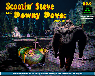
https://ncstudios.itch.io/scootin-steve-and-downy-dave-origin

If anyone else is interested: for each piece of criticism on either our game, itch page, etc, I will provide one piece of honest and well-thought out criticism on yours!

What is “The Beginner’s Guide”?

I can’t view this link!

I was really a fan of the minimalist presentation of your game. It meshes really well with the foundational, elemental properties that stone, branches, etc have and gives a great sense of unity to the design!

Will do! I spent a few hours familiarizing myself with DaVinci Resolve yesterday. I have a bunch of asset creation content I’m editing together into timelapse that I will record myself narrating. I’m mostly apprehensive about trying to stream live programming, as I spend a LOT of time: Googling, staring blankly into the void while thinking, and trying things that don’t end up working lol. I’ll let you know when we post!

Wow you definitely know what you’re doing making videos. I am going to be narrating, editing and posting our own recordings of the jam in a devlog soon - but have nowhere near the skills you show here! Great work.

Wow this trailer is incredible and looks like something you’d see on Steam for a fully ready-to-go game. Also love the sound design and music. Fantastic!!

I love the trailer! I like the whimsical music a lot. Nice job!

Did anyone else make a trailer for their game? I obviously didn’t have time during the jam, but was messing around learning DaVinci tonight so I can edit all the footage we took during the jam (coding, 3D modeling, etc).

I made this trailer tonight! [https://youtu.be/VbOu-1sVbvc]

Post yours here!

Thanks so much for the feedback! Glad you liked it! Apologies for the dialog - definitely a substantial part of the game, and it’d be a bummer to not be able to read it. We’ll have to make sure to add options to adjust in the future. Glad you liked the controls/movement, too! We reworked them several times to try and get them right and we’re happy to hear it paid off. Thanks again!

Wooly Wilby will be missed dearly - he was a friend to all. Sorry you didn’t get to the ending. We debated about the difficulty. One of us thought it was too hard, the other too easy. We’ll have to enlist more playtesters for the next one. Thanks for checking it out, and thanks for the feedback!

No problem Basie - I saw how much work you put into reviewing each person’s game and was really moved by that as well as the fact that when you couldn’t get ours to work on Proton you tried again on Windows.

We are still working out some kinks with Vulkan and don’t have a great way to broadly test across many GPUs/devices.

Thanks for giving it so much effort!!

Really, really good looking game!

Very, very cool! I love the music and the day/night cycle.