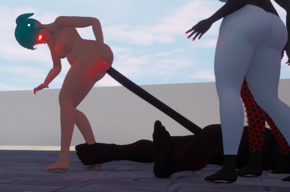
that poor orc
Looks great! Lots of good ideas, especially when it comes to mixing different movement with each size. You may want to add a condition to kick-out players if a colored switch-box/platform activates with them inside. Or you could use a Trigger to check if the player's inside the box when it gets the activation signal, and have it just wait until the player's outside its hitbox to gain collision.
Personally, I think adding self-heal to the first enemy in a game is a bad move- especially with such a low damage floor. It'd be better, at least, if it was a multi-move action. LOCKING BACK UP should *definitely* be a multi-move action. Encountering/using a move for the first time should should the move for a few seconds- it's frustrating to try a new move, and waste an entire turn because you didn't know it'd be three clicks immediately after it fades in. Better yet, move the enemies up, and make the bar always visible- that way you can see the required QTE for a prospective move. Giving everything such a wide range, with such a low floor, is intensely frustrating- am I going to deal 1 damage every attack for the next 5 turns? Is the Penetrate move going to hit me even if I'm in the square? Are they going to immediately heal themselves afterwards? I think it'd be better to have a higher floor. It might even be psychologically better phrasing to say '1+1-3' than '2-4'; that way the base damage seems to be 1, and the RNG is more of a bonus. But that's more subjective. If a staggering chasm of a range is absolutely necessary, it might be better to swap out for just the crit system- normal, consistent damage, and high spikes. *Preferably* where the player knows ahead of time- perhaps occasionally selecting a random move, and buffing its stats if you choose that specifically. The upgrades are also quite opaque, until you've chosen a few- it'd be nice to show the buff before you click. Praise: the art's nice, of course. Tucking Unlock out of the way until it's taught is good. Streamlined menus, easy controls.
Edit: I think the inconsistent-seeming hitbox size could be from the bar still moving after input is given. It'll barely enter the box for a 0, and will have just barely left the box for a 1.
Seeker doesn't seem fully implemented yet.
I'd recommend having a check for very low speeds without input, for freezing the character in place- otherwise they slide around, even when immobilized.
Might be good to lock the softbody angle close to the player angle- unless having tits temporarily 'growing out of their back' is intentional.
If the magic potion is intended as a hazard, having it slowly attract to the player might be good. I'd also suggest a starting splash screen that explains some of the effects- more/mirrored versions of items might also help add a bit more variety.
This isn't a game. This isn't a fangame. This looks like the product of someone being encouraged too early on, to stagnate and keep producing the same, absolute minimum of w-a-s-d and more than one sprite in MS paint. Namedropping Spacethumper, an actual game with good and deliberate design decisions, seems like desperation for downloads.
The same level of quality I saw in SB- stellar work! Very excited to see how this continues.
The UI element is a good addition- but I'd steal from Seeds of Destiny, and make sure it goes transparent when moving the character (or an option for it.) It blocks parts of the scenes, important ones at times!
Surprised to see this, compared to your previous downloads- it's a big jump in quality.
Recommendations:
The AR is ridiculously busted at high upgrades. Perhaps focus less on mag size, and swap it for reload speed?
Allow the player to pick up items when reloading!
Shorten the deadzone during/after reloads, especially with the shotgun- having 'finished' the reload, and having to wait a full second+ to fire afterwards is a slowly-annoying occurence!
Give us a button to throw items we're holding- I'd like to be able to move pills away from places like spawnpoints.
Maybe make the between-round time a little longer! Games like KF1/2 give you nearly a minute.
Perhaps consider in-round purchases, like the game above!
On that note, it should be (seemingly) easy to add things like damage resistance, speed upgrades, health maximum, and perhaps small ammo-drops from enemies. Hope this sees continued development!
I can't remember the path specifically, but on a path with a merchant-campfire-combat string, backing up at the combat room (to the tummy scene) sends you one room too far back- letting you spam the campfire, upgrade all your cards... and softlock the game, since it won't let you progress, even after winning/losing the combat!
My recommendation is speeding up all the cutscenes, and movement- if this is meant to be a roguelike with short plays, frequent resets- you don't want those to take longer than they need to!
I'd also recommend more healing options- perhaps with cards that apply debuffs (Like a certain other submission!), or otherwise.
Art looks nice, though more in-between stages is always a good idea- especially when in combat.
On the same note, potentially adding resets, or shrinks to the belly size- if the retry aspect isn't doing it enough- is always good for extra replayability.
The smooth, in-depth animations remind me of Haley's Treasure Adventure (https://ingeniusstudios.itch.io/haileys-treasure-adventure) - and I absolutely love it! It's a telltale mark of good development, and I can't wait to see how this progresses. (Plus the detail of the exhausted, tuckered-out expression at 3.)