I was so excited I stayed up way too late last night writing 4,000-odd words. XD
Hopefully they still read well, in the morning.
Edit: Er, afternoon, I mean.
Overlooked Option Visual Novels
Creator of
Recent community posts
It's worth noting that the price for A Lily from the Lightless Water has likely gone up since the last time I talked about it. Lily was initially released for $1.99 USD but... erm... how shall I put this....
Inflation.
Yeah... I'm sure you've noticed. I need to remember that I'm supposed to price my stuff fairly for modern times! Not for five or ten years ago! I've got to buy food~!
I'll try to give you good feedback, here. :)
You've done a good job on the backgrounds. Sometimes they can look a little empty, however, especially since these places are described as being filled with people. Not depicting people against backgrounds isn't unique to you, however - other visual novels do this, too, and it isn't really a problem.
The girl's art is well-drawn and cute!
It's clear that your English needs to be significantly improved, and your sentences sometimes don't start with the proper capitalization.
(For example, "You just getting up in the morning." should be "You're just getting up in the morning." or "You start getting up in the morning." and "you looking at the alarm clock." should be "You look at the alarm clock." or "You're looking at the alarm clock", with the "Y" capitalized at the beginning of the sentence. Also, "You decide walking to school." should be "You decide to walk to school.")
As I said, the girl looks cute! However, she lacks different facial expressions.
Her pose is also a little stiff, which is a good way to represent her emotional state (anxiety) through her body language. :)
However, if she were to ever NOT be anxious, she would need a less stiff pose. Therefore, in the future, if you end up with a character who changes their emotional state a lot, but can only manage one pose for them, I would suggest giving that character a more natural-looking pose, which would work fairly well with multiple emotions, rather than only looking right with one specific emotion.
Also, dissolves could be used a little more - the girl is sometimes shown and hidden without any transitions, which tends to look abrupt.
You seem to have a fairly strong understanding of variables and how they can effect your scenes.
All in all, a good attempt. Your backgrounds look quite strong, her sprite looks good, you seem to have a fair grasp on Ren'Py - even allowing the reader to set the name of the main character, at the beginning. Mostly, I would just say to work on your English skills.
Don't worry, you'll get better. People get better the more they read, speak, listen, and write.
The story itself was simple but sweet, and it would be nice to see the two characters grow closer together.
I hope this was helpful :) No offence was meant by this, I'm just trying to help.
Take care on your journey!
Hi there :) I heard what you said about the animation issue. If you're using images which display individual frame image files from your image folder one at a time in quick succession, you may want to look at movie sprites, instead? I'm still learning, but I'm interested in movie sprites myself and found the Ren'Py Tutorial game's Quickstart -> Video Playback section to be helpful. In that section, they talk about how movies can be displayed just like any other image (IE, like a sprite) and they touch on the fact that videos can have masks to make them transparent. They only mention that briefly in the tutorial, but there is a section of documentation which a kind person on Lemmasoft Forums pointed me to, which covers movie masking in more detail: https://renpy.org/doc/html/movie.html#Movie So, it seems like it's possible to make movie sprites which have transparency, and as far as I understand, playing movies is easier on Ren'Py than the manually-displaying-individual-frame-images method. (I think the movies should be .webm files, though.) I hope this may help. Regardless, I wish you well! :)
Hi there! I'll answer some of your questions! Although I wasn't aware of these questions until now (after playing) so I may not be able to answer all of them!
- How much time did it take you to go through Galactic Love Utopia: Arrival?
I didn't time my session since I wasn't aware this would be a question. It didn't take very long, though. Maybe an hour or two at the most? - Would you prefer the portraits of characters who are talking inside the text box to be static rather than move
Yes, I would prefer them to be static rather than move! Sometimes the animations of the images inside the text box move in a way which is distractingly out of sync with the on-screen sprites of the same character, so I think things would look better if the side images were static. - If you turned on adult content, did you feel like you the appearance of such content was too sudden/without warning?
I didn't turn on adult content. However, I was impressed by how naturally the option was presented to the player. It felt quite organic, in my opinion. (As did choosing the name for the protagonist.) - What did you think of the default settings for music, sound effects, and voices? Did you change any of the settings such as lowering the volume of one of these types of sound or increasing them?
I play with voices off, so I turned the voices off. I do recall, at some points, wondering if there was music playing and turning my computer speakers up to check. - Who was your favorite character so far and why?
Other than Ai and Os (who I assume aren't real characters) I spent a considerable amount of time with Kyta, Sho, and Ando. Kyta was very "DOWN TO EARTH???" *cough* Kyta was chill. Sho was cute but actually a bit hyper for me...! And Ando.... made me feel upset. Iroh ran off right away but is still a big cutie! To be honest, choosing which love-interest to pursue in a VN like this is often difficult for me. Iroh is probably my favorite because she's super cute, but I also like Kyta and Sho well enough.
Other than that, I have a few other things I'd like to say. I hope you don't mind:
(Lists are a little hard to do on here...!) ^^;
> I feel that the sprite animations could generally feel smoother and less rigid
There is no offence meant here. Time and effort has clearly gone into the sprite animations and I know working on them more would be more work. However, I do feel that things feel noticeably fast and rigid, and I feel that if more time was spent making the animations feel smoother and less rigid, you'd be very glad you took the time to improve them. It could make a big difference. :)
>An option to turn off sprite animations would be appreciated
This has nothing to do with the above point. I've just found that I, personally, have significant difficulty reading visual novels when there's a lot of movement on the screen. (I have no issue when it comes to lovely falling leaves or other similar particle effects, though.) A lot of animation can unfortunately distract me - or even give me headaches - when I'm trying to read. This is mainly an issue when there are multiple animated sprites (and/or side images) on the screen at a time. So, I hope you can understand why I'd appreciate the option. Still, I understand if you decide not to include this option.
>There's the very occasional typo or odd word choice
Not my intention to micromanage - each writer has their own style - I just noticed a few typos and odd word choices.
At a certain point, people are talking or thinking about how Ai and Os are fluent in various languages. However, the word "fluid" is accidentally used.
Other than that, at some points in the early section of the story, I noticed people using the word "that" rather than "who" when thinking or talking about people. For example... "I can't disappoint the people that are following me." could be... "I can't disappoint the people who are following me." and "You are not the only human that has been..." could be "You are not the only human who has been..." We each have our own writing styles, but I feel that switching "that" with "who" in those situations may feel more natural.
> I loved the greenhouse and the CG in it!
They were beautiful!
> Scrolling through the gallery seems a bit slow.
This is a very minor thing - I noticed that scrolling with the scroll bar takes a noticeably long amount of time before you can fully see the next image. A page system, rather than a scroll system, may be preferable here? But this is a very small nitpick.
That's it! Thank you for sharing an early version of your visual novel with us!
Good job!!!!
(I.... don't suppose Kyta showers or uses any saunas. Would... she die?)
Hi there! Sorry if I was harsh with my feedback! Sometimes I look back on my old comments and realize they sound harsh! (really QUITE harsh, sometimes.) I don't mean to discourage!
I thought I'd let you know, though, that I was discussing indie passion-project visual novels with someone. (We were talking about visual novels which were the closest to the writer's initial vision, so indie passion-project VNs came up!) They wondered if I had any recommendations, so I recommended this VN to them! ^^ Hope you're doing well! Take care!
I like it... it's really sweet and the piano music fits really well... thanks for making this and sharing it with us. I like Placeholder <3
Um... on the technical side of things, the game looks quite good. I think she moves around a bit much, though, compared to other moving sprites I've seen, but I get used to how much she moves as I play.
But really, though, this is just really nice. Thank you. <3
I got the true ending...! (Finally had/made time to play it again!) I have to be honest, I mostly had to brute-force it - throughout the game you were given a lot of information...! The ending was a bit confusing, but at the same time it was interestingly simple - contrary to where my head was during most of the game. It was rather satisfying! :) An interesting choice for an ending. ^^ Thanks for adding it to the game...! It's nice to have the true ending...!
Sometimes I can get passionate and forget that a real human will see my comments. (I spend a lot of time isolated and can think that, when I say something online, I'm only talking to myself. Which is silly and untrue.) I was freshly frustrated and rude. Sorry about that...
However... I just like the game and want it to have a real ending. I suppose that much is fair. :)
I understand wanting to release this as it is without its true ending: A lot of work clearly went into it and it makes sense to want people to be able to play it even if it isn't totally totally done. I do the same thing sometimes - release things in chunks. As long as a real ending is on the way I can accept that. I was really only rustled by a lack of clarity and closure. But, in game, you even eluded to us needing to wait for a future version before getting the true ending, so that should have given me closure... ^^; it's very possible that I'm over reacting about all of this. XD
Don't worry, by the way: Even if the true ending ends up being one I'm not personally a fan of, as long as it's the real ending to the story, I can respect that and that will be good enough for me. ^^
Take care~!
A well done, engaging game. The endings, however, I really disliked. I invested a lot of time and emotion into this story and cared about the characters and what was going on, but the story seems to keep its true ending locked away in an upsetting way. It might not even have a true ending. I did the detective work and made it all the way to the end only to feel cheated, or depressed, depending on the ending.
Maybe there is some special, secret ending that actually tells the truth, but I feel so toyed with and, if a true ending does exist in this game, it's surrounded by so many lies... I don't think if I care anymore. Developer, I hope you can understand where I'm coming from and know that I don't wish you any ill will. Peace, everyone. <3
( Was it actually aliens? Oh... I don't want to play the guessing game. Peace, everyone. <3 )
Hi there! I thought I'd let you guys know that the first third of the demo for A Castle on an Island is out! Even though it's the first third of the demo, it's a little over 8,000 words.
A Castle on an Island is a BxG romance visual novel about a young man who washes on the shore of an island with a castle on it after a terrible storm hits his ship. He's taken in by the girls of the castle and grows close to them. <3
Here's a link to the game page:
https://sellillianna.itch.io/a-castle-on-an-island-demo-13
I plan for the full demo to be a little over 30,000 words and am already working on part 2/3.
You can check out my YouTube channel where I post update videos on the visual novels I'm working on every Monday:
https://www.youtube.com/channel/UCNbj-JDHPVuv_qnr1KQ43qA
There are 5 heroines in A Castle on an Island and I plan for each of them to have a route of at least 30,000 words in the full game. That would result in the full VN having at least 180,000 words, which seems a respectable length while also seeming fairly manageable for a solo developer to make.
Here are some screenshots from the first third of the demo!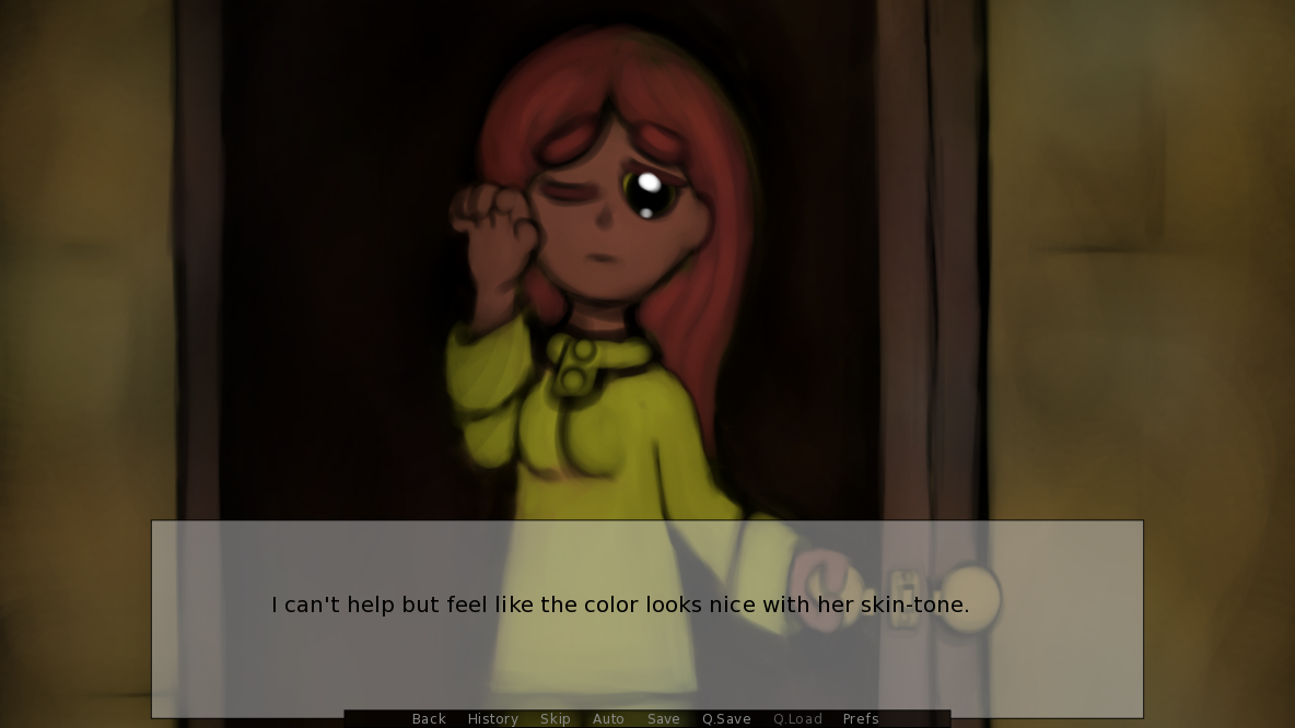
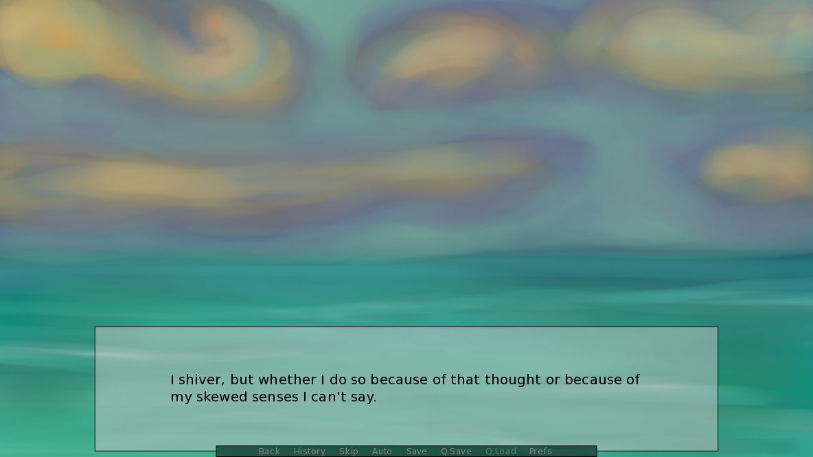
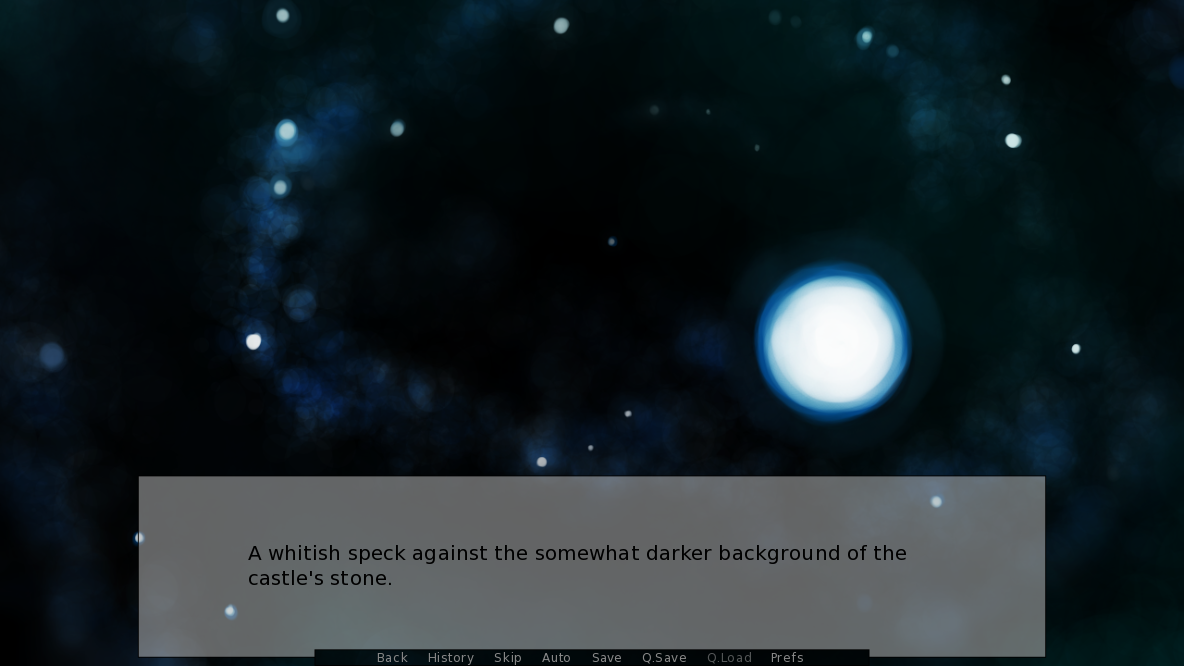
I also recorded a let's play of the demo on my YouTube channel. I fumbled a bit and acted like a goose, but here it is if you'd like:
Allowing visitors to be able to sort games from oldest to newest would help people discover more games. :) And being able to sort games randomly would help with that, too. Sometimes sorting by popular, new and popular, top sellers, top rated, and most recent doesn't feel like enough to those who want to hunt for hidden gems. Just an idea.
I like it. :) I got ending 3. It's a nice story. There are some minor grammatical things and slight continuity inconsistencies (I feel like there are some present-tense and past-tense issues and I think that Merlin at one point was said to be 17 and then later said to be 16. I might be misremembering this, though. And when Nero said "11 in the afternoon" I got a bit confused because I thought he meant 11pm rather than am.) Also, I think the art could be a little bit better. But these things are beside the point: it's a nice story. I like the characters, the plot, and the music. The story doesn't feel rushed pacing-wise, nor does it feel like a slog to get anywhere, it just seems like it the writer knew the story they wanted to tell and told it well, and I respect that. ^^ I'm often faced with a dilemma when it comes to replaying visual novels when I feel that I got "the good ending". I don't want to see characters go through sad events for the sake of being a completionist, if you know what I mean. Thanks for making and releasing this visual novel~! ^^
Hello everyone. I've finished the pre-alpha of the first chapter of The Silent Column. If you play it, I hope you enjoy. It's a visual novel that has science-fictional, supernatural, and mysterious themes. You can read more about it on the page.


