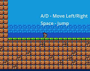
Thanks for the feedback! I do see what you mean. Some parts of the level are a bit too far. Even the camera is not able to show where the next platform is. I will definitely try to make it better next time.
Rcjee
Creator of
Recent community posts
Thanks for commenting! You're right that this is my first time engaging in game development. I understand the problem with the camera and will fix it in a later update. As for the theme, I should have made it a bit more clearer what I was going for so everyone would understand, but, it revolves around the mechanics of using your boost to complete the level quicker, but it decreases your coins by 1, the total score is calculated using both the amount of coins you have and the time it takes to complete the level, so there is a min-max element to the game. Basically, my idea was that when a machine (player) "overheats" (boosts), the parts of it starts degrading (coins), even though the work done by it may be 2x normal amount of work (speed boost). But, again, I should have made it a little bit more clearer. I also understand what you meant by the main menu needing a bit more love, truthfully, I would like to make a complete overhaul for the whole UI aspect, but I didn't know how to do it, so, again, it will be done in a future update. Thanks for playing!


