nice small game, finished it and got to 100% chance to be fucked.
rosly
Creator of
Recent community posts
I really like this game in concept, pixel art is gorgeous and the mouse being both aim and jump is clever. The boob bounce is satisfying every time and the expressions on the goat demon thing are fantastic. The writing is also quite good. I like this game, and wish there was more stuff like it. However, a few annoyances added up to make me not want to finish it:
single music track, I'm tired of hearing it
scene 3 part 2 feels like it's wasting my time, rather than being a meaningful increase in challenge or new gameplay. I need to get through phase 1, I have maybe a 1 in 3 chance of doing that on full hearts, and it takes about 30 seconds, so each death in scene 3 part 2 wastes about a minute and a half.
The game seems to randomly speed up and slow down, despite having plenty of resources available. I'm not sure why. It's sort of detectable without the music, but very, very audible in the sound playing faster or slower than intended.
I don't think any of these issues are worth fixing, I'd rather see a new project from this dev, I hope they keep making stuff, because this game is full of good ideas, even if the execution on some of the details came up short.
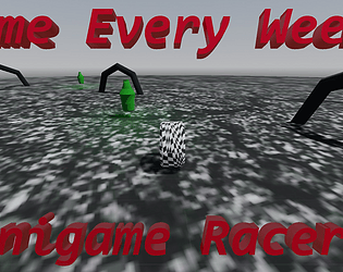
Strong concept, good job on assets and other details of presentation. However, I encountered a bug that made the truck fail to respawn, allowing me to get an unlimited score as long as I just let the game run. I also think that the game would benefit from a more freeform movement style, allowing you more freedom to weave through cars or hit multiple frogs by sideswiping them.
Great concept. Would like to see some more polish. Dragging and dropping can get a bit annoying after a while, I'd like to just be able to hover over and press 1 2 or 3 for the lanes. Clicking the color indicator for a lane should change it. Tasks stack in a way that it can be hard to figure out how many there are, and important tasks can get hidden under unimportant ones. And losing can be a little bit abrupt, and it might doesn't tell you why you lost. Also, you can drag processes onto a lane and not have them actually move onto it, just stuck in limbo
However, despite all these gripes, the game you're trying to make is one I really want to play. There are many ways the game could expand, and a little bit of polish could go a long way in making this game one of my favorites. If we introduced multi-threaded processes into the mix, for example, that would be something quite cool.
I'm glad I got to play this game! Thanks for making it.
Don't love the pause while switching sides, takes me out of the flow. I wish the type of guy you were about to play as was explained better, as the first two characters are very similar, and the slow,ranged character is a bit harder to use. I like everything else, though, especially the font and the kill noise. Time travelly mechanics are hard and you pulled it off! Great job.
Has some rough edges, but given the time frame, can't complain too much about them. Presentation: chromatic aberration/vhs effect/music slowdown as you take damage, incredible. Took a bit to figure out how to play, but once I got it, I liked it a lot. Great core loop. Reminds me of a lot of flash games I played as a kid. My only real complaint is how much grinding it takes to unlock the cool stuff in the shop.
I like the climbing sequence where you're being chased, the rest of the game is a bit unpolished, and I wish that the end of the game let you restart. Because you can't phase through walls even after roles are switched, preventing the purple square from getting to the goal isn't nearly as fun. I like the use of midi notes for sound effects, and I'm happy to see you made all your own art.
Major issues in every aspect of the game. Controls are labeled in the UI have J used twice, should be HJK, was written as JJK, this was confusing to figure out.
There's no score/defendable objective/ any way to tell if I'm winning or losing, and no health bars or sound queues on anything, making it difficult to tell what's going on.
I'm not sure the enemies are even deterministic, making the time travel thing not work very well, the past versions of my character seem to just punch air.
The wizard's spells don't have any effects associated with them, which isn't helpful. I can't tell what the spells are doing.
The game's concept is very solid, I'm a huge fan of time travel, but it seems like you bit off much more than you could chew for this jam. Good effort, I assume getting all the rigs and animations into the game took the majority of dev time, leaving not much time for polish, but the end product is... distinctly underwhelming. Please keep working on it, though! If you were able to make this concept work, I think it would be very fun!
love the concept and it plays well, but I think it needs one or two things to spice up the core loop (like the alien ships in asteroids or the power-ups in breakout).
I'd like to see a black-and-white mode for the highest possible contrast, and I'm not sure if there are minor frame hitches, but I think there might be. Cool game, thanks for making it!!
Haven't had a chance to look into multiplayer much but it seems to work all right.
(current high score holder at 291960, although screenshots imply you've gotten much higher)
Love the game! I'm just old enough to remember using a old DOS machine to play the Putt-Putt games. You replicated it really well! I got really invested in the characters, I ACTUALLY WROTE FIC for the in-universe show, and oh my gosh I love how everyone's flaws are important but not off-putting to their character, and the way the characters talked (typos, emotes, etc) really brought out their personality.
I ran into some bugs:
-Closing MNet can result in progress being lost, even if you don't exit the game
-Sometimes, the active window isn't on top and is thus invisible
-in fullscreen mode (might be unique issue to my 3:2 display) mouse cursor's position desyncs from the sprite representing it.
Thanks so much for making this game <3````
I love what you finished. The art style is beautiful, the poses are expressive and full of character. The background, music, and consistent theme, color scheme and style across the entire game really add to the immersion, too. If you ever get around to finishing this game, I would be very exited to play it. For now, I'm glad something like this- so full of style and grace, in ways I want my work to have, exists. Thank you.
TL;DR Fun, fast-paced, and colorful. It reminds me fondly of spending all day playing smup flash games.
The Great:
I love the focus on giving the player lots of ways to avoid troublesome obstacles! My favorite is definitely the dodge roll, with the saber as a close second (because I can't use it as consistently). I didn't like ducking behind cover at first, but I've come to love it as a catch-your-breath button.
The varied enemies are great, especially the diverse set of projectiles. I love exploding cars (Reminds me of Commando and Commando 2 in the best way), and the soundtrack feels good. I also like how the aim mechanic forces you to move to actually hit what you're aiming at.
The Good:
Although I like the focus on gameplay over story, a hint of story before the end of the first level might be nice. The main character's design is beautiful, and the animations are snappy and satisfying, but I can't tell that she's shooting beams out of her hand, instead of just having a laser pistol.
The enemy designs are also pretty good. The bright palette and good use of profiles really helps sell them, and keep them distinct from everything else going on. It might just be because I suck and have to repeat levels a lot, but I've noticed the same animations over and over again, so it might serve the game well to mix them up a little more like the voice lines.
The Meh: Having to remap every key to change just one is a little annoying.
The bad:
The default controls are a little clunky, especially for keyboard, and I don't like how the tutorial restarts completely when you die. I'd also like an option to make aiming a toggle rather than a hold-down. The saber also doesn't seem the most reliable: any tips for getting more out of it?
In conclusion, this game is a lot of fun, and really polished. It exceeded my expectations by far, and I'm very happy with the value for money. I'd be happy to pay $10 for it now that I know how good it is. Maybe I will when I get around to your other games.
Oh, congrats!
I don't have a twitter, sorry. I've been told to make one, so if I ever do, I'll let you know :)
As for music and animation, there are lots of solutions. You can find free stuff online or find talented people to help you out. You can also learn to do it yourself, but that's a little more time intensive.
I'll keep playing your games because I enjoy them, so please keep making them (when you have time, of course)
Thank you!
Music is kind of subjective, but I tend not to like harsh, high pitched tones too much.
You definitely did what you set out to do :)
That's interesting. What were you trying to make the rat's animation feel like?
I think it might be fun to have a third mode where the mines explode after three or four beeps.
Thanks for continuing to make interesting games :)
The concept is quite cool, and I like the way that mines beep to make them easier to find. The main menu theme sounds terrible (sorry, it does), but the level song is pretty good. I would like to hear a longer loop of it.
The menu looks really good. I like the way day mode, the top of the game's title, and night mode all glow in contrast to the dark, gloomy surroundings. It's very clear what you're supposed to do. I chose day mode first, which was a clever way to make me play the tutorial without labeling it as such or giving me on-screen instructions.
The visual design in-level is also great.- the rocks, mine, rat, and background are all very easy to distinguish from each other, since each has a distinct size, shape, and color. The audio que with the mines makes it fun to hunt them fast. I am not, however, a big fan of the player model or its animations.
Over all, it's a solid experience that left me wanting more.
Three small improvements:
Have the mines explode at some point
Improve the animations for the rat, especially in day mode, where it's more zoomed in on it
Replace the main menu theme, or use the level theme for it too, and extend the loop so it doesn't get annoying after two minutes.


