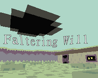
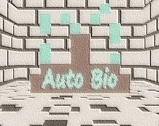
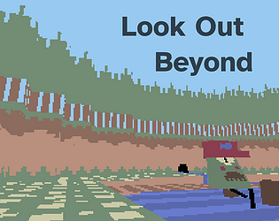
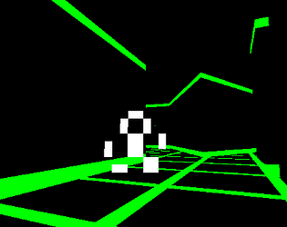
Oh hell yeah, also the graphic design on this itch page goes crazy
seacreek
Creator of
Recent community posts
If you're looking for tips to progress, just run into anything that looks like a point of interest and read the dialogue. You'll get to the ending quickly. Thanks for giving it a try! : )
I would also definitely appreciate feedback on what specifically was confusing so I can improve it in the future.
Thanks for the detailed review! Yeah this was Kyle's first soundtrack on a Bitsy game, and he did more for others after. He's a great composer!
I was planning for this game to have 4 dungeons and a whole plot about the Sheriff being insane, and people just playing along that she was a sheriff. There would be a final boss fight with the sheriff, and a really foreboding and fantastic track was left unused for it. Still in the files!
You did have a little laser sword yeah, I just gave up on the enemy feature eventually and left it in for fun. I believe your health might have refilled when you got key cards but maybe not lol. One of the main criticisms was the timing being too hard and not much fun, which I agree with.
And yeah, you were originally going to have an inventory and upgrade path. I made this game as a launch title for the Playdate, and so had a deadline. I lost steam eventually, but knew I only had one opportunity to make a launch game lol, so I slapped together an ending.
I recommend trying out some of my other games, they have a similar cute character based exploration, and are mostly 3D now!
I got really into Bitsy 3D (the color variant) in the last year. If you think not of how to bend the engine to your ideas, but of what would best fit its limitations, some amazing things can happen.
Really the big limit is the bitsy room size. Modern 3D exploration is all about looking out onto a vista, seeing the world out before you, and Bitsy 3D says absolutely not. Most of my spatial design has gone into how to work with this, instead of despite it.
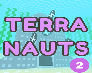
In Terranauts Ep. 2 I did so by making the vista smaller. I started the player in a trench at the bottom of a hill, packing in as many conversations, set pieces, and corners as I could into the ascent of one 16x16 room. This way, by the time you climbed halfway or all the way up, you could turn around and look down with a sense that you'd really gone somewhere.
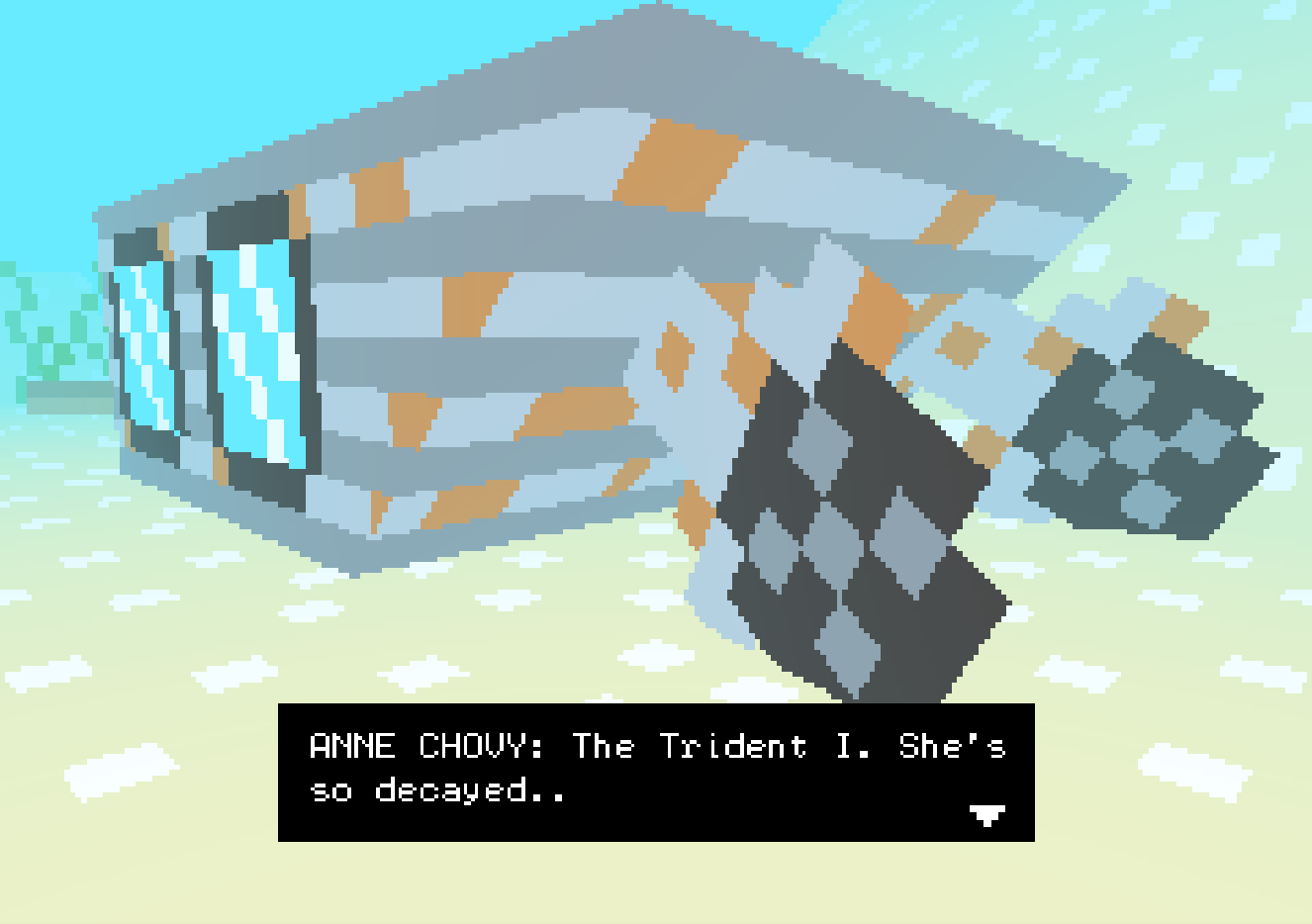
In my current project I'm looking back on how developers dealt with this constraint in the late 90s. Ocarina of Time heavily blocks the player in, giving you the sense that the world continues far past what you can see. It does this with tree walls, fences, hills, cliffs, anything to convince the player that cleverly disguised interior spaces are actually vast exterior ones. This approach is the only way forward I can see for rendering outside spaces in Bitsy 3D in a satisfying way.
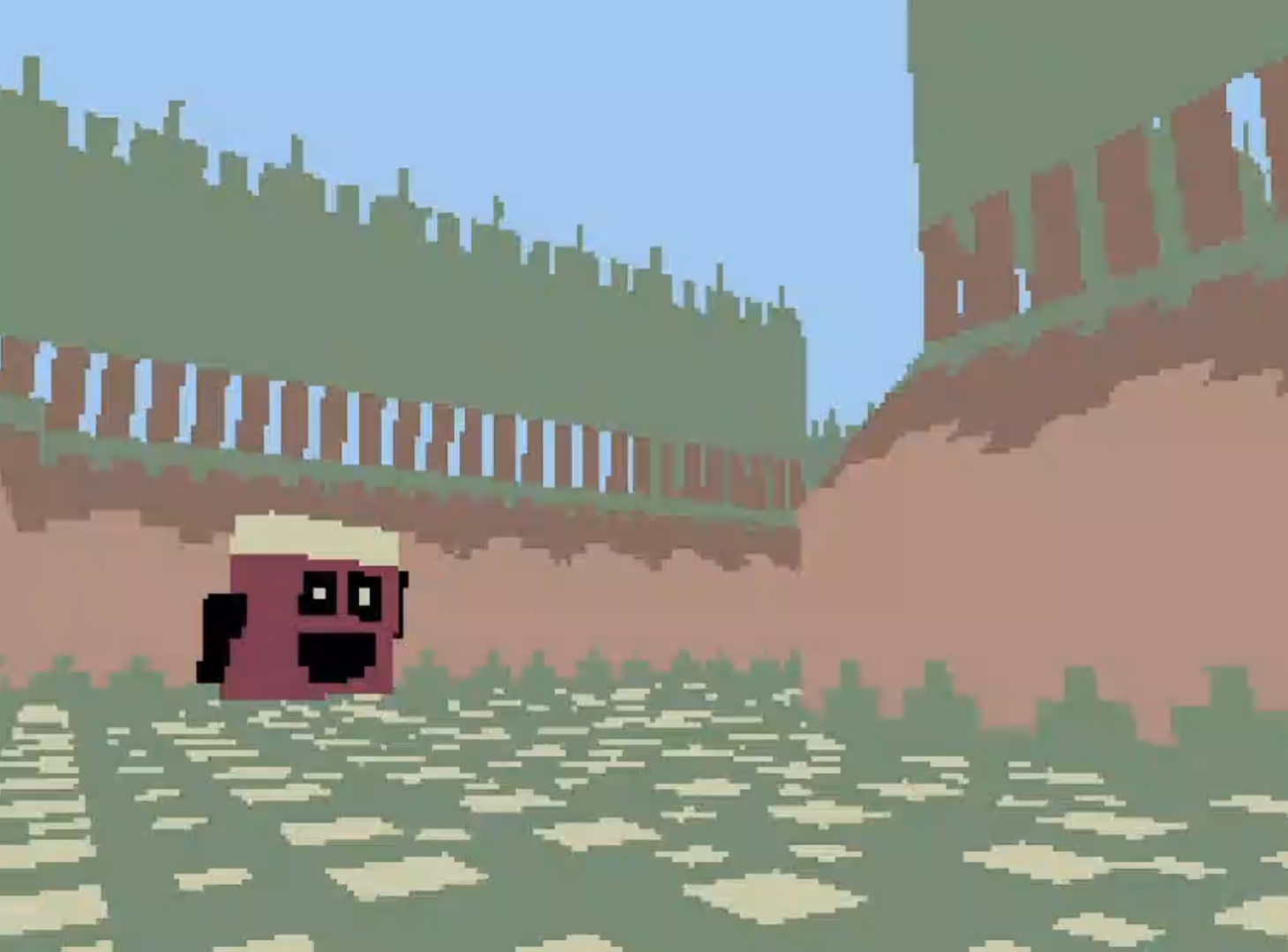
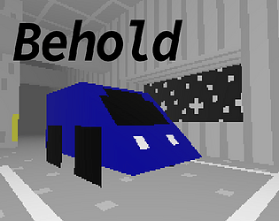
But then there's the 3D modeling itself. This is what really keeps me coming back. You get boxes, wedges, billboards, and planes. That's it, but you can do so much because of the transform functions. Planes can be skewed onto a wedge and a box to create a fully textured car. Multiple pole shaped boxes make convincing posts for your bridge of perpendicular plane textures. Skew billboard seaweed into your flat tower for an overgrown water meter. The possibilities are endless!

I recently realized you can link multiple assets together, transformed relative to each other. This has really emboldened my recent shift towards actually 3D characters, instead of just bitsy billboard sprites. I also find good results with a crunchy resolution and appropriate fog, but these are just aesthetic preferences.
So yeah, Bitsy 3D is my favorite game engine of all time. Thanks for making it Aloelazoe and Aurysystem, hope this is an interesting read for someone out there!
I've been making games in Bitsy Color 3D lately, and looked through the itch tags to see what others have done with the engine. This is amazing! Skewing a number of tiles together to construct models, like the bottles and the bugs, is something I've been experimenting with as well. It's crazy what this engine can do if you convince it to, and you did a great job taking advantage of everything.
There is some z-fighting in the canopy which could be fixed relatively easily, and I think the open ended nature of the world makes it a bit disorienting in first person 3D, but the atmosphere is great.
I was wondering how you managed to collect an item in one shot when its made of 3 tiles? The bottles and mushrooms I mean.
One option I would love is a horizontal panning limiter. I've been wanting to make a camera whee you do the dungeon crawler movement, but have mouselook limited to a 45 degree cone around your current facing position. This would be the best of both worlds I think. However with no horizontal panning limiter it's not possible.
Love Bitsy 3D! Thank you for this tool.
Hey Terry! I first played VVVVVV when I was 11 or so, and you've been a big inspiration ever since! Making games solo is a long tedious process, but you were one of the first people that made me say "Wow, maybe I could do this."
This game is tough for me. The sense of unfolding and discovery is great, but I did find myself just a little wanting for a more decisive conclusion.
Enjoyed this one, glad you're feeling better, looking forward to your future stuff. ( :
This game is fantastic!
First, I was inspired by the artwork. The way you use a ton of billboard sprites together with very basic shapes to create a compelling world is awesome. It's been my dream for a long time to make walking sim type games in 3D using my own art, and this gives me plenty of ideas for how to do it without having to learn blender lol.
!Spoilers Ahead!
Then I got really taken in by all the cool characters and fun little side things, including this one rare redshirt dude I kept finding.
Then I died, got turned around, ended up in the throne room, and realized there is an actual way to beat the game. This was at first disheartening, because the sequence was long and I had no way of knowing which sprites were the knights. Regardless, I got my pen and paper.
I walked around some more, trying the sequence on different folks, until I got to the last area I hadn't seen. It was a big house, and at the very top I found a red shirt guy. The game design was screaming at me, and I finally listened. My fingers flirted upon the lute, and the little dude zoomed away.
I then died, went to the throne room, and saw him there. Up to this point I was losing steam fast, having traversed the whole game twice by then. In that moment though, I was filled with an unmatched determination, and quickly got the other 4 using my mental map of the game.
The ending wasn't anything fancy, but that didn't matter. The game had not given me a tutorial, a map, or really even guided me towards the solution, but nevertheless I succeeded! You don't get that much in modern game design.
My main note is just a faster walk speed. Default is way too slow, so my pinky got quite tired.
Thanks for a fun experience! This is my favorite game genre, and I'm putting this one right next to Cryptworlds and Goblet Grotto on my shelf.
Definitely. The lack of any real complexity to the level is rough. You find the key, you open a door, level done. It seems like you could make it so that you start out without a weapon or with a weapon with 0 attack, and then a weapon could become a key of sorts to open a door which would be a destructible sprite, but I haven't experimented with that yet.
Right now I have it where each level is a location in which the player must find a new insight (The key, rendered as an❗) to an overarching mystery, which allows them to leave the location. Then the end screen is a journal entry where they discuss the insight, and how it leads them to the next location.
Enemies are NPCs that demoralize the player in some way, which they can heal by seeing scenes of positivity (which are designed to funnel the player onto an invisible health pickup). They can also find scenes of negativity in the level, which gives them conviction, which is used as ammo to neutralize said NPCs.
It's a bit silly laid out without the context the audio and visuals would give to those actions, but that's the fun of limitations right?
Once I downloaded this I sat down and read/watched it cover to cover. RGM is exactly the tool I've been needing, and this unreasonably thorough guide really sealed the deal.
Near the beginning you say this tool can only be used for FPS games where you shoot things, and that seems like a challenge. I'd been planning on making a narrative adventure game in RGM even before I read this lol. You laid out the exact limits of the engine so well that by the time I'd finished reading I'd already figured out the basic design.
Thanks! Your work is much appreciated.


