Really fun game Euris! As always your art and animations are a lot of fun and give this game such character. I only have a few criticisms regaurding the controls, as they seem a bit floaty and inconsistent, although that could just be itch.io acting up. While jumping and landing, the collider on either the objects or the player is a bit off and activates far past the area it should. When falling, the player is pushed back in a strange way causing a life to be lost and/or a game over. This is really the only part of the game I did not enjoy, everything else was spectacular!
ses880
Creator of
Recent community posts
I enjoyed the simplicity of this game, and earning back seconds by catching flies was a nice little reward system in conjunction with the actual score going up. I do not feel like this was putting me in the perspective of a frog or any creature besides a person picking at flies. Simply adding a ribbit sound everytime a fly is eaten or a tongue sprite lashing out (even if it is not properly aimed at the fly that has been eaten) would really drive home that this game is about being a frog.
What a gorgeous game! You really succeeded at making a very nice visual style with your use of natural colors and low-poly models. The aesthetic is remiscent of wooden block toys and is very nostalgic. I did not expect to see so many models either, the picnic area and log cabin where very nice as well, as was your fox's walking animation. Even though the programming is spare and not the focus of this game, it could really benefit from the simple addition of mesh colliders. It was a bit jarring to be walking so smoothly and then find myself phasing through trees and logs.
I really enjoyed the simplicity of this game, and the eye movements of the pet really help bring it to life! I think there is a simple code to make the eye movements interact with the mouse, adding that could give this game a nice layer of interactivity that I believe could really make it a lot of fun, if you want to keep the minimalist style. Another thing I would recommend would be some sort of goal, it could even be something small like the color of the sprite changes when you have fed or played with it a certain amount. Currently, I do not understand if I am feeding or playing with it for a certain reason, a level/progress bar could help with that a lot, or some form of numbers at the top, or even if the pet decided to say something when it had eaten enough food or something like that to let me know I was succeeding in some way. Sorry if this is a bit confusing!
This is such a cool idea for a virtual pet game, it might be my favorite I've seen so far. The static texture and sharpness of the 3d objects cements this very 90s style that reminds me a lot of pocket virtual pets like tamagotchi and cube world, is that coincidental or did you directly reference those properties? Either way, very cohesive style! I don't know if this is because of itch or the actual game, although I assume it's itch, but i felt like a lot of the movement and gameplay was a bit laggy, and I wasn't in control of what buttons I was pressing. Maybe consider making the room a bit smaller so the laggy-ness of the movement has less impact on the overall gameplay?
EURIS I love this so much, I don't know if you were practicing art nonstop during quarantine or what but you have improved an insane amount, the visual language of this game is so cohesive! All your color choices really help fit and create a really grimy feeling. The idea of this is also super fun and very creative, I wanted to explore all the ways I could interact with my little gamer. I was a little bit confused as to what the different buttons were doing, and when I had succeeded and failed. I pressed the buttons randomly just to see what would happen and a lot of them felt unresponsive. Maybe a progress bar of some sort could help solve this issue? Either way, fantastic work!
I really enjoy the beauty of this game, it reminds me of a meditative ios game, and the pastel colors really add to the calming affect. I enjoyed the sound effects of the stone as well. I felt a bit confused about where the stone was, and how I was supposed to time the jump/space button pressing to maximize the high score. I was also confused as to the purpose of the timer, was I supposed to want the time to be lesser or more? I was confused about this and tried to go back to the title screen to see if this was mentioned here, but wasnt able to. This is a bit of a nitpick, the game as a whole was very enjoyable! the only thing I would really recommend to change would be to add a shadow of the rock so the timing of the skip can be better calculated.
I really enjoyed this game! The login screen and ingame visuals are very cohesive and fit together very nicely. A small touch I particularly enjoy is the animated start screen. I was a little confused at the start as I assumed I would be protecting the earth with my asteroid as opposed to protecting myself and letting the earth get hit, perhaps change the planet to a different planet that isnt earth or find another way to portray that to the player? Another critique I have is the score feels a bit detached from the game, maybe flash a 100 above the player instead of having the score climb up seemingly randomly. Again, this is simply a nitpick, your game is a lot of fun!
I like how the sprout does not only grow when you press space, but flickers. This reminds me of older nintendo games like mario and is a really nice shorthand for those familiar with games to know that you are "powering up". I wish there was a more cohesive art style with this game, I recognize that you are using the pixel background from the stardew valley start up screen: I wish you would have made the sprout pixel art aswell, and maybe had the timer be in a pixel font. Or, if you wanted to use the hand drawn style for the sprout, either have a solid background or simply trace the mountains with a pen tool in photoshop for a quick background.
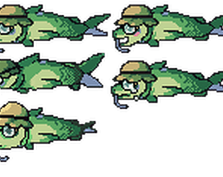
this was a lot of fun and I love the goofy movements of the fish character, he is really so smooth! I felt like I wasn't able to control him very well, and when I would try and jump to a certain platform, I felt like the fish would jump in the other direction. It also took me a moment to realize the bread was a platform and not part of the background. When I had realized that, I had already lost a life. Maybe outline the platforms with boxes so it is easier to notice and aim your fish at them. Still a very fun game with a lot of personality!
i love the art style of this game, its a lot of fun! Maybe giving the player character a few more colors could have made him look a but more like he fits with the woman and man, however. I like the animation and sound provided too! I really enjoyed pressing the space bar to make the chest beating sound as opposed to pressing it in order to get the girl. Another small critique is the dollar bills that come out of the man not really fitting the art style either, they look more like real dollar bills then ones that would be part of this mating season universe.
This is a very interesting take on the game, but I am confused as to whether the art style was a choice or meant to be a stand in until the original sprite art was acquired. Either way, the framework is all there and this game plays very much like the the original. The shooting was also very accurate and I enjoyed how you were able to get the bullet to follow the velocity of the player.
This is such a cool clone, not only is it essentially identical to the original emulator, but the sekiro reference makes it standout nicely. The only issues are relatively small potatos, the money will and hi score to increase seemingly at random, and the sprites do not change. Everything else runs smoothly, great work!


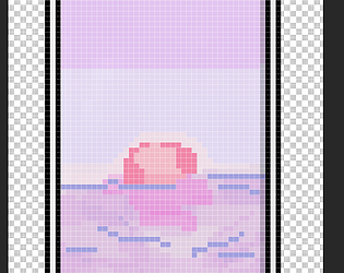
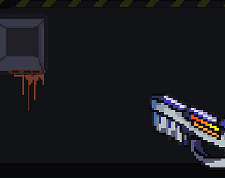

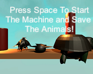

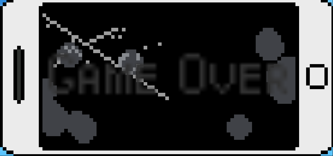 Thank you for the feedback! Thats very strange, i actually did create an ending screen that was exactly that. I guess there is something wrong with the build. Here is what it looks like in unity: