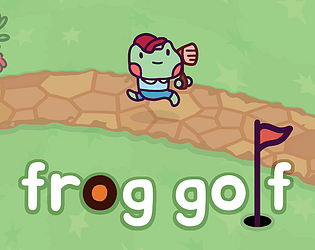
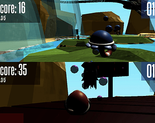
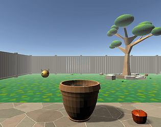
I thought this was a really cute and simple game! The biggest critique I had with it was that the score didn't work (it kept saying I had 0 eggs at the end). As a result I wish there was something to communicate you've caught an egg in game - something like the addition of a sound effect or showing the score, just to know that I'm doing it right. I also feel like the eggs fall a little fast, especially at the beginning when you're first getting used to the game. Overall though I though this was a really cute game!
Pianoducks
Creator of
Recent community posts
Hey Zitta,
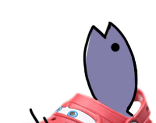
I really loved the design of the fish! It's so nice and simple - and it's really cool how they become arrows. Additionally, the level design was really nice! I felt like it did a really good job at starting simpler so the player can learn the mechanics before increasing in difficulty. This is a rather small critique but initially, I read the grey area you can move around in as a text box you'd close out of once you finished the tutorial, and I kept trying to figure out how to click on the exit button, it took me awhile to see the exit and then realize the exit text was a label and I was already in the level. I do wish there was a bit more of a distinction between the borders and background. Also, I felt like the fish moved extremely slow - while it did a good job of communicating this feeling of being underwater it also made moving around feel tedious at times. Overall though this is such an interesting mechanic! It was alot of fun to play.
I thought this was a really cute way to interpret the prompt! Admittedly I was also rather confused about what to do - I knew that I had to find the ball but once I did I thought I was supposed to pick it up and bring it back, so when clicked on it and the game restarted, I thought I had accidentally restarted the game or something. Something like a winscreen or even just an explanation in the description of the exact controls would have helped clarify this alot. Additionally, I think it might help to add some fog into the game. It doesn't have to be super heavy, just so that the background doesn't extend off into infinity, completely barren. Overall though I thought this was a great prototype! The models especially look amazing.
Hey Arjun!
I really liked the cell shaded style of your game! I thought it looked rather nice and clean. That being said, having such harsh, solid shadows on the objects but no shading on the water droplet itself did feel a little weird to me, it makes the water droplet look a tad out of place. Additionally, while I loved the bouncy, fluid feeling of the water droplet, I do wish there was a bit of acceleration/deceleration when moving. the movement's rather jerky as it is, making it really easy to fall off of stuff. Overall though I thought this was a really cool game!
Hey Raymond!
I really love the sound design of your game! The music you picked was very sweet and relaxing, and the meow the cat made when jumping was adorable. I think my biggest critique would be with the movement. Maybe adding some sort of acceleration/deceleration would make it feel alot less jerky, and having the camera bob kind of like a head moving up and down when walking could really sell the feeling that this is a cat walking as opposed to just a floating camera. Additionally, the camera would sometimes clip through objects when looking down. Overall though I think this is a really cute prototype! I had fun playing it.
I think this is a really interesting concept, and I love the way you did the art especially! It's all very bright and fun, and the music compliments it really well. However, I'm admittedly a bit stumped on what I'm supposed to do - is the goal simply to push the button the finger's hovering over? If so I think it'd be a lot clearer if the player saw the hand moving towards the button, or any sort of indication of which buttons coming up. As of right now I haven't been able to successfully click on a button before the hand, even knowing the which buttons it'll go to pre-emptively. I'm not sure if that's because of a glitch or just an issue with my laptop. That being said I think this is a really interesting concept overall, and a cool take on non-human POV.
I thought this was a really cool concept! The sound design feels super nice and the art's clear and readable - I especially liked the additions of the light hum throughout the entire game, it really instilled this feeling I'm working in some sort of high tech lab. I think my greatest critique would be with where the atoms spawn - sometimes they'd spawn right in your atom and cause you to instantly have a crash, and other times they'd spawn so far away you'd have to spend a good chunk of time just waiting - which felt rather tedious in the earlier stages where there wasn't much to do. This is a small thing but additionally, when the second nucleus first came in I had read it as an "enemy" nucleus that I want to absorb the atoms I was trying to get - it wasn't until I kept trying to get atoms with my previous nucleus and they'd zoom straight by me that I realized the other nucleus is also mine. I wonder if some kind of animation to show that the bigger nucleus is "finished" would help clarify that. Overall though it's a super well done game! I enjoyed playing it alot.
Hey Raymond!
I really liked the art for your game! Both the music and sprites are so cheery, and overall all it feels really fun. That being said I do feel like the text doesn't quite match the style of the rest of the game. Also, it gets cut off even when fullscreened. Additionally, I feel like the jump's a little slow, especially considering the bright, upbeat nature of everything else. Overall though it's a really fun game!
This is a super cool concept! I really like the color palette and the style in general - everything looks really nice and clean! I think the greatest critique I have is there seems to be some issues with the detection during the jump recording - I had to press space twice before it would work. Additionally, this is rather nitpicky but I don't think it's necessary to have the player press space at the end of each cycle to move on to the next action (ie once you finish recording right you have to hit space again to the jump action and then space again to record - I think it'd make more sense to just switch to the jump action automatically then hit space to actually start recording). Overall though this is a really interesting mechanic!
I really loved the art! Like the others mentioned the color palette and theme work so well together, and the music does an excellent job of complimenting it all. However, I was rather confused about how to play at the start. When I first saw the bars, I had assumed the pet bar was how many more pets I'd be able to give, and while I was eventually able to figure it out, it does feel odd that the command to pet was shown down at the bottom right corner of the screen when it's a main mechanic. I wonder if it would be clearer if the pet bar was displayed horizontally above the bunny and the pet command displayed below that, right in the center of the screen. Overall though it's an absolutely adorable game! I couldn't think of a better reward for winning than cute bunny videos :D
The sprites you used look great! The cats are adorable and the animation for the bullet looks especially nice. You also did a great job duplicating the UI of the game as well.
One thing I noticed however was that the game doesn't scale up when you change it to fullscreen! if you put the UI on a canvas and set it to scale with screensize I'm pretty sure that'll prevent that.
Overall though it's a lovely duplicate!
You did a really good job replicating the ui and sound! I especially liked the animation when it would switch from day to night shift. I think my greatest critique would be with the art style - for some sprites such as the trees and the sprite where you hit a biker, you used these sort of paintbrush like textures. Alternatively, there were sprites like the bullet or ui which had thick, solid outlines and no texture, and they stick out quite alot as a result. Additionally, the colors feel a bit too saturated in comparison to the original game, the sky especially. Overall though, it's a really well done clone!
You did a really good job replicating the sprites and ui! The biggest critique I have is the fact that the turning is extremely sensitive, it's so fast that it feels more like the bikers are sliding across the screen than actually moving across it. Additionally, the hitboxes feel a little bit too big to me, there were a couple instances where it'd look like I passed by a tree and it'd take a life anyways. Overall though, it's a really well done clone!
I really like how the sound was done for yours! You did a good job of communicating how fast the players moving by the pitch or the motorbike sound, and I thought it was a really interesting detail that the audio had static added to it when the bike was damaged.
I think my biggest critique would be with the movement of the other bikers - since they were also attached to the camera, it wasn't possible to aim at them, you'd just have to hope they'd enter your field of vision. Also, this is a really small detail, but the trees would spawn in even if there were enough in your field of vision - so when you're standing completely still the trees keep spawning and despawning and it looks a bit odd as a result.
Overall though, it's a really well done clone!!
The sprites look really great! I especially liked the bullet sprite and particles, I know they weren't the same as the death chase ones but they looked super nice!
I think my biggest critique would be the movement - it's alot slower than in the original, and there were times where the other bikers would exit my range and it'd take a super long time to aim at them again. It also felt a little weird that turning would just have the biker slide to the side then actually turn.
The rest looks great though! it's a really well done duplicate :D


