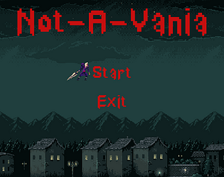
The assets all have their own licenses. You'll need to review the credits and details included in the template. I believe all of them are some form of creative commons but require visble attribution.
The event logic I created is MIT licensed, you're welcome to use it for whatever you like.
Silver-Streak
Creator of
Recent community posts
This tool is fantastic, thanks for releasing it!
Is there anything to look out for on redeems? I have 2 redeems, one for the Emote Single (named Clonk), and one for the Emote Barrage (named ManyClonk).
Both detect the redeems correctly after doing "Listen". However only the Emote Barrage will activate correctly. The Emote Single will never show up even after being redeemed, even though the test screen works correctly.
Is there anything I should be looking for to fix this?
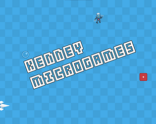
Minigames were pretty good, and I like the setup!
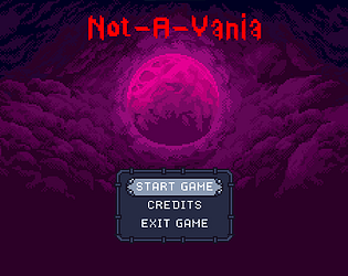
As others have mentioned, the title screen can be harsh on the eyes. However, what's worse is that since it is a rapid repeating pattern and alternating color, it could be very dangerous for anyone with Epilepsy.
I see you're going to work on changing that after the jam, so no worries, but keep in mind in the future you should always avoid rapidly repeating patterns and colors to prevent your game from potentially causing someone to have an actual (and dangerous) seizure.
No worries at all! Definitely nothing rude there, as with the other, my response was to just add detail.
Overall, thanks for the quick reply. And yes, based off how my original comment you were describing could be read, I can totally get what you meant. I went back and edited it, because I think their criticism is totally valid.
What's worse is I just found another pack from Kenney that had larger buttons, just not in the asset store. Doh.
Edit: Also, never feel bad for championing accessibility. While there's always a push and pull between authorial intent (like what From Soft does) and user access, there is NEVER anything wrong with asking for more accessibility.
Gotta hand it to Kenney, he always releases great quality assets.
All of the voices are from his Voiceover pack: https://kenney.nl/assets/voiceover-pack
Someone else above mentioned this as well. Can you give context on the issues you ran into?
That game should have a Target indicator on the upper right in the box, and there are 5 targets that are placed around the player (always the same place and always the same order). With that in mind was there an issue when you shooting the target that matched the one in the box, or was there too much visual noise from the other objects?
- "Couldn't make sense of what was happening in the shoot the target level. Possibly a bug but IDK. When it kept repeatedly giving me that level it became annoying."
- Can you give context on this one? The only thing that should be required is shooting the target shown in the target box in the upper right (which will be one of the 5 surrounding the player ship). The challenge of that level is that the stations/stars/meteors all randomly generate around the level to be visual noise, but the actual targets are always the in the same place and the same order.
- With the above context in mind, were you running into issues where shooting the matching target of the five didn't register as a success? or was the visual noise from the other objects in the scene too much?
- "Just a quick note regarding making the UI challenging: You are not doing yourself a favor here. That would be like if the Elden Ring technical director said to the UI team: "Huh game is not hard enough, you need to turn every piece of text in the game upside down, so funny haha". It'd make some funny meme videos, but after that nobody would ever want to play the game again."
- I can totally see what you mean. To clarify, my comment wasn't to call out that their feedback was wrong, it was to give context on the why it was that way (I actually reduced difficulty on that one, as originally the jump button was randomly placed every time the game loaded). I will add an update to that comment incase it was interpreted differently.
Although your mention of elden ring is an interesting callout, because the director has actually done interviews where they explicitly took out UI elements to make it harder (there was a quest log or some kind of quest visual indicator at one point that they removed).
Similarly, in the context of Warioware, UI obfuscation is not an uncommon component of many of the microgames over the various sequels they have done, since most of them only have one button/single focus interactions. Many times difficulty is added through UI changes/covering the inputs/etc.
Thanks! The jump button is made small for two reasons:
1. I made sure to not resize any of Kenney's assets. They're all kept at their original size.
2. Having to move over to where the button is is part of the challenge of that level. :D
Edit: Just to clarify on the above as someone else mentioned the concern, this is not to say your feedback is wrong, just to give context on why it was designed that way.
Also available over on Liluo: https://liluo.io/silver-streak/kenney-microgames
Hey! I love these assets and am wanting to check on your distribution license.
One of the engines I use has an asset library for users that lists a bunch of free assets (with accreditation), but the asset library *is* stored on a centralized server off itch. While I'm assuming your licensing would restrict/deny this type of use, I wanted to confirm to be 100% sure.
Sorry, missed this reply. I'm working on the boss logic today and I expect to have the example done this weekend if not early next week.
Finished it today! Here you go: https://silver-streak.itch.io/not-a-vania-redux
The new example will have a Finite State Machine, allowing you to avoid animation conflicts/have as many "check" variables in the player controls.
It will also have more detailed explanations on Enemy AI, a basic title screen with both Gamepad and Keyboard support, a "speedrun" timer, etc.
Both of these are examples, but I intend to put big huge disclaimers all over this one pointing people to the new one once I'm done, since I would probably not recommend most of the methods I have in the old example to people.
Looks like the project folder I have updated has "Loop" enabled on that animation for some reason, even though my local copy and the compiled version does not.
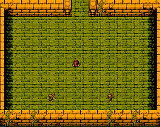
This was my first project using GD5, so it has a lot of bad practices in it. I'm currently working on remaking this using all of the stuff I've learned over the past year or so, so I would say wait for that. But I'm uploading a copy with this fixed. As mentioned, you can just open the hero object and uncheck the loop option to avoid this.
The fixed project has now been uploaded.


