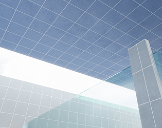
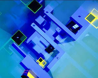
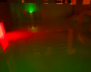
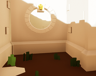
Took me a while to notice the color changing. Add sound and increase the lenght to two to five minutes to allow to get into a flow and you have a smart little timewaster.
Smuf Mcfudel
Creator of
Recent community posts
OMG I AM ON TWITCH !!!
Thank you so much for playing and commenting. Totally agree with the critique on the color scheme. I will definitely put some thoughts into it when I remake it after doing 2 or 3 other projects.
The text tutorials were planned to have homouristic character, because the level at the start is repetitive in levels 1 and 2 . The thing with one key being placed ofen behind you repeats 3 times and two or threee levels have the same starting message.
I think this could easily be missed when a levels eats most of your attention span. Maybe I could fix that with timers on messages like "under 15 seconds = normal message" and "more than 60 seconds = explain what mechanic to use"
Uuuh. Just saw you dropping to the bottom of that tower level right before the finish. Ouch.
I don't know what is wrong there though. After the launch pad you should be able to do the second half of the double jump and even dash after that. But if it was unresponsive once, you learned the mechanic in an unintuive way. KUDOS for super-jump though, jumping exactly when the pad launches, that was a new one for me. I could be that in the back for a hard mode :D
Seeing someone playing it helps so much with future design decisions: colors, mechanics, even designing level areas in a way where someone who can't make a jump in an intended way would be able to finish it even when it takes longer.
Nice to hear you mention a timer: it was planned but I couldn't get it done on my last night developing it.
And thanks for sticking with it through the end. Just closing it may had emotionally damaged me :D I can see the frustration though.
Nice idea, great execution aside from the balancing that a gamejam usually leaves no time for really tuning fine. Sometimes I was not able to either reach a box or pick it up because the interaction would not pop up. I liked your humor on the strenght and speed upgrader :D . Very well done for the original amount of time you had.
Thank you very much for the kind review. Credits for the artstyle and most of the mechanics goes to Gavin Eisenbeisz's course
https://www.udemy.com/course/unrealengine5-make-your-first-game/
The contrast issues are last minute, for I needed some harder ones on the levels after realizing that the original version (a whole lot darker with much more lightning) was single digit FPS even in the editor. I'm glad you liked the pacing of the learning curve. I would have loved to play around with the platforms and lasers a little more, but the jam already ate up a lot of time. The two full weekends decision was great though, couldn't have finished without it.
Thank you for the feedback.
If I had to take a guess, then it is a) a mixture of the camera being a little to much forward, for I wasn't able to fix the issue of being able to look inside the character, b) the character standing a little sideways in the idle, giving the feel of not running straight when you start running , and c) inexperience on my part on exactly how much of each value plays into another.
Thanks for the "(no reflections)? " explanation. I always wondered what people meant with "vampire". To be honest, I did not even noticed that. If I had noticed though, I would have disabled it. I am developing on a 280x, I can not even reach 30 FPS outside of the editor :D.


