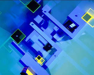
Play game
Launch to get dopamine's itch.io pageResults
| Criteria | Rank | Score* | Raw Score |
| Execution | #45 | 2.333 | 3.500 |
| Audiovisual Presentation | #49 | 2.333 | 3.500 |
| Overall | #56 | 2.167 | 3.250 |
| Creativity | #70 | 1.667 | 2.500 |
Ranked from 4 ratings. Score is adjusted from raw score by the median number of ratings per game in the jam.
Leave a comment
Log in with itch.io to leave a comment.


Comments
Very simple and fun, sometimes a little hard to see where the eys were but it could just be my color blindness acting up
Hi. Thanks for trying out and rating. Yeah. After all the critique I kinda see how the color spectrum is a mess :D ^^
I really liked this Game.
Btw. awesome music !
Thank you. Credits for that goes to 'The Ever Expanding Audio Collection'.
Controls were a little awkward but it’s hard to explain exactly why. Is it canon that the player is a vampire (no reflections)?
Thank you for the feedback.
If I had to take a guess, then it is a) a mixture of the camera being a little to much forward, for I wasn't able to fix the issue of being able to look inside the character, b) the character standing a little sideways in the idle, giving the feel of not running straight when you start running , and c) inexperience on my part on exactly how much of each value plays into another.
Thanks for the "(no reflections)? " explanation. I always wondered what people meant with "vampire". To be honest, I did not even noticed that. If I had noticed though, I would have disabled it. I am developing on a 280x, I can not even reach 30 FPS outside of the editor :D.
I think it’s okay, it doesn’t take anything away from the game. And it’s fun to just add it to the lore that the player is secretly a vampire lol
Wow, that was awesome. The character of the text boxes to the difficulty curve was amazing. Levels 6 and beyond were a complete blast, and everything before that set up a good understanding of the mechanics. The game looks stunning, and the control over the character is well done for a game jam (a little finicky here and there, but what can you do). My only gripe is that sometimes the contrast between the environment and the collectibles or hazards (red on red or blue on blue) is a bit hard to read at times. Well done!
Thank you very much for the kind review. Credits for the artstyle and most of the mechanics goes to Gavin Eisenbeisz's course
https://www.udemy.com/course/unrealengine5-make-your-first-game/
The contrast issues are last minute, for I needed some harder ones on the levels after realizing that the original version (a whole lot darker with much more lightning) was single digit FPS even in the editor. I'm glad you liked the pacing of the learning curve. I would have loved to play around with the platforms and lasers a little more, but the jam already ate up a lot of time. The two full weekends decision was great though, couldn't have finished without it.