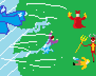
Haha, I'm so happy to hear that my comment made you (as far as I can tell) smile. I hope you love your current life and strive to make it better. I was just curious to see what itch can offer in the field of inverse kinematics and procedural animation. There's this indie game in development called Synthetic Selection which seems really good at that. If you're interested in procedural animation, it's worth checking.
stevegamer
Creator of
Recent community posts
Don't get me wrong, I like your game, it's good, but requires improvements to become great.
It's uncomfortable *for me* in general.
The things below are probably what makes it uncomfortable for me.
- Everything is probably too big
- Font is purely a personal preference, but the wide bold pixel font used everywhere at the moment is a bit bad. It's bold so it's meant to pull a bit more attention than a usual font would. Everything is written in "significant" font, so my eyes are pulled towards... everything? Maybe you should make the regular font less prominent? Like use a less "significant" font probably.
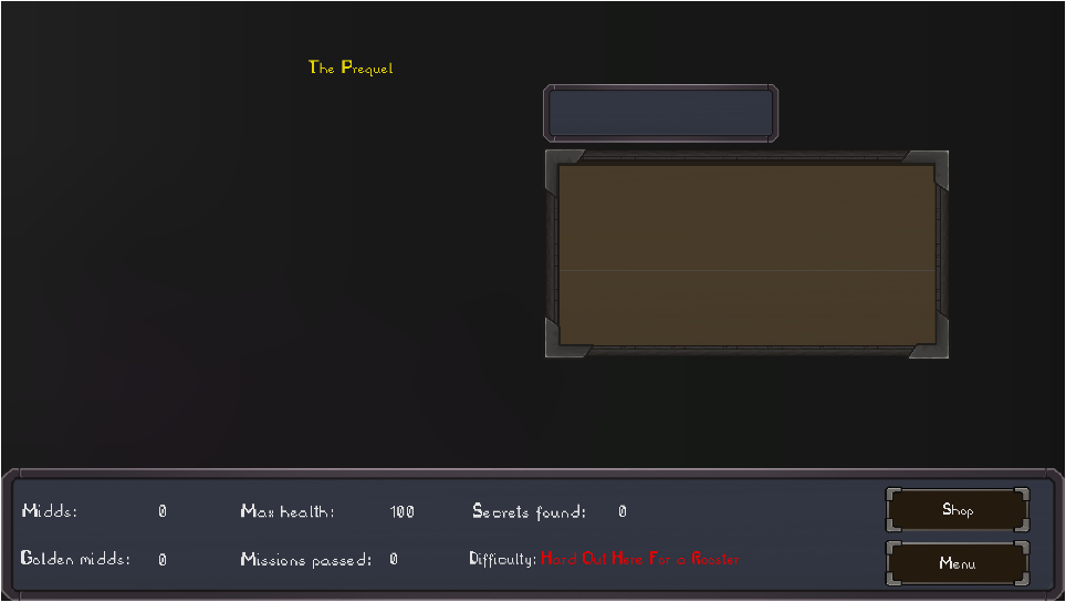
- Too many buttons in the main menu. You could probably put credits & settings into options, and then controls into settings.
- The title in the main menu is a bit too big. I mean, sometimes it's good to leave some spare space. Like, the "quit" button in the main menu doesn't have to be in the left bottom corner.
- I think that Picasso was right when he said "Good artists copy; great artists steal". Look at other games, how did they do UI? I think that without much experience all you can do is to look and learn.
Overall, good game, I like this kind of games. I like the choice of music, how it changes through scenes.
Oh, I see.
Then the game (especially platforming) is too difficult for me. I think you should lower the gravity, I can't perform the jump in the place where you need to open the door with blue button and squirrel tries to kill you.
Also I think that the demo mission (platforming forest) is a bit unsuitable for the game (kill-everything laboratories and outposts), though I respect your vision on how it should be (I haven't played the game yet, only demo, so honestly I can't know if the demo is suitable).
Also I want to say that I like the game: music, gameplay, dialogs and jokes, the sprites and animations. There are many interesting details, like the chicken rotating its head while I move the mouse.
P. S.
Thanks, now I hate squirrels.


