Thanks for trying it out. I did check out your game, pretty tight gameplay!
Zashers
Creator of
Recent community posts
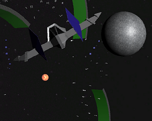
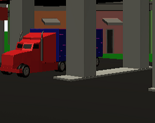
Do you ever make extrasteller shipments inside a ring super-structure while your dog boss yells at you? Well then, you’ll feel right at home with STARHAMSTER 64, a slick retro-throwback to a groovier (and graphically chunkier) time! Battle through the trials of a sci-fi nine to five until you finally decide to Break Out of the Loop! 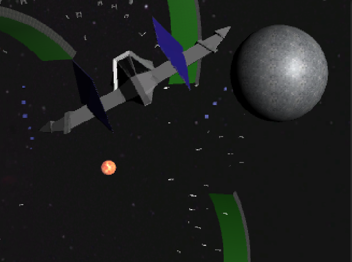
I think this game was excellently made, from the graphics to the sounds to the gameplay, it all fit together very well. I like the combination of puzzle solving a skillfully timing your jumps, and teleports. My only critcism is that almost all the platforms seemed to be placed just below the threshold that the player could reach through jumping, so it would maybe take a couple tries to get on platforms and such.
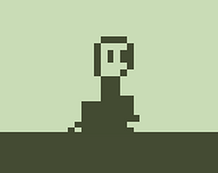
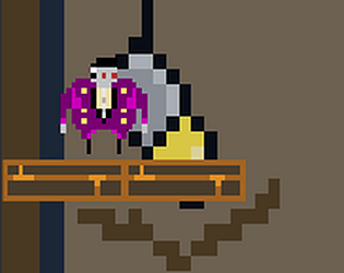
Hi, thank you for voicing your opinions. The reason he dies upon trigger is because he's a vampire, he can't see himself, so he is reminded of who he truly is and dies of shame. I do understand the platforming issues, this is my first tutorial-unassisted game, so I couldn't work out some kinks of the platforming, will definitely work on that next time.
Hello Solarlune, I did a quick play through of your demo and thought it was great! I love the atmosphere and feel of the game so far and can't wait for the release, but I found a couple issues you might want to consider.
Firstly, my biggest problem are the controls. I find it odd that the default directional keys are the arrow keys, yet jump is X. This alongside with both combat keys being next to x, this leads to some clunky platforming and combat game play, even when fighting those zippy onion things (love them by the way, I think their aggressive AI is fun to fight). Epsilon also gives off the feel of a heavier robot, yet has a very floaty jump, making it appear as if the environment was in sub-zero gravity. With X also being accept yet the down arrow being interact, interacting with signs and NPCs can be a bit confusing at first. I found game play to be much easier with these changed controls as follows:
WASD for movement
Left and right attacks be left and right arrows, with accept staying as the down arrow key
Accept changing to Enter
All other controls remain the same, as I found no fault with them. I understand if you are used to the controls as you have been developing the game for months, but immediately upon playing I found the controls to be flawed. I'll be fine if you keep these controls as the default, but bear in mind I will change the controls once I get the game.
I do realize this is not a finished product, but I hope this isn't the final level design. Unless this is a more "throw you out into the world" kind of game, it it not so great of a place to have a small tutorial. And the moody lighting is great for atmosphere, but many obstacles such as the spikes, gaps in the platforms at the hub city, and the first camera-laser enemy I failed to see the first time through. Because of the darkened lighting, I didn't notice that pile of bricks holding the gate key, and so it took me a while to find it. Also the area with the elevator platform is a bit slow, and the placement of the second camera-laser enemy is rather annoying. Also, the shadowy lighting effect on things in the background looks pretty cool, but I noticed it makes them seem a little flat like stage props, as if the game had the visual style of Paper Mario. I'm not sure if this is want you are going for, but I just noticed this while walking past the trees in the grassy area.
Overall, I think with a little polish this game could be really great! I hope I wasn't too harsh on your game, just trying to make it the best it can be.


