I just saw that I said basically exactly what Nate said yesterday, oops :(
TR
Creator of
Recent community posts
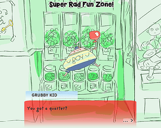
This is such a cute game, I love it so so much!!!!! I love looking at this goofy kid, for some reason he endeared himself to me so fast. I think one thing that would be a really easy fix would be to make some penalty or negative feedback for pressing the wrong keys, because it feels like I can just press all of the buttons at once and I get the thumbs up. I also kind of wish that the arrows and circles were a little more stylized
I really like this game! You pushed the prompt in a very literal and extreme direction and I really think it paid off. My biggest critique is that the "oh no" and "yes" sounds seem really really out of place (in fact, the first time I heard that "oh no", I actually yelped because it scared me so much"). The other thing is the music. I really like the lofi, chilled vibe to it, but I don't really feel like that vibe quite fits the sort of upbeat, peppy energy of a bunny, especially since at the beginning it references an "adventure". I think a faster, more upbeat song would work a little better, but the one you have now isn't bad by any means.
I really, really love this game. The concept, the low-key visuals, the little log readings, it's all really wonderful! I kind of wish new cards all appeared in one place, or even just a contained section that you could go to if you were ready for a new person. I also wish that the scroll speed was higher when you press WASD, but other than that I don't really have any complaints, this was a ton of fun!
What an absolutely strange, baffling thing you've made, Jordo. I love it!
I'm not 100% sure if I got the full experience, but I think I got a good amount of it. I have no idea what could have possessed you to take those random assets and turn them into THIS, but I am SO GLAD you followed that instinct, because I really enjoyed this. I was a bit sad that there were one or two eyes I couldn't poke, but maybe I'm just being excessive. My biggest note is that I wish the little dialogue button would only go to a different piece of dialogue when you clicked it and not when you hold it down, because I accidentally clicked and held and I missed a few little lines.
I absolutely love that you made this, it's so so rad. I really love the music too, great choice!
I think some bigger visual/audio feedback when you fire would be nice, because I wasn't 100% sure I was shooting until I looked and saw the ammo was going down. Also, it's possible this is just a dumb unity/webgl thing, but the mouse sensitivity was crazy high for me, even when I turned my sensitivity all the way down on my computer.
The final thing is kinda nitpicky but I think that, since this game is like a DOOM parody, the enemy HP should be turned down. Enemies in the original DOOM are generally really easy to kill, and that's a big part of why it's so satisfying to just run around and kill those goons. I think making these guys die in fewer hits would make this game be like, a spot-on DOOM parody/clone/love letter!
Hank, you genius, you madman. This is such a spectacular concept, and it's so well executed! I think the only critique I had is that you held back some by including the human POV map. It definitely became a crutch for me, so I couldn't get the full feeling of the game. I think ways you could get around that while still being like, not impossible would be to either have like, "hotter"/"colder" audio cues (although that could hypothetically take a while to implement) OR have the human POV map only show up for a little while, then disappear, and then maybe the player has to wait for it to like, charge back up.
I LOVE this game! It has such a cozy yet exotic vibe to it. I think it would be really cool if you played a little bit more with light, since we are in a submarine, after all. Having a little light attached to the submarine to add to the feeling of exploration would be really radical. Also, maybe it's my mouse or maybe it's just classic unity webgl shenanigans, but the mouse seems a bit sensitive.
Also, possibly some sort of visual/audio feedback for when we speed up/slow down would be great, because some times I didn't notice if I was actually moving faster.
I really love the tone and concept of this game! This is like, a genius use for these assets. I think in terms of critique, sometimes the ui bugs out, specifically when looking at the palm trees. Also, you should unify the fonts (sometimes you use the default unity arial, but other times you use the included font).
Without asking you to go outside the restrictions of the prompt, I guess I'd love to see more of this little world you've made, like short, snarky bios about the artists, or little quippy responses once you give them a comment. Maybe that's out of scope though, I don't know.
I really love what you did with this game, Jordan! The beginning sets the scene so, so well, I really love that whole transition of the layout becoming a 3D world. I really like the music you chose, but the other sounds are kinda janky at times, especially at the very beginning when the water is flooding the apartment. Also, the controls get a bit weird, I think that maybe pressing the left and right keys are rotating the camera at a different rate than the rate at which they're rotating the fish's orientation, but that's just a guess. Other than that, great job!
I love Terry! You did a great job with the dynamic movement and AI, it's really impressive! I'm also super glad you added a speed up button because I'm an incredibly impatient person (also because it's fun to watch Terry run around really fast). Also, I like that if Terry goes hungry, she doesn't die, she just gets taken away and you get reprimanded.
I saw that you said you were going to add some more features like playing and stuff, which I think is a really good idea, so I won't mention features you could add.
I noticed a few weird UI things while I played. The Feed and Come Here buttons light up when you mouse over them, but the Refill Water button does not. Additionally, once you press the Feed button it remains lit until you press the Refill Water button.
Other than that, I can't think of any notes! She's a wonderful little spider!
I absolutely love this game. It's so adorable, the UI is so clean, the gameplay loop is so simple yet so fun, it's wonderful!
I ran into a bug a couple times where cherubs would get caught in a never-ending loops of the watering animation, so they were taken completely out of commission for the rest of the game. That was the only real bug I found while playing though.
A couple things for user experience: It would be really great to have the cherub's names under them as little labels so I can tell them apart. A lot of times cherubs would spawn behind trees or in other spots that are kind of hard to click. If I spawn a tree in front of another tree it *really* messes things up, and while I quickly learned my lesson, it felt pretty bad to have happen. Also it would be great if the cherub menu closed automatically after I transform a cherub.
As far as design goes, I really like the idea of basic cherubs turning into other kinds of cherub, which turn into different trees that give different resources. That loop, in a vacuum, is golden. However, (since I have to give critique) I think there are a couple ways the game could be improved while staying at its current scope.
First is an easy one: the sound is wayyy too low. The first few times I played through, I didn't actually know there was music at all because my volume wasn't turned all the way up.
Second this game is kind of "all carrot, no stick". The player is motivated to take care of the cherubs because they turn into different forms and will eventually spawn more resources. The transformation aspect is inherently cool, and has historically been an extremely effective motivator in video games. Gamers pretty much universally love when things transform, and once they know it's possible they'll go to the ends of the earth to make it happen. I think that even if the cherub's *didn't* eventually give the player more resources, I'd still be motivated to make them level up (and I think a lot of other people would be too), but the resource-gain is definitely the cherry on top (although it does add a weird level of depersonalization where this active, living creature you've been caring for is turned into an inanimate thing with no reference to the creature it used to be, but I think that could probably just be solved by keeping the cherub's nameplate under the tree so that players can like, look at a fountain and go "ah, yes, that fountain was once Jeremy. Jeremy is still with me, in a way. I love Jeremy")
The "no-stick" side of things come with the fact that there aren't any negative consequences for the player if they don't do their tasks/don't do them well enough. I think the best virtual pets have an element of tension to them where you don't want anything bad to happen to this little thing you're taking care of, but this game doesn't have that element. When basic cherubs starve, they turn into evil cherubs, and when non-basic cherubs starve, nothing happens. I don't think it would be too difficult to implement a way for cherubs to die (or, if that's too morbid, run away), and it would be an extra incentive for the player to make sure they're taking good care of their pets.
I also think that sleep is kind of superfluous. I understand the instinct to put it there, since resting is a mechanic in pretty much every virtual pet, but in this game it really doesn't do anything other than make you less able to interact with the cherub. There were times when a bunch of my cherubs went to sleep at the same time and I was left twiddling my thumbs and gathering resources, unable to interact with my beautiful pets. You could rework sleep if you really want to keep it, but I don't actually think it's a necessary thing to have in the game, especially since these creatures are somewhat mystical/magical/supernatural, so you could get away with saying that they just don't need to sleep.
Another small thing is that, after cherubs level up (with the notable exception of the evil cherub), their stat meters don't go down by very much (other than the water cherub, but the water cherub likes water so much that its meter gets filled up super quickly), so it only takes a couple plums/flowers to get their meter high enough to transform. This makes it feel like the cherub might as well go straight from basic to final form, since such minimal effort is required to move on from stage 2 to stage 3. I think a good way to fix this could be by leaning into cooldowns for each action, like you do with the pet button. It would make sense logically for a cherub to not want to do the same thing again immediately after, and it would also keep players from hyperfocusing on a single cherub, and encourage them to instead care for each cherub a little at a time.
I know that was a lot of critique but it's only because I really, really dig this game. As a final note, I want to talk about some things that you could focus on if you want to keep working on this game. Like I said before, the formula itself is golden, so don't change anything about the core loop. The obvious way to expand this game would probably be just to add more stats with their own resources and cherub types, but it would be pretty unhelpful of me to just suggest "add more stuff". Instead, I'll talk about some things that you already do really well that you might want to look into expanding.
I really like the fact that some types of cherubs like certain things more than others, and that's definitely something worth exploring. Also, I know I mentioned the evil cherubs in the critique but I really, really like the fact that there's a transformation that occurs when a special condition is reached outside of the normal "fill the specific stat bar" requirement. I didn't actually read the "try starving one, for science" thing on the tutorial menu, so when I accidentally neglected one of my cherubs and it transformed I was surprised and totally elated. I think that having more specific transformations that trigger with secret conditions would be a more interesting way to add more types of cherubs than just adding more stats.
One final thing I'll say is that the only thing gamers like more than transforming things is combining things. I'm not saying add a breeding ground or fusion station or whatever necessarily, I think that wouldn't quite fit with the vibe of the rest of the game. I'm more saying like, what would happen if someone maxed out a water cherub's food instead of their water? What would that turn into, what ratio of resources would it give? Stuff to think about, I guess.
Sorry I wrote a whole manifesto in your comments section, I tend to do that when I really really like a game!
Finally, a virtual pet game *for* and *about* me!
Seriously though, whenever people ask why I don't like virtual pets or relaxing games like animal crossing or stardew valley, I tell them because I only like games that stress me out. Well this stressed me the fuck out, and I loved it! The combination of the sounds and the visuals were super unnerving, and I loved the unnatural way the limbs moved, and the slight parallaxing you have with the figure and the background is *primo* stuff.
The only major bug I found was that the blood button doesn't seem to work. Other than that, it seemed like the lose condition was a little inconsistent. A couple times it seemed like I lost immediately, and sometimes it seemed like I lost even when the limbs hadn't been moving very fast or for very long.
I think one of the main issues I have with the game is that the lose condition isn't that any single limb moves too much, it's that all of them move for too long. This means that as long as I made sure I had control over one or two limbs, I could completely ignore the other ones. A little after I started playing I also realized that limbs only woke up on a random timer or if I woke them up with one of the humours that is assigned to them. This means that the ideal way of playing was to pick a limb or two and wait until it moves, then press a button to make it stop, while completely ignoring all the other limbs. This actually made the game kind of relaxing, especially given the fact that it doesn't seem like it gets more difficult as time goes on.
There are a bunch of different ways to fix this. I think the best overall change would be to make the game about making sure no single limb moves too much or for too long, rather than all of the limbs, so that players aren't encouraged to just focus on one or two limbs.
If you want to keep the boolean-based interactions, I think you can either make the timer get shorter and shorter as time goes on (until the game gets pretty much impossible, which feels like it would be a nice, stressful end) OR you could move the buttons around. Either switch their positions with each other or just have them disappear and pop up in random spots on the screen every so often as the game goes on, so that the player is never given an opportunity to zone out.
If you aren't married to boolean-based gameplay, then maybe it'd be worth exploring to make each limb run on a value that slowly builds up, which the player has to decrease by pressing a corresponding humour button one or more times (which might *increase* the value of a different limb, since in the boolean-based version pressing a single humour could put one limb to sleep and walk another one up). I think that the frantic gameplay of having to press a bunch of buttons multiple times would suit this kind of stressful, nightmarish game more than having to move between buttons and press them each once. At the very least it might be a gameplay direction worth exploring.
A true vibe! I really like the music and sound you chose for this. I also got weirdly nostalgic, like even though I never had a turtle, I feel like I had done this or played something like this a lot when I was younger. I'm not generally a person who likes to play relaxing games, I tend to gravitate towards the most stressful entertainment possible. However, this little turtle kept me playing this for a good while, I just didn't want to leave the little guy. I really like the decorations you put it the tank, it really makes the space feel alive.
I think one of criticism would be that the turtle's back legs don't move, and I think if you added that to the animation it would go a long way. Also, it looks like the food disappears once it hits the turtle's shell instead of its mouth. Other than that, a nice relaxing little experience!
Really excellent job on this one! I really love the song choices (I'm a big Louie Zong fan, and hello world is perfect for the end) and the sound in general. I also really love how expressive you made Max despite him having such a simple visual design. The last thing I was expecting from this prompt was a narrative game, but I'm really glad you took this direction!
As far as critique goes, I think one might be to change the name so that the tone of the game isn't spoiled (if that's something you care about). I knew this was gonna be pretty meta just from the title alone (although I do really like the title, it's what made me click on it in the first place, so I'm kinda conflicted on this point). There's also some issues with food spawning when you press the button a bunch of times. I wouldn't really want to add a ton mechanically to the game, since I think its simplicity is part of its charm, and also it supports the point you're making. However, I think one little unexplored part of the weird world of virtual pets is the whole "or else" of raising a virtual pet. A lot of games will tell you like, "oh make sure you do this, or else this will happen", and the player doesn't want anything bad to happen to their pet, so they do whatever menial task is required. It'd be cool to make the player feel worried about Max's wellbeing right before he goes on a little rant about how absurd it is to worry about the health of a computer program.
Finally, a game based on my life!
I really dig this one, Hank. There's something really primal about smacking on the spacebar that really makes me relate to this big handsome ape. I guess if I were to give some critique, it would be that there is a severe lack of ape noises (some of the funniest noises in the animal planet), especially when the player wins. I don't think some degree of scaling difficulty would be too hard to implement, like just make her move a little faster each time, smack some "level 1, level 2" stuff on the top. Maybe that detracts from the minimalist charm of the game, I don't know.
I also think it would be cool to see different faces on the other guy based on how far away the girl is from him, just to up the rivalry-factor.
Jordo! You've done it again, haven't you! I LOVE the aesthetic and concept of this game, totally sick. I did have a tiny bit of trouble knowing which head I was at first, and also It was hard to keep track of how much damage I'd done to the enemy. both of those could be fixed with like, me vs them hp bars/hearts on each side, corresponding to our heads. I also think maybe overhauling the action UI on the top would be good, like making it a bar with different symbols on it, with lengths that accurately reflect how long the cursor/selector stays there. While we're at it, I think a cool feature to implement if this ever gets polished up (or possibly in the supposed sequel you mentioned) if the order and/or length of the different actions was random each time. Maybe that makes it less fun, I do tend to veer towards the random, but I think it'd be worth a shot!
Fuckin spectacular as expected. This game screams "Alekai": A personal, emotional drama with a rockin aesthetic. Hell yeah, sign me up. Speaking of aesthetics, I think one of the ways to improve this game is to do something special with the font of the text. Everything else looks so nice, but the font is real boring, and it'd be such a quick little fix. The only other thing is that I'd LOVE to know how many different dialogue options there are for each one. If that's supposed to be part of the like, nuanced stress of this game, then I totally get it.
I really like that you used different contexts to make the single-button requirement more interesting! I've already told you how much I like this game on discord, so I'll go right to criticisms.
I think the sound mixing could definitely use some work, it's a bit loud, and some of the sound effects that are generic boops can probably get replaced by 8 bit gunshots (like the one you use for shooting) or other, more thematically appropriate sound effects. Speaking of that sound effect, it seems like it only plays around 1/3-1/2 of the time it should, other times the cue is missed and it's completely silent (other than the background music).
I like the detail you added to the hat flying off, that's really fun. For something more nitpicky, the blood particles go over the bullet-bar-thing, so if you're gonna polish this up definitely fix that. You also can't change your difficulty after you lose.
Speaking of the difficulty thing, I don't like that it's the only thing that uses the mouse. I know that it seems like a dumb comment, but part of the charm of the game is that it does so much with just the spacebar. I'm always a big fan of mechanics bleeding over into menus, so I think a really cool way you could teach the player about your game is to use a little bar similar to the bullet-bar to let them choose their difficulty at the start. Like press it once and then press it again to choose the difficulty. Maybe that makes choosing the difficulty too annoying, but I think it's an idea at least worth trying out.
Holy shit this game is so cute. King is probably my favorite.
The art, the vibe, the concept, the music, all their little expressions, it's such a great little experience!
Since I gotta give some criticism, I'd say that the big block of text in the beginning to explain the rules is kinda intimidating, especially since the execution is actually pretty simple.
Also, for whatever reason (probably because I read left to right so my brain is wired that way) I assumed my guy was the guy on the left for the first bit. I think having your homie's intimidation and smooch bars be on the same visual hierarchical level as yours is a bit clunky for when you first start playing, since your bars are so much more important. So changing that layout would probably improve the experience of this already-great game.
Hey Alekai! Rad job on this one! I think if I were to give one piece of criticism it would be that the controls seem kinda stiff on that first section. Like, my little square gets stuck a lot when I'm moving. I also think that the blue square's hitbox might be a bit bigger than it was in the original game, it looks like it hits you even if you're on the row above or below it, but maybe it was like that in the original game as well and I'm just not remembering.
The speed feels nice, but the fact that there are limits to the left and right definitely makes it feel restrained. Sometimes the enemy bikers get into positions that are really hard to shoot because of the boundaries. I do enjoy the explosions you put in when the bikers die, those are really satisfying.
I really love the way the bikers move, it's so smooth and it feels like they have real momentum and acceleration to them. A lot of the time it looks like the missiles come out of different spots to either side of the player, and it also seems like the hit detection is a little inconsistent. Sometimes I fire a missile and it completely goes through one of the enemies. The speed and turning of the player character is really nice, though!
Nice job Arjun! You totally nailed the aesthetic of the original. I'm sure other people have mentioned this, but the transition between the normal tree sprite and the close-up sprite is very abrupt, and it can really make things difficult to parse when there are a bunch of giant trees on screen at once. The missile also doesn't feel as satisfying to fire, I don't know if it's something about its speed or maybe it doesn't go as far as I'm expecting. I'm not quite sure, but I'm sure you could toy around with it and make it feel a little better to shoot out those missiles.
I like that it's actually 3d, but I think giving the enemy bikers a little bit bigger hitboxes would've been nice. As it is now, they can be a little hard to hit. Sometimes they also get really far away from the player if you don't go for them from the very beginning, so maybe you could make it limit how far away they can get.


