It's been a while since I last updated this forum, though I've been posting dev logs on the page for Tic Tactic. I wanted to swoop by and give a quick update of things that I've added, or that I'm working on!
First of all, the game has grown in size considerably: the previous update I mentioned "both" areas, but in the new version, you can now travel to the chicken's capital of Cluckhaven and battle with their forces there! You'll find some additional dialogue, too, that sheds some light on why you're on this journey in the first place; not much, mind you, since the journey is still far from its end.
There are a huge variety of other changes to accompany it, from potion slots to chaining combos to new tiles -- we're at over 20 unique tiles with a wide variety of effects and abilities!
Thanks again for reading! Feel free to check the Dev Logs on the main game for more details and longer write-ups. I'm pretty good about mentioning all the changes I make :)
unbreaded
Creator of
Recent community posts
My deckbuilder just got a HUGE update!
With 7 new enemies, 6 new tiles, a new shop, and an entire new area, this update has brought the game from 10 to 21 total encounters (more than double!!).
You can check out a breakdown of the additions here: Update log 7
Great job with the game! Simple but engaging idea, and I had a good time playing. It reminds me of games like Minesweeper and Solitaire, and I could totally imagine playing this while taking a break from working.
Some specific things I liked:
- There was a good amount of variety in the different cards. I rarely ended up drawing the same buildings more than once.
- The card art and icons are simple, but I thought they looked nice. The visual identity was very cohesive.
- Music was pretty good! I think it fit
- Everything seemed to work as intended. I didn't encounter any bugs to report.
Some things I think could be improved:
- I had no idea what the icons on the map meant until I stopped playing and looked in the menu. In general, there's no way to figure out what is on the board already. I think you should add a tooltip that explains what the environment aspect or building in the tile is.
- I played three times and got close, but didn't manage to win. One reason was that my buildings kept getting moved and having their score lowered by the jungle and something else. I didn't realize that was the issue until I got frustrated and checked - leads me back to the previous point.
- I think you could go a little further with in-game feedback. I think more reaction from the cards being hovered over or placed would go a long way!
- Lastly, I couldn't always tell what was going on between the end of one turn and the start of the next. There were a lot of little actions happening. Sometimes, they were expected, like the greenhouse gaining power, but sometimes they weren't. It would be nice if you added a little dialog panel, or something similar, that just logs all of the things that are happening in the game. That would make it easier to understand, and I would remember for the next time I played. I see in the dev log that you mention that the building causing the change was highlighted, but I actually didn't notice that.
Overall, I thought you did a great job with this game. There's a lot of potential here and I think there are a lot of people that would enjoy playing a game like this.
Edit: Just revisited the game and realized there IS a tooltip. For some reason, it didn't trigger when I played before.
Ah, gotcha! Rebinding from arrow to WASD did make it much easier to play.
I still struggled a bit with the controls as they did not feel intuitive. I would expect up/down to move you up and down, not rotate, whereas I would expect left/right to rotate the character. I had a really hard time landing on the platforms, even knowing how to play.
I liked the idea for this game! Skateboarding while fighting off enemies sounds like an interesting concept, and some of the mechanics felt pretty good.
I had a really hard time managing the controls. There are a lot of things you have to do at once and the platforms are too far apart to really get a hang of it. I have a couple suggestions:
- Make the platforms more frequent at the start of the game. You can spread them out further later, but at least while I'm getting used to the controls, I need the extra help.
- Add a little bit of explanation when things happen. I think a Tony Hawk-style trick counter would be great! I was bouncing off the rails (without grinding) and didn't register that wasn't what I was supposed to be doing until I read the controls. I bounced up, so I thought that's how it was supposed to work.
- Flying through the air seemed a little weird. I would have expected to be on the ground while skateboarding. That's not really something you need to change, but it could help with #1 if you made the game take place on the ground and procedurally added obstacles.
- Finally, the control layout is the opposite of what is usually seen in games, with no method to change it. Usually, you move with WASD and do actions with the other hand. This made it harder for me to play than it otherwise would have.
All in all, great job for your first project! I definitely see a lot of potential here.
First off, the header image is really big! It made the whole page scale weirdly on my laptop.
The title screen music was nice, and the scene selection looked nice, too!
Once I got into the game, I was able to move around the environment, but enemies never spawned. I waited a few minutes, but nothing changed, and the bar didn't seem to progress, either.
- Good point! I'll change it so the continue button appears only after you made a choice in the trade.
- I did add the ability to click on the deck icon to check your upcoming tiles that you'll see in the next update, but I should also add a visual difference for the shield. Maybe it'll maintain the shield shape but just be cracked/broken!
- (From the video) I never registered how confusing the health rewards might be. They don't have a symbol (X or O), but they're still the same shape as a tile. I'll fix that.
Thanks for your feedback!!
Another week, another update.
Since the first launch, Tic Tactic has been playable from start to finish. The start and finish have changed, but the game was always a linear roguelike experience, with some randomized encounters in between.
While the "what" has not changed, the "how" has changed many times. Each update has introduced new steps for the player to experience, from actively choosing loot to collecting gold to making deals with slimy-looking traders.
In the newest update, I added some changes to existing elements of the game, including new quality of life features, graphical updates, and new sound effects. I also introduced some new things, like a map to show you what your path will look like, and a trader that will take some of your tiles off your hands. If you're interested in a more detailed (and frankly, more engaging) breakdown of the changes, feel free to check out the dev log!
I've also started ironing out the roadmap for the game. As the main Itch page loudly proclaims, I'm still considering this a pre-alpha. I hope to enter Alpha towards the end of October. Planned changes include:
- Alternate bosses for both areas
- New enemies and elites in the pond environment
- Another AI adjustment to make it a little more predictable at earlier stages
- An inventory system for items
- The ability to view acquired tiles as well as the tiles sitting in your draw pile
- Act three, where you will finally enter the fowl home of the chickens.
If you give the update a try, let me know what you think! I included a Discord link and a feedback form in the game, and you can always use the comments on the Itch page. Thanks for reading, and until next time!
- unbreaded
Have you played tic-tac-toe? It's a simple game, but it's an easy way to waste a few minutes and fill the margins of your paper.
Well, what if it wasn't?
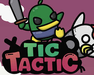
I had this idea of making tic-tac-toe into a strategic experience. A difficult experience. A game that actually made you play it, without immediately knowing how the match would turn out. That desire led me to create Tic Tactic, a roguelike deckbuilder where you play as a duck who fights his way through an army of chickens by playing tic-tac-toe. As you defeat enemies, you'll be able to add new tiles to your deck, which have unique properties and change the way the game is played.
The game is in active development, so each update brings new content and big changes. This week's update will include the start of several planned economy updates, introducing new ways to encounter tiles and add them to your deck.
I am also actively resolving bugs and adding QoL changes. A huge part of this is feedback through Discord or the in-game feedback form. I do my best to resolve issues as quickly as possible to keep the game fun, fair, and respectful of your time.
I hope you give it a shot!
I had a random thought: What if tic-tac-toe was a roguelike?
My mind immediately flooded with ideas for mechanics, narratives, and enemies. I imagined it with a protagonist, in an RPG-style roguelike experience. Losing a match would be too easy, so I created a health system around the tic-tac-toe board. There should be some kind of progressive system, where you're collecting loot. Well, that's a natural fit for a deckbuilder, right?
About two months ago, these ideas snowballed into Tic Tactic, a deckbuilding roguelike where you play as a duck who seeks vengeance against an army of chickens by playing tic-tac-toe. Why chickens, you ask? Well, the protagonist is a duck, so naturally, he has to fight against chickens... Maybe it's best you don't ask.
The current state of the game is entirely focused on the combat system. Each turn, you add one tile to the board. If you complete a three-in-a-row, the enemy takes damage depending on the tiles used in the trio.
Different tiles have different gameplay effects that can change the course of a match, like exploding when damaged, falling and crushing tiles below them, or even spawning additional tiles to the board. You'll face a variety of grunts, elites, or bosses, with their own decks and playstyles.
As you defeat enemies, you will get the opportunity to add new tiles to your deck. In this weekend's update, you'll even be able to buy tiles from a merchant.
At the end of every run, you'll be scored based on the number of enemies defeated, the number of turns used, and the amount of health lost. The game isn't never-ending, so a perfect pull can improve your score towards a theoretical hyper-optimized calculation. Once the game is done, I'll actually calculate the perfect score; for now, it changes with every update.
I'm still early into development, so updates can add huge features or significant mechanical changes. I think it's part of the fun, and, in this developer's humble opinion, the game has gotten more interesting and more replayable the longer I've worked on it. I have a definite roadmap, so the project will not last forever, but for now, I'll do what I can and have a good time working on it.
Also, if you like reading about development progress, you'll love me. I'm a certified yapper, and discuss progress in Tic Tactic's dev logs, on Discord, and on Twitter. I prefer Discord, since I can respond to you, but I'll serve you news in whatever form you prefer. I'll even send you personal emails if you ask me nicely enough.
https://unbreaded.itch.io/tictactic
Here's a link to the game. Sorry to make you wait for it.
The intro is great and I liked the innovative take on the chrome dinosaur! It's like a no-internet game... but it makes me feel bad.
I agree with the other comment -- the music feels like a mismatch. I would expect something a more somber given that we're chucking lizards at a wall to start a run.
Other than that, my only qualm was that I had a really hard time timing the jump. It felt like it went up higher than I anticipated and I never made it over the obstacles. Otherwise, I liked that there were obstacles to keep an eye on in both areas of the screen. Using both the shadow and the treadmill was clever, and it would be really cool to see a platformer in this style.
I like this type of game a lot and could definitely see myself getting lost in it for a while, with a few updates.
First off, I did notice some bugs around photos. Whenever photos appear, the text reacts strongly and moves around. Sometimes, it doesn't immediately recover (https://imgur.com/a/fzykbFi) and you can't read the next few lines.
I understand the vision here, but a bit more UI would be a huge help without detracting from the overall design. I had a hard time keeping track of the hunger level, because it changes without telling you. I died in the middle of Day 2 because I had no food and didn't realize I was on death's door.
The story seemed a little too outlandish. There were random details that didn't make sense and took away from the overall game. I went to Elon's factory and met Billie Eilish in the park on Day 1. It was funny, but I had a hard time caring much about my character (Justin Beaver). I would have more fun and feel more connected to the game if the world became absurd due to something I did, rather than me having to do normal stuff in this absurd world.
Overall, I see a lot you could do with the game. It's a good start for a project that could be a huge time sink. It could even be a cool mobile game - I could see myself playing this on a cross-country flight. Great job!
I really like the idea - like Hill Climb Racing meets Death Stranding.
I couldn't really figure out how to play. My car wouldn't drive in certain environments, and I couldn't understand what the objectives were with different items. The controls also didn't feel intuitive; clicking to go or stop felt weird, and I didn't understand where the engine comes into play.
I like the idea a lot and I see the potential here, I would just need the game to be a little clearer.
There were a couple areas where I felt the game could have been better. For example, the UI at the right side of the screen was confusing - I couldn't tell which was my currency at the start, because they're all just lines of white text. Later, I started collecting power crystals, but I didn't see any purpose for them. Maybe I needed to upgrade the towers more?
The enemies never posed a threat. I stopped adding more towers after round 3 and still made it to round 9, where the enemies just started circling the island on the right until my towers eventually picked them off.
There's also no feedback on the enemies. They don't make any sounds or react to being hit or killed. I think that's a huge area that can be improved, since the majority of gameplay is watching the towers shoot the enemies.
Overall, I think this is a solid representative of a TD game, but I can definitely see a few things you can do to make the game better!
This was a fun idea! An omelet-station deckbuilder is clever and the sound design was great!
The rounds themselves felt a little static. There's not enough randomness - the rounds are mostly the same as the one before it. It also makes it difficult to keep up with the increasing score thresholds. I was fine through round 3, but after that, I had a hard time getting enough points to move along unless I got lucky with the ingredients.
It would be great to have a background of some kind - even just a stainless-steel commercial kitchen counter would add a lot of atmosphere to the game.