Indie game storeFree gamesFun gamesHorror games
Game developmentAssetsComics
SalesBundles
Jobs
TagsGame Engines

Watermark RPG

103
Posts
10
Topics
83
Followers
45
Following
A member registered Aug 12, 2015 · View creator page →

Creator of

Recent community posts

Oh, don't get mad at Indrah. Giving tough love is her signature move. She gives honest criticism equally to everyone with no ill will. She can be very nice too. :)

As gamedevs, taking criticisms is part of our job. I know it can be hard sometimes. But be humble. Listen, learn, then move on and make a better game.

(1 edit)

This game looked interesting, so I tried it out. It appears that the game is a hybrid of a board game and a RPG. Here’s some thoughts: 

PROS

1. There’s a lot of cool engineering here. We have good visual effects, a board game mechanic, crafting systems, a tarot based mythology, and lots of events to do. This reminds me of one of those Taikou Rishiden games from back in the day. There’s a lot of potential for this game.

2. The game has an exciting start. You get to pick your hero’s element and class. You even get to start filling up your harem right at the start. :p It can be satisfying for those players looking for an isekai fantasy.

CONS:

1. Game Balance: This game is currently too difficult for most people. It is really disheartening to play the game when the first enemy wipes me out very easily. After dying a few times, it seems that I must avoid battles,  gather materials, and get better equipment before I fight. However this becomes impossible because the slot system forces battles. I think you were trying to balance it with the Newbie Package, but since you get random equipment, it is very easy to get something that will not help the hero you created.

Especially since this is a contest game, you will need a difficulty that most players can get through. i.e. easier difficulty even on your normal difficulty. In other words, it’s better to make the hero a Mr. Dragon Proud Sky rather than a punching bag. This way at least most players can see what your game has to offer. 

I know this because I made this very same mistake in previous contests. My game was too hard for most people. Due to time constraints, balancing stats was the last thing I did, and that’s a bad idea.

2. Tutorial: This is a game with many nuances, which means it can be confusing for new players. It seems that I must defeat the dark lord before my food and water runs out? It seems that I should collect tarot-like materials to craft better equipment? And how do I get new skills? So many unsures will make a new player uncomfortable.

I know that a shorter tutorial is usually better, but I think this game requires a more complete tutorial. Especially since English is not your strength, instead of a long help file, you could try showing with guided “safe” battles and railroaded scenes. Give the player free control only after the player understands your systems. 

Hope that was helpful. Good luck and keep on game making!

(1 edit)

Ben the bone is quite blue at the start. After all, he is literally in a sh** pit. It’s rather difficult to remain jolly in such circumstances. On the bright side, things can only get rosier from here.

This battle within the colon of big snake Sar-Dakka does present quite a challenge. First, the random battles here are analogous to when one gets indigestion: you never know when you’re gonna blow it. Fortunately, after wiping out a few (I lost count) times, one eventually figures out a good rhythm of appeasing the demons before whacking them.

I must say planting flowers is a nice touch. Not only is it creative, it brings a cozy feeling of spring and pleasantness. If you think about it, despite the circumstances, this game does have cuddly aesthetics and cute dialogues. This might even be a PG rated ga…OMG what? Eyes and tongue?!!! OK, forget everything I just said. Yup, Ben’s in hell alright.

At the end of the day, I did rather enjoy the game and had some good laughs. I don’t think I got the best ending because I didn’t take care of big bad on the first try? Or maybe that’s an unwinnable battle? Anyway, thanks for the good fun and good luck!

I got to play as a cat, and it's a nice twist on a fairy tale! What's not to like?

Very lovely  atmosphere. It's great for a rainy day play to unwind. At first I was thinking: is this a horror game? Then it got too cute for that. :p It's hard to get scared when you are a cat. The sparkly trails are a nice touch.

I don't think I got the best ending. I think I'll give it another go later. :)

I didn't know you can rotate isometrics like that! Very impressive! There's a lot of awesome engineering going on in this game. Unfortunately I was also one of the black screen people so it was a lot of bumping in the dark. :p Is there a way to fix it?

A few things:

- I actually found out you could rotate screen by accident. Or maybe I missed a tutorial somewhere?

- Met an enemy who kept on putting me to sleep and had to reset game and try again.

- The difficulty could be toned down. Or maybe it's because I couldn't figure out how to heal, so I got stuck rather quickly.

Love the art! And impressively coded!

You have an English version? This jam is English only. :)

Thanks for the interest! Right now we leave it on Steam because it's easier to keep one updated version. Also the final version will be released on Steam so we want to make sure it works on that platform from the get go. Follow us for updates!

Thanks so much! I really enjoyed your hilarious playthrough! It made the game better than it really was. :)

Still, at times during the play I felt so embarrassed at some of the terrible gameplay. Some of the design was absolutely horrible. In my defense, it was done in too short a time. A lot of the things I wanted to do simply weren't done due to time. The biggest problem of this game I think was not balancing the combat. Well, that's all part of being in a game jam. 

I hope I will find time later to fix this up to its proper form.

Anyway, thanks for playing and the encouragement!

Thanks for liking it! Yeah...you're definitely not supposed to get Seraph, she's like the cheat character I use for debugging purposes so she's got the kill all laser. I don't know how you did it. :p

Glad to hear you enjoyed the game!

Thanks for playing! Yes, I agree, the balance in this game is atrocious. The excuse is...I ran outta time to playtest. :p

I literally shipped the game like 1 hour before the deadline. So to people who are gonna play this game you may experience the same thing as CruelGamer in that if you get a good map you'll have a good time, but if you don't it'll be Game Over pretty quickly. You could say it's old school rogue-like. I seriously don't expect to win anything with this, but I say you guys can give the game a try. I think it'll give you a good time for...20 minutes? Afterwards it's no man's land.

I'm thinking of making a non-contest version afterwards with proper balance.

Swing by our itch page or Discord to keep updated on the game. :)

No, what I mean is that different players get stuck on different puzzles. There is never a guarantee.

Less hand holding means more players may get stuck. 

More hand holding means less players get stuck, but at the sacrifice of making the game feel "dumb".

It is always a tradeoff.

So for this highlighting, you can try some of our other games and you will notice we don't always do this.

Thanks for your interest in the game!

Ah, this is the ol' "How much handholding is needed" debate, of which there are always two camps: make everything easy for players or the "Sadistic Dungeon Master Mode" where players need to figure stuff out. Einherjar was a game made for a contest. In the game prior to Einherjar we went the "players are smart" route, and we noticed that a number of players couldn't finish due to difficulty. For Einherjar we thought we should go the more handholding route to make sure all judges can finish the game (interestingly, some players STILL couldn't figure out some of the puzzles. XD) It's understandable as there will always be a spectrum of players, including grade schoolers who also watches Dora. :p Maybe we overcorrected, but it is what it is. 

Thanks for the feedback!

No, the game was completed! You can play it here:

https://watermarkrpg.itch.io/chosen

I guess we forgot to link to the final page. This was like the development page. Thanks for the interest.

It's incredible what can be done with minimal graphics and little technical whizbang. The story is top notch and very compelling. The dialogue is phenomenal. I loved this game. Great job!

One little thing is I thought that the emotion balloons actually detracted from the whole experience as they actually yanked me out of the somber mood created by the dialogue at times due to their anime cuteness. But it may just be a personal preference.

I hope you develop this game further. I am definitely interested in seeing more of this game. 

Thanks for the great comments! They're very useful. We'll improve these details after the contest. Hope you enjoy the rest of the game!

(2 edits)

You need “something” to use in the computer. :) Without spoiling it for you too much, check the rooms around you more. Remember to keep flashlight turned on. Some objects don’t show if it’s off. Good luck!

We should provide a full walkthrough soon.

For the signs please click on the area just below the sign, it’s the Save Point. It was a bug we didnt manage to eradicate in time. :p

Oh wait... i just realized... thats a later part. You have the beaker now? Check the room with pits more thoroughly again for a locker. You will get a clue there. Then remember the beaker description reminds you that it can hold liquids. :)

Thanks for playing! Well, we were aiming for a new creative direction, so I'm glad you said you couldn't tag it as a say, "Oh! It's a Silent Hill clone! Or It's like Witch's house! Oh it's just like Outlast!" The overall background does makes sense (and actually has been done before), but we can't tell you without spoiling the game.  

I see you noticed that the first and second halves have distinctively different gameplays, and it is our hope to show the judges (come on, we only got one hour. :p) what could be done if we get a chance to fully expand this. The first is more the puzzlely horror part, and it seems you enjoyed the action survival second part better.

Anyway, thanks so much for playing! Please give me the link to your stream!

(1 edit)

Hey thanks so much  for the feedback! I’m really glad you liked the characters so far. The current version uploaded is our insurance against “OMG YOU FORGOT TO SUBMIT?!!” But we are still tweaking it. Thanks for the suggestions!

Also, being a survival horror and not a power fantasy, to survive in this game your first option should always be “get out of the room” or “run”. Fighting is usually a last resort.

<<<<< DAY 21 >>>>>

OKAY. The countdown has entered single digits. We are entering the final stretch. It's crunch time!


We will be hard at work on the game so probably won't be updating for a bit.

Here we go! See you later!

(1 edit)

<<<<< DAY 20 >>>>>

So we've been hard at work on the game over the weekend. Putting everything together. Here's a quick progress update:

  • Miss Nile is done all the maps! Yay! Now I got to event all of them. Nooooooooooooo!!!
  • CuckooOrange ran into a problem with the transparency. Now things don't disappear. Oh no! We gotta solve this soon!
  • Linhtendo finished more sketches, will begin coloring. Can't wait to see 'em!

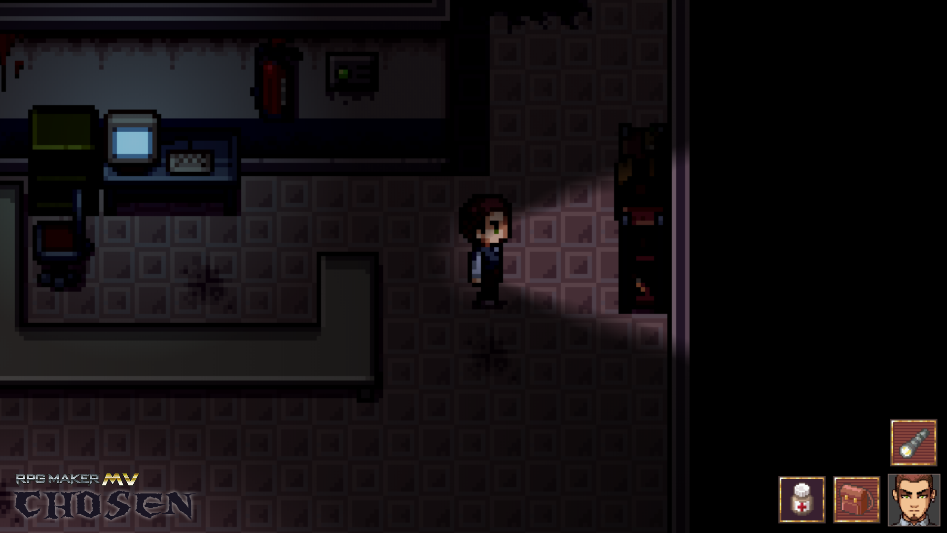
The game's about 50% done, but still lots of work to do. Anyways, here's a screenshot of the game:

There is something on the right side I think...

Ok. I'm just kidding. :p Well, it IS an actual screenshot of the game, but probably not the most glamorous one. Being a horror game, there will be times when our protagonist has to traverse through dark places. Darkness is an enemy. Still, just looking at darkness probably isn't very interesting, so here's one with lights on:

The Pop Horror set works quite well. And the lighting script we're using is Terrax Lighting, which is pretty awesome! 

Weedman looks oddly appropriate. I would totally play a game with Weedman. XD

Fantastic looking art! Looking forward to seeing Edgy chan in action. She’s got the whole Ayanami vibe down. 

Good luck!

<<<<< DAY 18 >>>>>

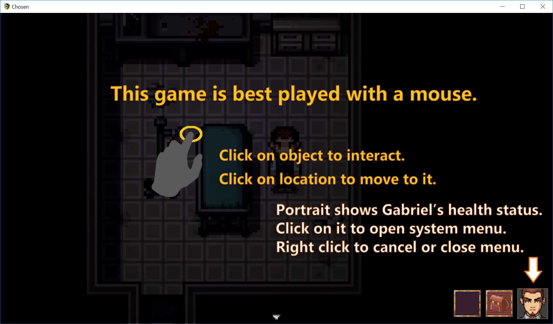
I've always made RPG Maker games controlled by the keyboard. However, Chosen has a more adventure game mechanic that seems to work better with a mouse driven interface.


So while you can still play the game with a keyboard, we're going to design the game as if the player has no keyboard.

Not much more to report today. Everyone hard at work. ^^

(1 edit)

<<<<< DAY 17 >>>>>

I remember the first year I did IGMC I actually spent money on buying advertising. At the time I thought paying for banner space would help us attract more players. It did I suppose, but the effect wasn't as spectacular as I thought it would be. I think marketing and advertising isn't that effective unless one goes past a certain spending tipping point, which is probably beyond the means of most indie developers.

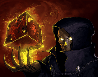
Since our budget is limited, instead of spending it on advertising, this year we're gonna put it into content instead. One of those things is cover art. I've always loved those games with great cover art, so I wanted one for our entry this year too. Since I can't draw worth a damn, and Linhtendo already has much on her plate, we hired the very talented Michael Galefire to draw us this wonderful cover art for Chosen:


Isn't that absolutely stunning? He painted it based on some basic concepts we provided. You can see our hero Gabriel in that cube. Our team really likes it, and I think it's fits the mood of our game very well. Thanks Michael! Phenomenal artist! I highly recommend him.

Maybe a Reviews subforum should be added soon? I'm sure as the submissions start to come in we'll have reviewers as well as review requests. It might be good to have a separate place for it.

<<<<< DAY 16 >>>>>

One dilemma going into this game is what rating to shoot for. On the one hand, the more general the rating, the wider the audience. On the other hand, the nature of horror games makes it almost impossible to attain anything less than a Teen rating. So here's the general direction the game's gonna take:

  1. It will have at least a Teen,  maybe even close to Mature (Rated R), rating. I believe this is still within the contest rules.
  2. The game will have some gore, but not "piles of bloody mashed body parts everywhere" overkill. Mainly because I'm not a big gore fan. XD
  3. Strong language such as F*** and S*** will be used at times in the game. We won't sprinkle every sentence with them, but it really would break immersion if our characters go "Oopsie daisy!" during intense moments.

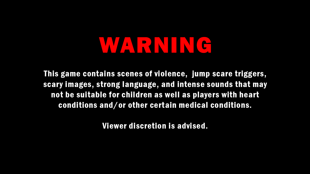
Of course, we're aiming to make this as good as a pixel horror game can be. Which means it has to be somewhat scary at the very least. Still, there's only so much you can do with pixel graphics, but just to be on the safe side, I'm still including a fair warning before the game begins:


Players should know before they start that this is designed to be a horror game and may not be suitable for everyone.

However, if uh, we should like...win, and it becomes necessary to make the game suitable for a wider audience, we are definitely open to toning down the game to PG-13 levels (cough...talking to you judges...cough....XD).