I love that infinite loop XD And the Bureaucracy skill too, I put points into it because it felt like a Chekhov's gun and it paid off.
WindySilver
Creator of
Recent community posts
I had to keep trying and trying until I found an ending that did not involve me going SPLAT or BOOM (whether it was by the orange BOOMs or the pretty flower BOOM). The tone of the story was super entertaining - and the point of view was refreshing after all the human-POV zombie apocalypse stories I've seen.
You summed up how I've felt about this thing ever since the concept came up and got chosen during brainstorming in five words and four exclamation marks XD Thanks for the feedback! It's inarguably true that the moving could've used a lot more testing and polishing than it got. It was by far the most painful part of coding this game for sure.
I lowkey want to revisit this to at least fix some visual issues and implement the audio properly; we had an insane crunch on the last day to get this even this playable so the audio side suffered quite a bit even though our audio designer made lots of stuff for this. We'll see if even that much happens, though. No promises at least from me!
This was fun, although I think the hitboxes for the melee enemies were a bit too big (I kept getting hits even though I was a bit above them on another level of the platform) and viewing the papers and items was rather finicky. The artstyle was really lovely - the idle animation for the crab is brilliant - and overall I enjoyed the gameplay. Nice work, erakkoravut!
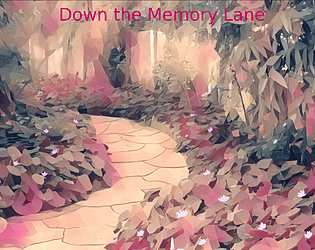
Lovely sprites! Thank you for these! I used them in my visual novel Down the Memory Lane.
Such lovely backgrounds! Thanks for sharing these! I used them in my visual novel Down the Memory Lane.
Thank you for this music pack! It's fantastic!
I used it in my visual novel Down the Memory Lane.
This is super hard to play. I think this could use a bit fewer jellyfish or a bit slower speed. I like the audio and graphics, but it's hard to enjoy them when I'm dying within 5 seconds all the time. ^.^' The actual moving feels good, but there's usually way too many jellyfish to have any chance of getting past them.
Instructions and/or a tutorial for the controls would've been great; either I couldn't understand how it was supposed to work or the controls are buggy and/or clunky. I'm not even sure if the setting changed anything since the "arrows" controls didn't let me leave the settings and both "keyboard" and "mouse" started a new game when selected, with the former using the mouse still. The audiovisual style is nice, but the controls need proper instructions at the very least.
The gameplay was alright. The graphics were cool, althought the text could have used a text box of its own instead of in the background; it was rather unpleasant to read since some of the text ended up being out of the camera's view and/or blocked by something.
The gameplay was a bit boring since it was repetitive (I got tired of having to reattach myself to the chain all the time), so it could have used some variation. Some audio - especially sound effects for things like hitting enemies and infection - would've also helped with making the game less boring since it would've brought more feedback for the player's actions. Nevertheless, nice work.
The concept is great, but having both harvesting and entering the submarine mapped in the same key made playing the game frustrating especially since you could only enter the submarine when you were near enough, which meant that it was also super easy to get stuck if you fell somewhere too far away from the submarine, for example the beginning area, after venturing further. This meant that
the submarine was likely to be too close when you were trying to harvest a plant and thus making you enter the submarine rather than get the plant like you inteded.
I like the audiovisual side of the game, but harvesting (or entering the submarine) certainly needs a key of its own. The pause manu could also use a "resume" button; I pressed the "return to the menu" at the beginning of the game multiple times since I just assumed that it would let me begin playing and didn't read what the button actually said - another button would've forced me to actually read the text instead of just assuming that the single button in the menu will just close the menu. In addition to that, I think the game shouldn't begin with the pause menu to begin with; if the player wants to turn the audio off, they can open the menu by themselves.
Overall, this has potential to be a fun game but the controls need some polishing.
The graphics and audio are fine - although I think the background music didn't quite fit the game - but it was a rather boring gameplay-wise. It was easy to lose track of the ball since it went so much faster than the fish, so it ended up being more about avoiding the enemies and hoping they won't hit you and hoping that you manage to relocate the ball and send it the enemies' way. Decreasing the ball's speed would've made it more wieldy and helped with defeating the enemies.
By the way, I spotted a bug: when you exit the settings in the main menu, you get stuck in the menu screen since the menu buttons don't reappear.
A nice game for something made in three days. The passageways were a bit too tight, though, and I admit that the background audio loop with the splashes started to annoy me pretty soon ^.^' The other one fit the game far better, so I think this game would've been better off with just that. The moving mechanic worked well, though, and it was fun to use.
The art style is lovely! I admit that it was a bit hard to get the hang of the controls at first, but I think they were fine when you got used to them. Also, I like that you put a brine pool as a great hazard! A quit button would've been nice, like RareChip already said, but otherwise your game is really nice.
The graphics and audio are nice. The concept is interesting, but I admit that gameplay was pretty frustrating. Although, after playing I noticed that it was partly due to user error; I didn't notice that the keys' current directions were visible on the screen. Hence, I played the game a second time with more attention to the keys' icons, but the gameplay was still more frustrating than fun since the changing directions kept messing with my own sense of direction.
As for improvements, I'd say that the keys' icons could have used some kind of a visual effect to draw the player's attention to them so it would've been harder to miss and/or ignore them. I think their positioning is good, but it was easy to ignore them as soon as you started playing the game. Unfortunately, I don't know how to improve the movement mechanic in its current form, so I can't give any constructive criticism for it.
Nevertheless, I think this is an alright first game. My first one was so bad that my partner and I named it "Brain explosion" simply because the platforming was so awful that it felt like our brains would explode when we tried to get through it (which I think we never did). It didn't even look good or, if I recall correctly, have any audio to make it any more pleasing to the eyes or the ears, so you did far, far better than I did back in the day!
Thank you! The confusing navigation was actually intentional since it would stand to reason that you'd have no idea which way is which in an underwater cave system. I've gotten lost in caves in Subnautica so many times that it felt like the most logical choice :'D
Whether or not it was a good design choice is, of course, a completely different story.


