Thanks! I haven't done much background art before so I owe a lot to my artist friends and tutorials online for help. I look forward to your continued support!
Xcissors
Creator of
Recent community posts
Sorry about the first sentence haha, it was more of a 'is this not the best thing ever?' kinda sentence structure.
For the intro, I agree that more characters are a bad idea but I still think having one with extra focus/appearances would do a lot. Everyone in town did have something interesting to say, but it would be nice to have one the player cares about more (think like Zelda / Groose in Skyward Sword).
For the combat itself, the reach was fine, but the width was too small. Having to jump and time each hit and not sure if it would. I understand the need for skill but it was annoying if I'm in front of a moth and can't hit it at all.
My god is this not well done. Big props to you guys.
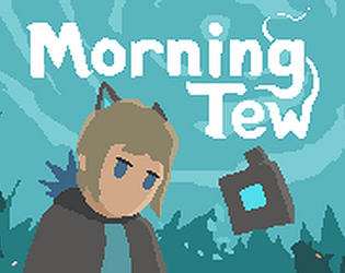
Art & Music: The use of the pixel perfect camera and the unity particle system is masterful in this, adding a lot to the atmosphere with the never-quite fully legible yet horrifying monsters and abstract symbols. Small nitpicks would be that the main character is a bit stiff, and that some of the UI feels less polished than the rest of the game, but you get used to it. The small worm enemies are sometimes too hard to distinguish from grass, especially when you're moving fast. The music is also varied, catchy, and pairs well with each environment.
Story: A slow burn that builds until a great turning point that hooks you completely and integrates well into gameplay. It's straight to the point and gives you a sense of greater unknown powers at work. The simplest things like the location name give you lots of intrigue by itself. One thing I think that could use more work in a longer game is to give more characters and attachment to the townspeople, though that may lengthen the intro a bit too much. Perhaps focusing on one or two characters and really endearing yourself to them would make the impact that much better. Right now they are funny and varied, but I haven't spent enough time with them to remember them much or our main character.
Gameplay: The movement is oh so satisfying and easy to control. I'm not sure I found out what to do with the stone symbols, but there's a decent amount of content in this map. The spear's hitbox does feel a bit small so landing hits can be a bit hard to judge. I found myself tanking hits / avoiding enemies more than I tried to properly engage them, so it might be worth looking into making combat more fun? Not sure.
The levels are well crafted and have many small, interesting puzzles and challenges to do. Coming back between rooms was still fun and little nooks and crannies weren't too obvious but still easy to spot if you were looking for them. The game really opens up after the turning point and it feels exhilarating (which ties into the story well). There's a small issue where occasionally I can get tossed back and forth between level boundaries but it's mostly smooth.
That is to say, I am completely nitpicking and was blown away by your work. I enjoyed it immensely and will be following to see more progress!
There's a lot of interesting ideas at play here, but I have some comments I would like to share. Apologies in advance if I sound a bit negative, I want to see this project improve because I think it has a lot of potential.
Art: The art and animations are lively and impressive. The main character and boss are well designed (and cute), and the tile sets are polished and work well. However, the signs are a bit confusing (not sure what they're supposed to tell me), and there's not enough visual variety for me to build a mental map, becoming very lost.
Gameplay: The block throwing mechanic was very interesting immediately and has a lot of potential. However, when it is used repetitively (like to clear a number of floors in a row) it quickly becomes tedious. I really liked it when there was some tricky gap where I had to meticulously set up my blocks, which made for a very satisfying puzzle-solving element. Creating more puzzle set-ups for this would be great, but as a movement mechanic it needs to be quicker and easier to execute.
The powers caught my attention in a great way, as I was very excited to find and use more power-ups. However, I became cautious to use them or experiment as there was only one slot at the beginning, and I didn't want to become stuck exploring just because the right power was not equipped. This was compounded by the lack of save barrels to change them at. However, the idea really intrigued me and I wanted to see more.
Map design: I had to keep looking at the map to figure out where I was. The layouts had some interesting puzzles, but most were monotonous. There were a few too many times where I got to a place and became blocked, having to backtrack to the last fork, which was a good distance away. If there is a thing that requires a power, it should be tested at a fork so the player can go another way.
Overall, it's very impressive for a month's development and I hope to see more of it in the future.


