Indie game storeFree gamesFun gamesHorror games
Game developmentAssetsComics
SalesBundles
Jobs
TagsGame Engines

yoVeronn

11
Posts
2
Followers
1
Following
A member registered Jul 11, 2021 · View creator page →

Creator of

Recent community posts

Fun concept, cute cat assets. I like that you can choose different cats and audio. Sensible and satisfying scoring system.


A couple of adjustments I'd suggest:

- for the free camera, it would be more intuitive to rotate it from the player's perspective. Currently the world is rotating in the same direction as the mouse rotation, but if you want to simulate the player turning their head, it has to rotate in the opposite direction.

- explosion sound can be toned down in its volume. It is significantly louder than the other sfx and bgm.


Nice work!

It certainly creeped me out, the music became more and more unsettling and the ingredients as well.. <SPOILER> i was certainly relieved and bamboozled with the ending lmao the devs did an awesome job with the entire game's atmosphere.

(1 edit)

This game is unique in its premise and tells a touching story. It pulled at my heartstrings because this lady is living alone and unlucky enough to die in an accident but she loves her cats so much that she doesn't care about her own problems TvT The art and music are really good and of course the writing was really effective and gave just enough hints to balance the difficulty for firsttime players. I like that you don't necessarily have to follow a strict order so if you mess up you don't need to restart the entire game. The only thing I would ask for are pause and escape buttons, and maybe another separate story if you guys are up for it! I love the details like the fish food not being able to fall into the bowl if the fan is blowing in its direction. Good job at making such a cohesive short game that has a beautiful tale <3 

Thank you for playing our game! Your feedback was very constructive; we will definitely be making some adjustments to the difficulty and pacing of the game. We did include instructions on what to avoid in the help page in the menu, but we will think about how we can remind the player of the different objects at the start of each scene. Lastly, I'm glad you liked the art as we tried our best to design everything on our own!

I really like the aesthetics of the game and the starting narrative. Good contrast between the cityscape and the fantasy land. I especially love the bgm and how it evolves after each level to be livelier.

Currently I'm stuck at the fourth mushroom where I can't jump high enough to reach the next platform xD I always just barely miss it. Also for a while I thought that the black curly things on the ground were killparts, because they look the same as the big one chasing the player, but turns out they were just speed debuffs.

I don't know if this is intentional but after restarting the level many times, the whole art just becomes black and white except the UI (hearts).Also thankfully there were checkpoints within the level, though I would have preferred if they weren't hidden, but I can understand if you choose to leave them like that.

Anyway I hope the character has a nice ending even if a bittersweet one. The story makes me motivated to beat the game!

(P.S. credits and quit buttons not working)

Holy moly, my stress levels went up so much but since I like puzzles, that was still fun. This game is quite promising and hopefully there will be more levels and tasks. I like the underlying humour in the dialogue. Also, I'm not sure if this was intentional but when the rookie was trying to fix the wires, the bandaid was just placed randomly in the middle of nowhere instead of on the broken wire, which made it funnier lol. The password challenge is hard I'm still not sure how to get to the 9 so I just reroll haha. Good effort and nice art!

No problem, I went through another round of the game because I really liked the planning involved and I wanted to see if I could complete it faster :P I only have two things to note: sometimes the score  calculation for the damage is wrong, for instance in the first enemy stage I only got hit once but it said that the total damage was 10. Might just be some equation that needs a slight edit, but it's not a big deal as the HP works correctly in game! 

The second point is that it could possibly help the player a bit if they could occasionally view the rest of the map/the whole map while they are playing the level, perhaps by being allowed to move the camera with the mouse button down to see the remaining steps and then the camera snaps back to it's normal angle once they release the button. This is especially helpful for the levels with the underground portals as I sometimes cannot see where I would teleport to or how far the next enemy is. Thank you!

Aww thank you for playing our game, and glad you enjoy it! Do let us know if we can improve on anything

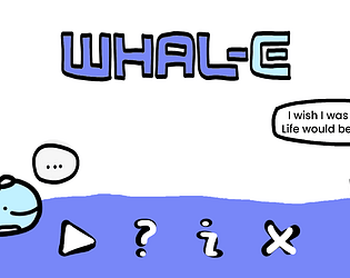
Thank you for playing our game and giving so detailed comments! I'm glad you picked up on the theme. Narrative-wise, we would have loved to spend more time developing our story. The idea we had was to have the player experience different stages of the whale's life - so it was meant to be the same whale, and injuries from its past would be carried onto its older forms, but the whale can gain back health by eating food from the second stage and older.

I like your suggestion for the items, our design was directed towards items that would represent each stage of the whale's life. It definitely could have been incorporated in a more cohesive way into the story/theme.

In future iterations of the game we would want to think of ways to age up the whale while keeping the unique aesthetic of each level, as well as developing the narrative. I would also love to learn to programme more complex abilities for the player, or design more level features, so that the gameplay will be more challenging and stimulating. (I'm still quite new to programming so still learning!) For now, we just hope that people can enjoy the vibes in a low-stress context, just as an introduction to the world and the theme.

Very engaging game, I like the strategic thinking it requires me to have!

I think it's a very cool concept, simple and neat designs and clear instructions! Perhaps if you'd still like to work on it, I would suggest that the difficulty pacing could be worked on, as having 8 elements might be too hard for a beginner. Maybe have an easy mode where there are only 4 or 5 elements to play around with. But overall, I like it and it fits the theme really well. Glad to hear that you've learnt a lot :)