What a clever idea and beautiful realization!
Zee Weasel
Creator of
Recent community posts
Oh another shooter! I really love the idea of having to reveal enemies as they approach, or in general, having to do an action to reveal an enemy - I am totally going to yoink that concept for something in the future! Certainly a great implementation of the '2 Buttons' Modifier!
What was that cool rock riff in the back?
Super interesting concept, didn't even consider that optimetrist simulator could be a game!
I am really bad at remembering these things, so a post it note of sorts that I could check to see what type of customers wants what would have been great (unless I missed that), but I muddled through.
The controls threw me off at first, but once I understood in which order I had to click them, it was very smooth sailing. Would have probably loved it even more if I had to rotate the actual device around for each eye, but using slider worked just fine!
Cool entry!
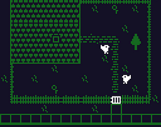
The automatic door thing is definitely something that someone else brought up during playtesting, but I was hesitant to add another button to go into the door, in fear that players would get confused how to enter. If I had a bit more time, having an input icon bounce above the exit to teach the player would have been the way to go I think!
The palette limitation really helped me to keep the art consistent and if I go pixel art with other projects, I will most certainly make use of a palette like this!
Thank you so much for the kind words!
Thank you, those are all very valid points. Crouch is something I implemented, thinking the player might want to sink down faster, but ultimately the levels are too small and the enemies don't lend themselves to using that sort of movement. It also isn't really needed otherwise, since the player will always fit in gaps regardless.
Rebinding keys would be something I should have added if it wasn't for the time constraint (and my wish to create all code by myself rather than use others assets), but there are so many spots where I wanted to do more polish and ultimately add more content... That's jams for you haha!
I am really glad you enjoyed the game, even so much so that you went for another run!
Since I was livestreaming the progress and had a few people test the game for bugs for me, I was thinking I'd let a bunch of folks just draw maps (they are PNGs with colored pixels determining the map layout and placements) and add them as a selectable list, but I felt that would have gone against the overall idea of doing it as a sole developer!
Again, thank you for your kind words, they made my day!
The hill size is a really good point and I should have played around more with scaling but i ran out of time to do another pass. The camera was really tricky to get right for me and the y movement was something I wanted to do but after 20 hours I figured 'good enough'.
If I decide to pick thst project up again I will most definitely make those changes!! thanks for the through feedback!!!


