Indie game storeFree gamesFun gamesHorror games
Game developmentAssetsComics
SalesBundles
Jobs
TagsGame Engines

[Pixel Art Feedback] Home Furniture Asset Pack

A topic by Powered By Decaf created May 07, 2021 Views: 914 Replies: 7
Viewing posts 1 to 6
(4 edits) (+1)

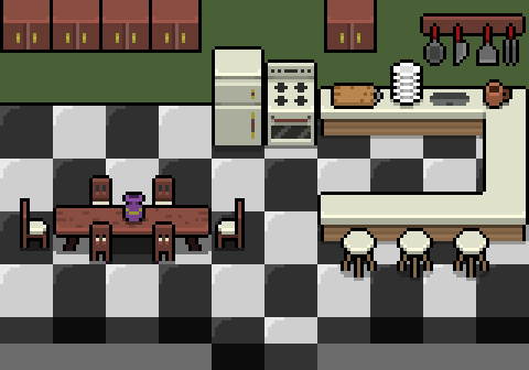
So I'm working on an asset pack for home furniture but figured I'd get some feedback on it before I draw too much. I'm doing modern styled furniture right now because I'm not a big fantasy buff and I don't really see enough modern style asset packs. If there's something you'd like to see added or you just have an opinion on the look, please let me know. It's divided into 16x16 and at the moment I'm working on the kitchen aspect. I plan to add bathroom, living room, bedroom, and maybe study.

This pic has been scaled 300% for more forum visibility.
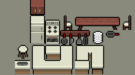

I slapped together this scene with the assets in the pack. The floor is also a part of it too. Hopefully I'll be able to release it soon. I want to make it part of an entire home set.

(+1)

This looks very nice! I think the shelves could use a line of shadow under them. But otherwise, looks good!

Oh yes. I'm going to include the shadows as a separate sprite so users can place the cabinets as high or low as they want. Thanks for the feedback. I forgot to do that. 

(+1)

Like with the weapons pack, these look great, especially at such a small canvas size! You understand shading and utilize it very well.

Is everything in the mock-up part of the pack? I notice a vase, cutting board, cup, and alternate chairs that aren't in the spritesheet. Perhaps part of the kitchen pack can be an individual plate, individual utensils (I just see the pan in the spritesheet), and cup? 

I've been adding to it so everything you see is in the pack. I'm going to add a few more items and release it. As with the weapons pack, I'll probably be adding onto it. 

(+1)

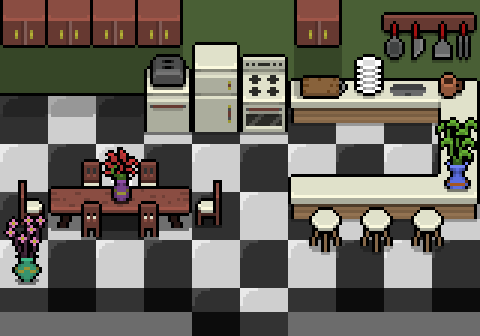
Ok, I've uploaded this asset pack. It can be found here. Let me know if there's something I can add or some other feedback. Also, here's an updated screenshot. It's 16x16 but I've scaled it 300% for the purpose of this screenshot.

I've updated the asset pack with another room. I've decided that I'll definitely be making this a full home asset pack. Here's the updated look: