I saw!! Excited to watch this. Thank you so much for trying it out!
Thank you. That means a lot. I've always liked Tarot cards for the layers of symbolism and general thought-provoking nature of the experience.
Appa's Papas
Creator of
Recent community posts
Hey there! I'm so glad you liked it! I cried this morning reading this (good tears, good tears!), so thank you for sharing.
The YT playthrough sounds awesome! The demo here only goes through Swords ... and it's quite old. I'm going to release an updated demo hopefully next week. If you'd like to play the full game, send me a shoutout at daniel.totten@appaspapas.com. I'll send you a build of "beta v2.2" once it's done (~ next week).
Take care,
Daniel ~ Appa's Papas
Thanks for sharing the installer trick! I'm definitely gonna look into it.
For the menu, if you can, I'd recommend checking out this Udemy course: https://www.udemy.com/course/level-management-in-unity/ . Obviously try to get it at the reduced price, but he goes over a very handy and flexible menu system/ save system you can use on all your games.
Hey there!
I spent ~15 minutes with the demo. Here are some notes:
I agree with a lot of the comments from TripleSmeven. I will say I liked the installer for the game. . . I need to look into how you did that, because it made it feel professional and polished to come as a real "program" instead of a zip file of the build.
- Good job on the opening cutscene! It wasn't exactly representative of the game, but the cinematography was good. I didn't need to skip it, but having the option is always good.
- I don't understand Spanish, so I couldn't read the intro text. It did fade a little quickly. Perhaps pad it with a few seconds. I try to go for ~2 seconds for a decent pause, or ~4-5 sec if I really want to emphasize something.
- There is a hefty lag between the Control screen and the main menu (when going back to the main menu).
- For the opening level, there are a lot of mechanics all at the beginning. The platforms are a little too stacked, and I died a lot just trying to get to the first moving platform (the one above the first one would clip my jump).
- If you haven't / don't already, try taking a look at GMTK (Game Maker's Toolkit) on YouTube. This video is great for getting a decent starting ground on simple platformers:
- I also died like 4 times trying to get the purple vial until I finally realized there were spikes. I think TripleSmeven's suggestion of blurring the background could help, or more outline / brighter colors on the hazards if you want to keep that pretty background.
- For the second scene, it might help to have the falling platforms be slightly different than the non-falling platforms. But it was a good surprise!
Good luck!
I haven't sold any packs, but I took a look at your page.
One suggestion would be to remove the tiled background to let the dev focus on the animation work. I think the color palette is good, and I didn't notice any typos.
If you haven't, perhaps blast your page around social media to drum up some interest. You can also contribute to OpenGameArt and other dev repository sites to help build up interest in your work.
I hope you get some sales!
Daniel
I think that's a great idea! Other "modes" could really expand it to a full mobile game. Just spitballin':
- Start with addition, then add subtraction, then multiplication.
- Then get really crazy and start changing it up for each input round: addition, multi, sub, sub, add, multi, etc.
- If you really want to challenge ppl, throw in fractions! (;;;*_*)
- Not sure how you'd make it extremely obvious what operation to perform. . .
Morning!
I spent ~15 minutes with the game. I found it to be really fun! I love number-based games (I'd take a Sudoku over a crossword any day), so perhaps I'm a bit biased. I have to say, I quickly forgot that I was trying to play this game to review it. It was genuinely that fun and polished! I tried to get on the leaderboard, and got to #11. . . so close!!
- I quickly understood the mechanic. The only "issue" was that I thought it had to be 3 moves. It wasn't until presented with a "3" and I did "2 +1" to realize it could be up to three.
- By the by: the tutorial was really well done. I really liked where you let the player try out and find their preferred way to interact with the game. Kudos.
- I didn't understand what qualified as "Good" or "Nice". I enjoyed when it popped up, but I couldn't readily understand what conditions triggered that.
- I didn't find it too difficult, but it definitely wasn't easy. I got the furthest after buying more time for level 1 in the shop. Personally, the time is a scooch short.
- Visual
- Generally looks good. Perhaps some UI "sparkles" (like the buttons changing color on hover), but, again, that's my opinion.
- I enjoyed the game screen: the color changes to match advancement, the buttons. I never focused on the timer, instead relying on the "LOW POWER" warning, which, for me, constantly prodded me to add a sense of urgency.
I think this should definitely be a mobile game. It's got that "hook" (I kept playing. . . ). Does it ever progress to other mechanics, or is it just endless?
Cheers,
Daniel
Much better!
- Lighting was greatly improved. It was dark, but not total black. The fog helped "shape" the rooms, so the back half without the fog was still harder to see, but I like the contrast.
- None of the jump scares scared me, but I liked the movement of the objects (the crayons and the objects). The drawing that moved in the back then ran away was a nice touch, as was the first one on the right (in the back area).
- The darker skybox is a major upgrade! It was only truly noticeable with the bathroom-glass wall (since the green is so bright compared to all the other textures), but the darkness was definitely better to see than the blue.
- That music box music. . . . is both annoying and offsetting. I think it definitely helps set the mood. I kinda even like it. Is it possible to "balance" your music by playing that track slightly softer than the wind one? It's your game, of course, so do what you want. :-D
- The player speed is spot on! Do you like it faster?
Hrm. . . . I'm not sure. I use Unity / C#, and I've never used Godot before. But, here is how I would set it up for Unity:
- Depending on the game, I'd have a Rigidbody component either on the trigger GameObj or the player GameObj. Let's say it is on the player.
- Create a GameObj that has a Collider on it. *Make sure it is set to trigger!* That's important.
- Have a script with code (sorta like this) on the trigger GameObj:
[SerializeField] private float timer = 10f;
[SerializeField] private float timeForAnimation = 3f;
// State
private bool startTimer;
private void Update()
{
    if (startTimer)
    {
        timer -= Time.deltaTime;
        if (timer <= 0f)
        {
            GetComponent<Animator>().SetTrigger("Scare");
            Destroy(gameObject, timeForAnimation); // This could be extracted as a function to use as an anim event
        }
    }
}
private void OnTriggerEnter(Collider other)
{
    if (other.CompareTag("Player") && !startTimer)
    {
        startTimer = true;
    }
}
Like with the weapons pack, these look great, especially at such a small canvas size! You understand shading and utilize it very well.
Is everything in the mock-up part of the pack? I notice a vase, cutting board, cup, and alternate chairs that aren't in the spritesheet. Perhaps part of the kitchen pack can be an individual plate, individual utensils (I just see the pan in the spritesheet), and cup?
Morning!
I've spent ~15 minutes with your demo.
- After going into a room that takes me to the hallway with notes, I found this error:
- ERROR: Node not found: Timer.
At: scene/main/node.cpp:1381 SCRIPT ERROR: _ready: Attempt to call function 'start' in base 'null instance' on a null instance. At: res://world/gametunnels.gdc:6 - The music stops, I go back to the main room, but I'm not sure I'm getting the full experience. No other room triggers anything.
- ERROR: Node not found: Timer.
The atmosphere wasn't particularly spooky for me. Very dark, yes, but almost too dark (see Screenshot 2). I also had a problem with draw distance (see Screenshot 1). That in particular pulled me out from the overall experience. Could the skybox (or whatever background is being used) be set darker than that blue? If almost black, one may not notice the "pop in" effect as much.
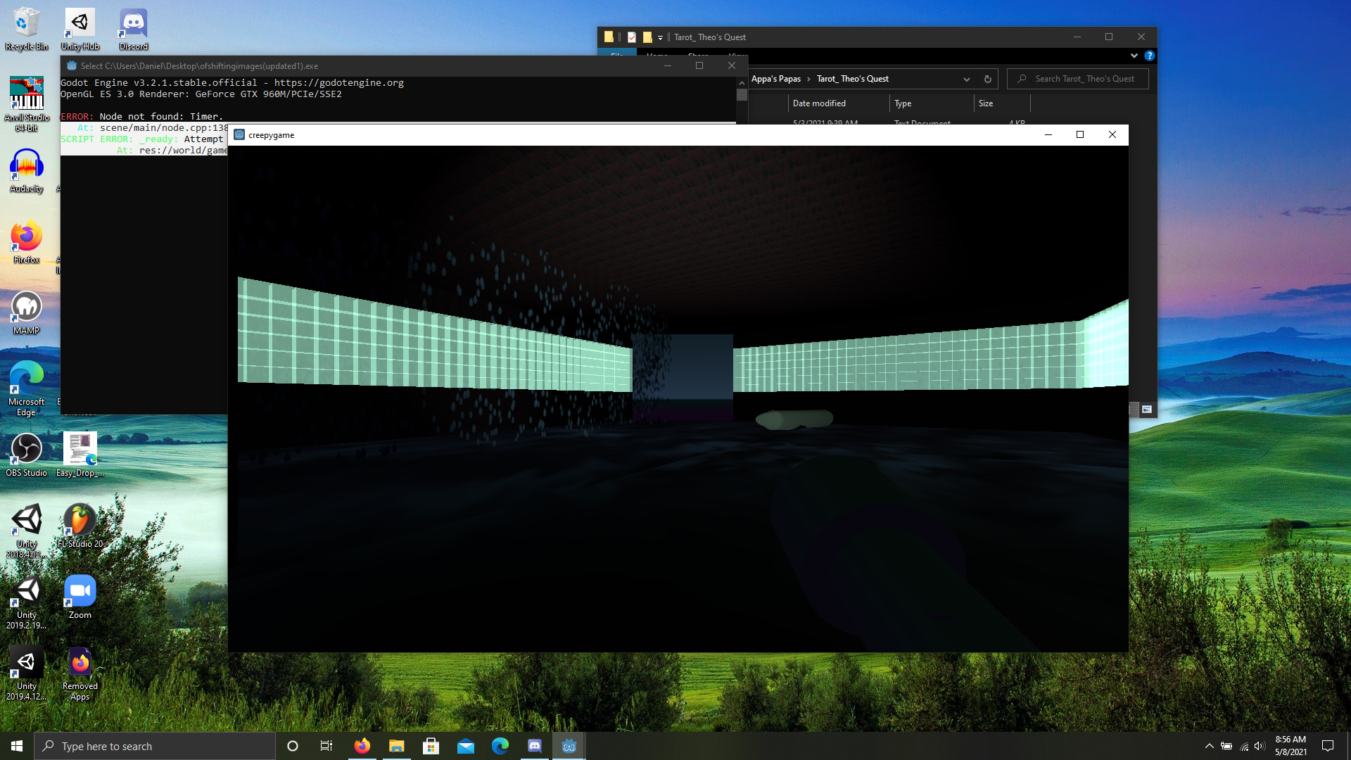
Screenshot 1 - Blue skybox visible
I did like the hallway with the notes about Cooper. That section legit started to give me "spooky" vibes. Perhaps if it was put first? Or at least encountered before the room with the crayon? It helps give context to the experience.
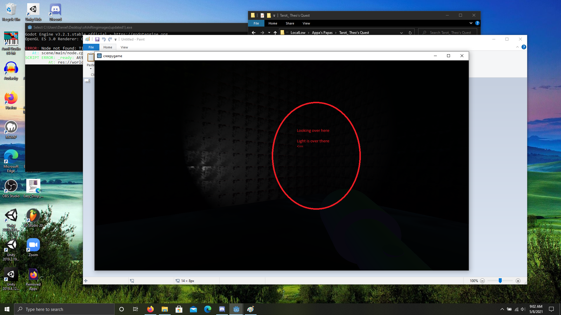
Screenshot 2 - Hello darkness my old friend
Have you tried increasing the movement speed of the player? Even by ~1.5x, it might help keep players engaged with the game. Super slow movement almost always makes me want to quit a game, unless there is a lot to look at (Vanishing of Ethan Carter, or Gone Home as examples). That's just my opinion, though, so make sure it's something you like!
I don't think the game is too busy, per se, but instead a little too open. I like the black texture used for the walls. I think the red texture has a harsh border that makes the units a little distracting once tiled.
For the drawings, yes, definitely. It might be fun to make a jump scare (when players get close to certain ones, maybe it triggers movement, or runs away, or something). If you want more subtle horror, you could make it so that drawings do tiny things, like blink, every once in a while.
Layout:
The layout was a bit confusing, but I was able to build a mental map of the area fairly well. The only thing that really confused me was after the hallway. I think I'm respawned in the room opposite from the one that triggers the event. . . or if not, I got turned around both times I played after that event.
Music:
It was ok. In both play-throughs, the music stopped after the hallway scene. While there, it did help set the tone (dark, alone). Since these are children's drawings coming to life, perhaps a dissonant music box (like Jack-in-the-box music) that slowly plays behind the wind-like music? Again, that's up to your vision/ direction. :-D
Hey Bob! Thanks for the detailed feedback. It is very much appreciated.
- I will look into other font options. I sometimes have a hard time reading it, and my husband's parents (bless them for trying) also strain to read it. It might make it to mobile, so it'll be even tinier. . .
- I'm in the midst of negotiating with the composer for unique music (the music was from OpenGameArt). I'll ask them to spend a little extra time with the battle music, since it will be the most listened-to track. Thanks for sharing!
- Hrm. . . a notebook. That'll be something new for me, but I think it could be implemented. I could put it in the pause menu. That definitely can cut down on the overwhelming aspect since the player won't have to retain it all.
- I'm even pickier, so no worries! I've fixed the spelling already. :-D
- Cancel the mini-games. . . I don't have a way to do that at the moment, but I can listen for a right-click and cancel. . . yeah, that's a do-able feature!
- The bug sounds like a problem with grabbing the dialogue SO asset from Resources. I'm upset with myself for having the bug, but I'm actually glad you had the same one. Now I know where to look to hopefully fix it.
- The dreaded map question. I'm planning on this to be very linear. The player starts at the bottom and goes clock-wise back to the same town. In my very first prototype, I had a fast-travel option planned (by riding a broom), but I scrapped it due to the linearity. If the player won't be re-dueling anyone, do you think a map is necessary, or a "nice-to-have" thing?
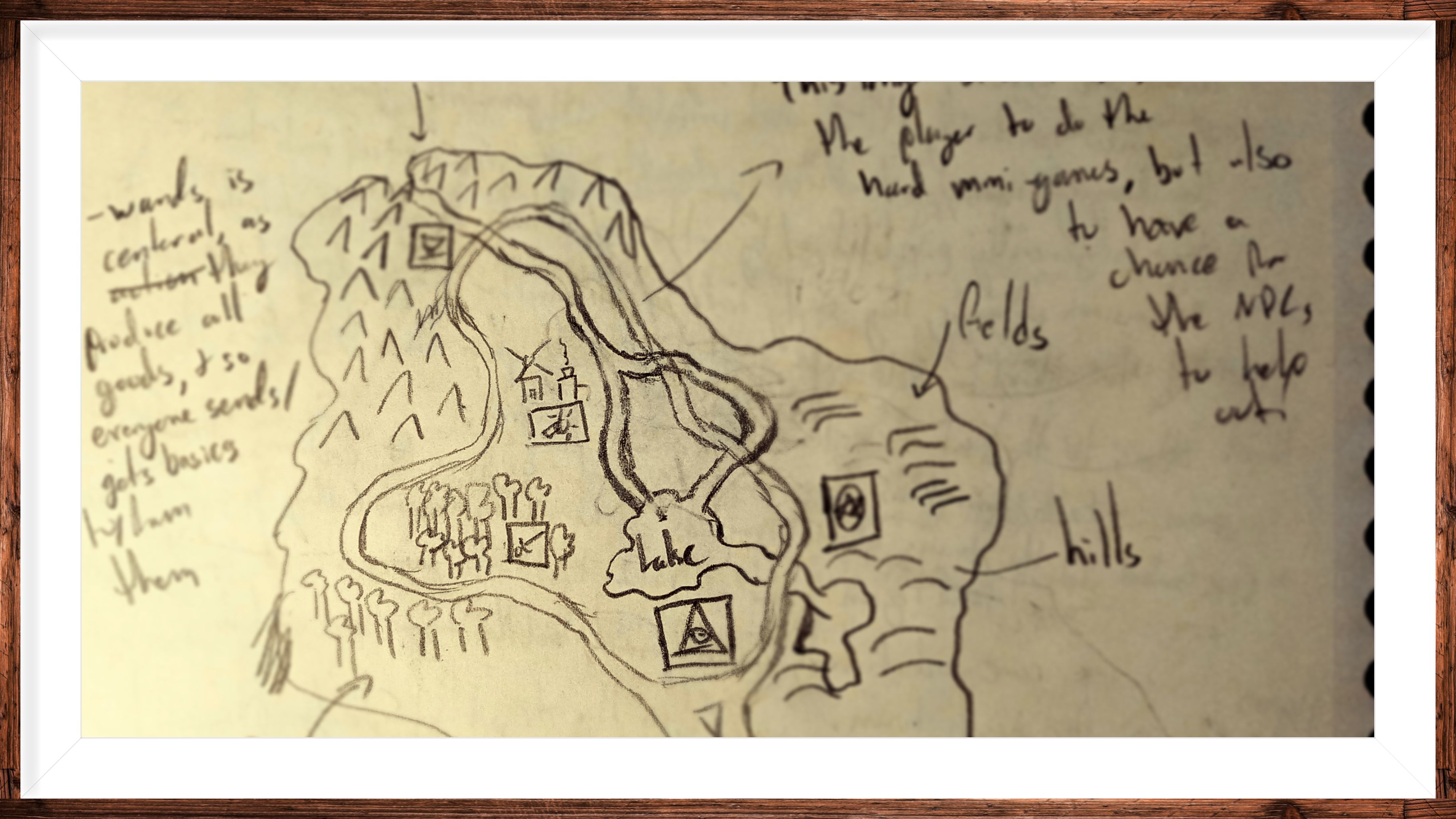
Thank you for the kind words, and thank you even more for taking the time to try it and leave this review!
Thanks for the feedback!
I thought the text at first would be a lot. . . In the final build, you'll (hopefully) start in a town, and the tutorials will come from fellow witches as you try to reach the Master to get your starting suit. For the demo, though, I will try to think of a way to get everything across without it being overwhelming.
Oh no! The cutscene didn't work at the beginning of the second section? I'll look into it. Where you on Mac or Windows version?
I'll tell Appa you think so. :-)
Thanks again!
Howdy! I just put in ~1 hour into your demo. Please don't take any of this as personal. Here are some observations/ thoughts.
- Potential bug? I downloaded the game and started it. It went to a screen with Artin talking to me. I realized I wanted some music, so I quit the game (Alt + tab out, then manual close). When I came back, the scene didn't play. Instead, it went to the main menu. I wiped the player prefs in AppData/LocalLow, but I couldn't get that scene back. I'm playing on Windows 10.
- At the beginning of the game, the textbox says "Write with a pen. . . " I tried to use a mouse to write a name. . . until I realized it was just to type in! It might help to have a different instruction in the box.
- In line with this, I don't understand why the player writes their name. Once I select a new file, it asks me to write a name again. And then I think I'm assigned a pre-defined name during the game (I didn't see my name during the boss battle).
- You got good particle effects! The squishiness of the player, the breaking test tubes. . . I enjoyed these interactions. The hit rate is a bit high (I played as a mage), as it took a min of 4 charged hits to kill anything, though.
- In settings, under Audio, I like that I have instant feedback with the music slider. Unfortunately, the SFX option does not play an effect to let me know the volume level. You can add an Event Trigger component to the Slider. Then choose "OnEndDrag" and drag in a GameObj with a script that has a function that plays a sound effect.
- In the menu, there are several instances of "It can't be . . . ". The text is hard to read against the background. Perhaps white text with black outlines? You can use TextMeshPro to add outlines. Or use a script like https://github.com/n-yoda/unity-vertex-effects
- In the demo, there wasn't anything to tell me how to jump. I almost quit at the first obstacle because I thought it was the end of the demo. Unless I missed a sign, then ignore this.
Overall, I enjoy a good Souls-like. You've done a great job with the movement and particle effects. I like the visual style. . . it's simple, but off-putting. . . a lot like Undertale. I had a hard time with the combat, though. I died 3 times against the boss (which I LOVED the fight intro - don't change that), and several times I died while dodging (I was dodging the spikes that went up through the ground, one after another). Keep at it!
Daniel from Appa's Papas
I think your shading is quite well done, especially since the canvas is so small. An easy way to expand the collection, though, would be to swap out themed handles onto each type of weapon. . . you've put in the work to make unique ones, might as well make them modular (and to allow devs to make a theme set of weapons from these awesome sprites). Another way to expand it would be to create "magic" overlays for the given weapons (you only have the fire sword in the upper right corner at the moment, but there could be poison (green), ice (blue), electric (yellow), etc on every weapon). Additionally, you could create a set of different arrows. . . the tails or heads could be different, or dripping with something. Finally, it would help to have a solo arrow in the pack since devs would need that as a separate asset when firing the weapon.
(Edit 5/17/21)
Game: https://appaspapas.itch.io/tarot-theos-quest
Systems: Windows and Mac
Genre: Card game (based on Tarot deck) with additional light adventure elements
Controller: None needed. Entirely mouse-based.
Hello, hello, hello!
I've been developing this game since October 2020. I've released an updated demo. Specific things that are on my mind:
- Is there anything that you would like to see in the battles to ease the experience?
- We are already planning to let players see the hover preview for the card in the present slot, and we are thinking of making the card flash on the screen, or in a dedicated space, during the spirit duel portion of the battle to let the players know what caused what effect.
- Is there any player feedback / UI elements that could be improved? Better SFX? Any particle FX?
- Do you encounter any crashes / freezes? Any odd bugs? You should be able to quit to main menu and hit "continue" if anything odd happens, but that's not a good solution.
Thanks!!
- Of course, I would love to know what you liked as well!
I'm excited to start exploring this forum and joining the community of indie developers. Thanks for taking the time. I'll try to do the same.
Daniel Totten from Appa's Papas
PS: Here's Appa to brighten your day:
