On Sale: GamesAssetsToolsTabletopComics
Indie game storeFree gamesFun gamesHorror games
Game developmentAssetsComics
SalesBundles
Jobs
TagsGame Engines

[Tester] Can someone test my game and give a little feedback?

A topic by SweetMint created Jun 18, 2018 Views: 644 Replies: 3
Viewing posts 1 to 4

Hello guys! I'm Joe and I'm making a game for a university project called Momo's Adventure. The game started on the Weekly Game Jam #42 and now I'm trying to validate it, so I'm looking for someone who can spend 10 minutes to play this demo version and give me a feedback into a Google Forms (Pretty small one, don't worry).

Here's the game link: https://sweetmint.itch.io/momos-adventure
Here's the form: https://docs.google.com/forms/d/e/1FAIpQLScID_GejP5k1KwWShOeYWUkeizUOUQ5B-zHI_WN...

(2 edits) (+1)

Hey Joe! Just finished the sheet! I love this game so much... Keep up the great work! Three things I forgot to mention on the form;  The sound when you land back on the floor get pretty annoying after it repeats so many times,  so maybe make it quieter or change the sound, and also, when you hold the jump button, it looks like he "charges" his jump. This should make him jump higher, and I think that would be a cool mechanic to have! Finally, whenever I die the screen just goes to black. IDK if i'm doing something wrong or what, but if I am you may need to make it clearer whats happening, as it seems like a glitch... Other than those! I love it! Keep up the good work!

Heya! Thank you for the feedback. I'm really glad you could enjoy the game (:

I had lots of sound problems because Construct is a pain in the @ss to handle some problems, mainly related to sound volume and stuff. That's the reason I didn't finish the options button btw haha
The falling sound got me anoyed too, I was considering changing it's volume and make it vary a little more. But I got the conclusion it wasn't worth the work for a testing version of the game. If we decide to finish developing the game we'll probably do that on Unity, and that itself already makes it so more confortable to work with sounds. I hear you tho, I know there are lots of volume and audio problems on the project (I just wish I had the time to make the sounds myself).
About the jump, it's a funny story. The first version of the game had the normal instant jump (you can check it here if you want: https://www.scirra.com/arcade/adventure-games/momos-adventure-29580 ) and for me it was working perfectly. As I was validating the game tho, I used a metho called Fly on the Wall (where I watched people playing the game avoiding saying anything), and the 'double jump' puzzle was just too dificult. People would get stuck in there and give up on playing it. So I started telling people what they had to do and they couldn't make it anyway (maybe for lacking of action gaming skills?). To "help" those people I changed the jump action so it'd be on button release. I did this cuz if the player was trying to jump and change places with the beacon, I could know that and make it jump higher anyway. You can actually see that on the game: if you are holding jump and change place with the beacon the game will force a jump in the end. It seems I didn't let it clear on the gameplay and the new jumping system become really unintuitive. I've seen many people failing on basic jumps because of timing and etc...
A fix for this would be maybe create a difference between jump forces as you said or maybe allowing both ways of jumping? Idk yet what the best option would be haha

Thank you a lot for your time on testing/answering/commenting. I really appreciate it and it really helps to make a better experience for this or new games!

Admin moved this topic to Get Feedback
(1 edit)

Good job dude it has a pleasent presentation graphics wise


  • instant jump if you quickly tap the spacebar, If you hold for more than a second or so it should stick and charge the jump.
  • I dont like the mix of pixel art and than you have antialised text. I know its nit picky but it just looks so wrong.
  • music is very adventurous after a while i dident really feel it mixed very well with what i was doing.
  • I think the Click E for text is a little too frequent. the noise it makes is pretty aggresive.
  • the game is a little slow to get the point across of what you need to do. and i completly missed most of the mechanics beacasue there were so many notes to read i was rushing to play the game. i figured it out though
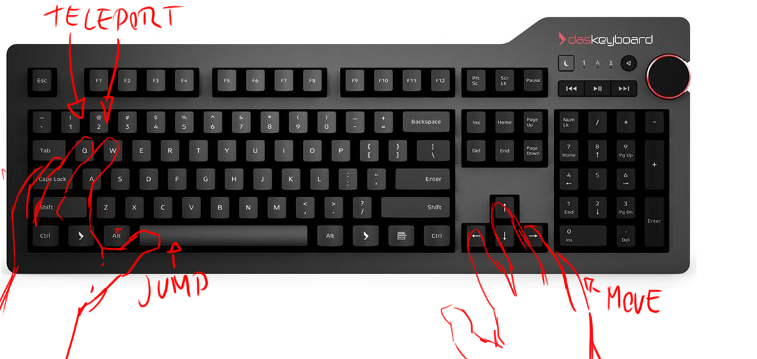
  • The keys "Y" "U" was  kind of strange i dunno it's just weird?  maybe it could work like this instead?
  • Are the notes also the checkpoints?? i was not really sure but it seems that way. maybe you need a better signpost for that.
  • the main mechanic is pretty interesting but the stop go jumping sort of messes that fleuncy up a bit.
  • the scrolling camera can sometimes place itself really awfully, hiding spikes just right out of view, sometimes there is one small tile than spikes. it feels like it's designed to kill the player rather than present them to a puzzle challenge.
  • I think what would be good is a pacer for the game when you click the button to teleport something that sort of pauses and goes and still keeps the speed. just a second or so so the camera can sort of get there first then the action happens, It feels very abrupt and you will just have to trust it will work out. It doesent solve the problem of teleporting in blind.  But it will atleast feel a little bit more fair.
  • Double jump puzzle part after that it was a HUGE gap between checkpoints i failed and had to do the double jump puzzle i stopped playing right there because ive solved that puzzle already, and i know i have 5 more once i just failed a second ago. remember to not waste the players time too much.

Good job though it was cool. But some compromises in the design has kind of made it feel really strange?