On Sale: GamesAssetsToolsTabletopComics
Indie game storeFree gamesFun gamesHorror games
Game developmentAssetsComics
SalesBundles
Jobs
TagsGame Engines

Pixel Perfect Aligning of a Pixel Font

A topic by emongev created Nov 04, 2022 Views: 251 Replies: 5
Viewing posts 1 to 6

Hello!
Sorry if this is an obvious question, but I've read the documentation to no avail.

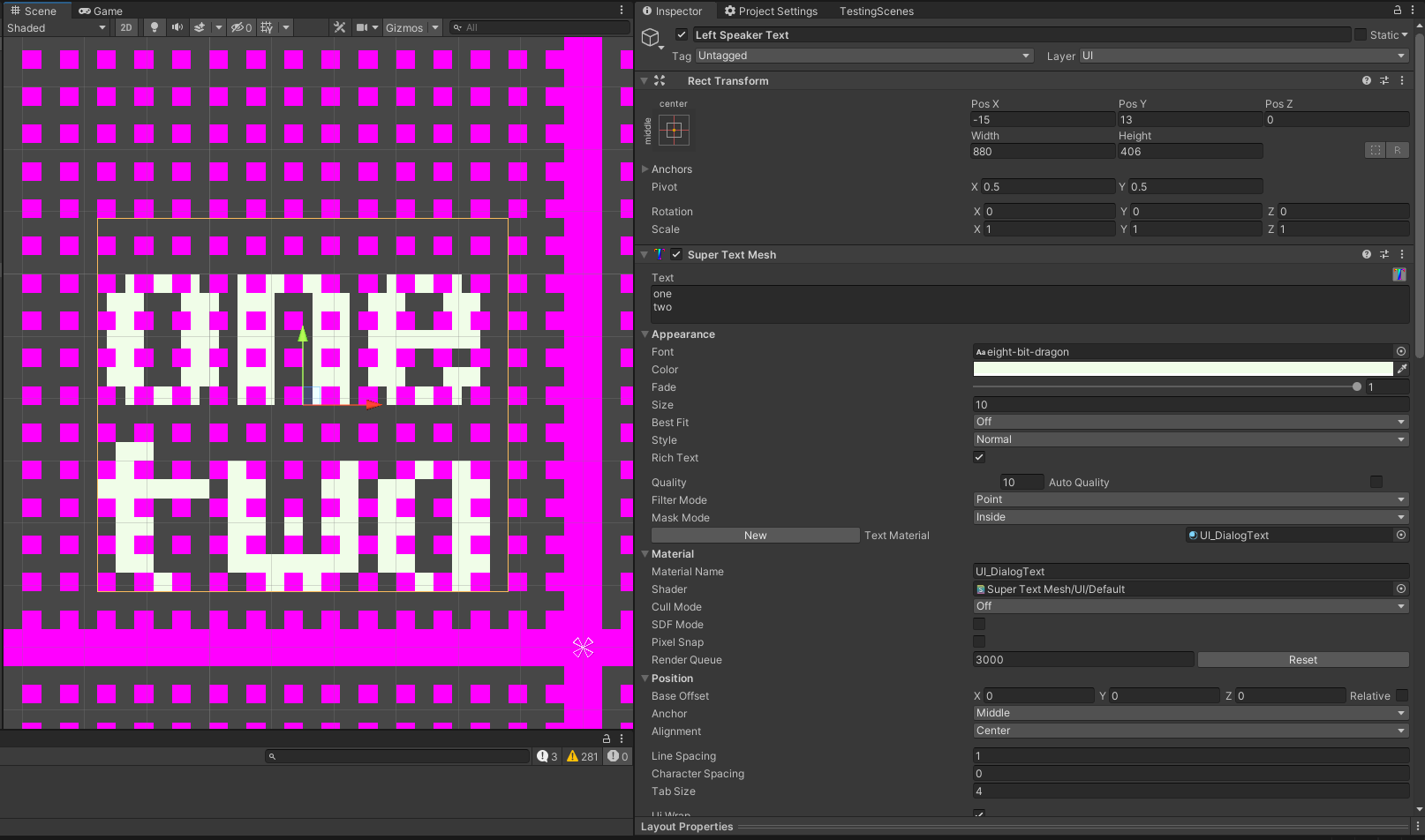
Our game is pixel perfect and is intended to be visible on 640x360, but I'm noticing that when I'm using a pixel art font with center alignment with a middle anchor its alignment is not pixel perfect while using pixel snap.

In this example the magenta points are a helper to view the actual 640x360. The game is rendering at 1920x1080, but the canvas is using a reference resolution of 640x360


If I use one less character (the exclamation mark, which is an uneven pixel length) the text now aligns properly horizontally, but not vertically.
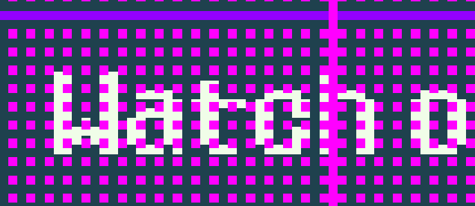


So I was wondering if this is what pixel snap is meant to solve, and if not, how would I go about solving it? :)

Thanks in advance for the help!

Developer

The pixel snap option should be the same code used by Unity UI, so it's moreso meant for non-pixel fonts or canvases rendering at the same resolution. If you're getting good results without it, then you don't need it! I will have a look at that soon though, but it does just use a standard application of Unity's internal pixel snap code...


Just make sure the "quality" is your pixel font's point size, the "size" is "quality / pixel scaling" (eg. 16 pixel font / 100 pixels in a unit = 0.16 size) and that the text is aligned to your grid. (eg 100 pixels in a unit = position should be a multiple of 0.01) and everything should be fine.

So my text is in UI mode so for the Rect Transform to be aligned to the pixel grid it only needs to be a number with no decimals since the canvas is already at 640x360, which it is, and i tried what you said about sizes, but I think that's also for 3D text, cause it made my text tiny in my Canvas.

I think my issue is that middle anchor center alignment is not working depending on the amount of pixels.

In this following example, its the same text box, with two lines of text, one with an uneven amount of pixels, and the other with an even amount of pixels, and you can see how one is aligned and the other one is not. So I'm wondering if I can make it have a "middle rounded" anchor in a way, that's rounded to the nearest pixel, therefore pixel perfect aligning both lines.


(2 edits)

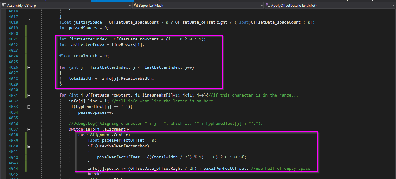
This is my hacky fix that did manage to align them correctly:

Basically adds up the width of the characters in a line, and if its even or uneven it adds an additional 0.5f to offset it.
I'm sure I'm ignoring a bunch of use cases that you may understand better, but for now this kind of fixes my issue :) Hopefully it can be added as a feature!

Sorry to bother and thanks for the help! If i do find issues with this I may be back :D
EDIT: Im still not there cause spaces screw me over, but im getting there haha
EDIT2 : Nevermind, it was something else! It still works!

Developer

Hey, that works!


I did just remember that in the VertexMod scene, I think there's a sample script that can snap the verts of a text mesh itself so specific coordinates, so that would work, too! But yeah, the centre-align doesn't like to work naturally... I really like this fix you did and if it works for you use it for sure! (That's why i ship STM with source code exposed, after all) but yeah, I'm not sure about including it for everyone... it's been a while since I've modified the pixel snapping code, so I could be forgetting about some edge case I need to watch out for.

No worries, I did search for solutions in this forum before posting, so if anyone needs this hopefully they can find this post!